Steampunk Industrial
Steampunk industrial interface. Ideal for landing pages, saas. AI-ready template.
Use case: Landing pages, SaaS
Historical Context
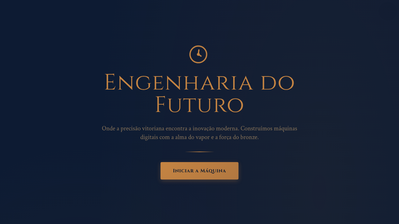
Steampunk didn't start as an aesthetic — it started as a literary argument. When Gibson and Sterling wrote The Difference Engine in 1990, they weren't designing a vibe. They were asking: what if the information age arrived a century early, powered by steam and brass instead of silicon? That question cracked open an entire genre. The maker movement grabbed it and ran. Suddenly you had people building actual functional computers inside mahogany cases, soldering copper pipe into keyboard frames, retrofitting analog gauges onto digital devices. It wasn't cosplay — it was a philosophical stance. A rejection of the disposable, the sealed-shut, the deliberately opaque. If you can't see the gears, how do you trust the machine? In UI, steampunk translates surprisingly well. Gauges become progress indicators. Dials become input controls. Riveted panels become card containers. The mechanical metaphor gives users something physical to grab onto — every interaction implies weight, resistance, consequence. Nothing happens without visible cause and effect. That's not decoration. That's information architecture wearing a top hat.
When to Use
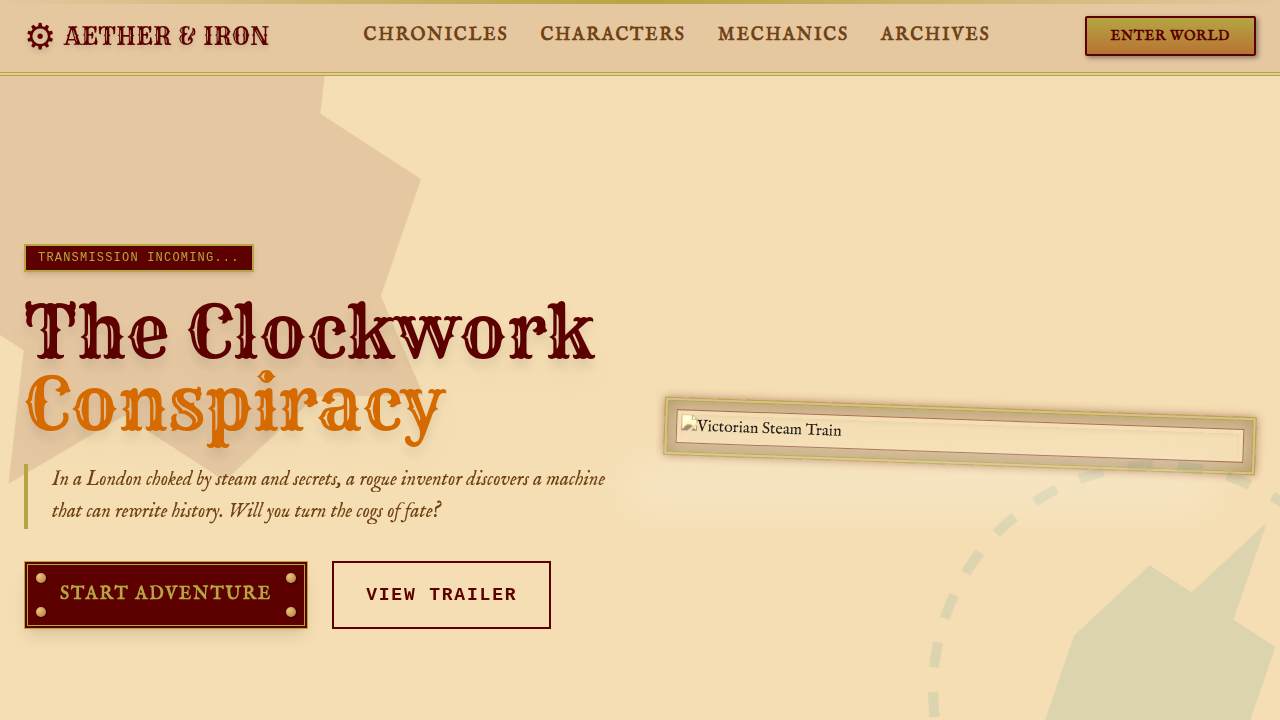
Reach for steampunk when your project needs personality that conventional dark-mode-with-gradients can't deliver. Gaming interfaces, alternative history narratives, maker community platforms, themed entertainment experiences. It works when your audience already self-selects into worlds of craft and imagination. Don't use it for enterprise SaaS. Don't use it for medical apps. But for a tabletop RPG companion? A museum exhibit kiosk? A retro-futurist portfolio? The brass fits like a glove.
Design Principles
- Visible mechanics — every state change should feel like gears engaging, never abstract or invisible
- Material honesty — brass reads as brass, copper as copper; textures must reference real metallurgy, not plastic imitations
- Analog feedback — prefer gauges, dials, and mechanical indicators over flat progress bars and spinners
- Constructed weight — elements should feel riveted, bolted, assembled; nothing floats without visible support
- Functional ornament — decorative elements must serve navigational or informational purpose, never pure embellishment
Technical Specs
Colors
Primary
Secondary
Effects
Cinematic warm rim lighting, gear rotation animations, steam particle effects, clockwork tick animations, brass shimmer on hover
Light/Dark
✓ Full / ✓ Full
Related
Last synced: 4/1/2026