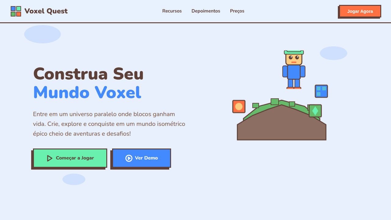
Voxel Gamified Isometric
Voxel landing page, isometric 3d style, gamified design, floating islands, blocky characters, colorful and friendly. Ideal for landing pages, modern websites. AI-ready template.
Use case: Landing pages, Modern websites
Historical Context
Voxel aesthetics didn't start with Minecraft. But Minecraft made them universal. Before 2011, isometric pixel art lived in niche communities — modding forums, indie dev circles, demoscene archives. Then a generation grew up placing blocks, and suddenly chunky 3D geometry wasn't retro nostalgia anymore. It was native visual language. The crossover into UI happened gradually, then all at once. Gamification platforms needed visual systems that felt playful without being childish. Isometric voxel illustrations solved that tension perfectly — dimensional enough to feel substantial, stylized enough to avoid uncanny valley. Notion added game-like progress bars. Duolingo built entire worlds from flat isometric tiles. NFT projects in 2021-2022 leaned hard into voxel avatars because they rendered fast, looked distinctive at thumbnail scale, and carried instant community recognition. What's interesting now: voxel-gamified design has matured past novelty. It's a legitimate system choice for products that need to communicate complexity through spatial metaphor — dashboards as cityscapes, data as terrain, progress as construction.
When to Use
When your product needs to feel approachable and dimensional simultaneously. Perfect for onboarding flows that teach through exploration, metaverse interfaces where spatial hierarchy matters, education platforms competing for attention against actual games, and NFT/Web3 projects establishing visual identity fast. Works best when your audience already speaks game — they'll parse isometric depth intuitively. Avoid if your users expect clinical precision or if accessibility requirements demand flat, high-contrast layouts.
Design Principles
- Commit to the grid — isometric projection demands mathematical consistency; one misaligned block breaks the entire illusion
- Limit your palette brutally — voxel art gains charm from constraint, not from gradient excess; pick 8-12 colors maximum and let form do the work
- Design for thumbnail first — if your voxel scene doesn't read at 64px, it won't communicate at any scale; silhouette clarity beats interior detail
- Animate with purpose, not spectacle — a single block placing itself teaches more than a full camera flythrough; micro-interactions over cinematics
- Respect the z-axis hierarchy — depth isn't decoration, it's information architecture; foreground is primary action, midground is context, background is atmosphere
Technical Specs
Colors
Primary
Secondary
Effects
Isometric projection, voxel-style block characters, floating island platforms, smooth vector gradients, edge lighting.
Light/Dark
✓ Full / ✗ No
Related
Last synced: 4/1/2026