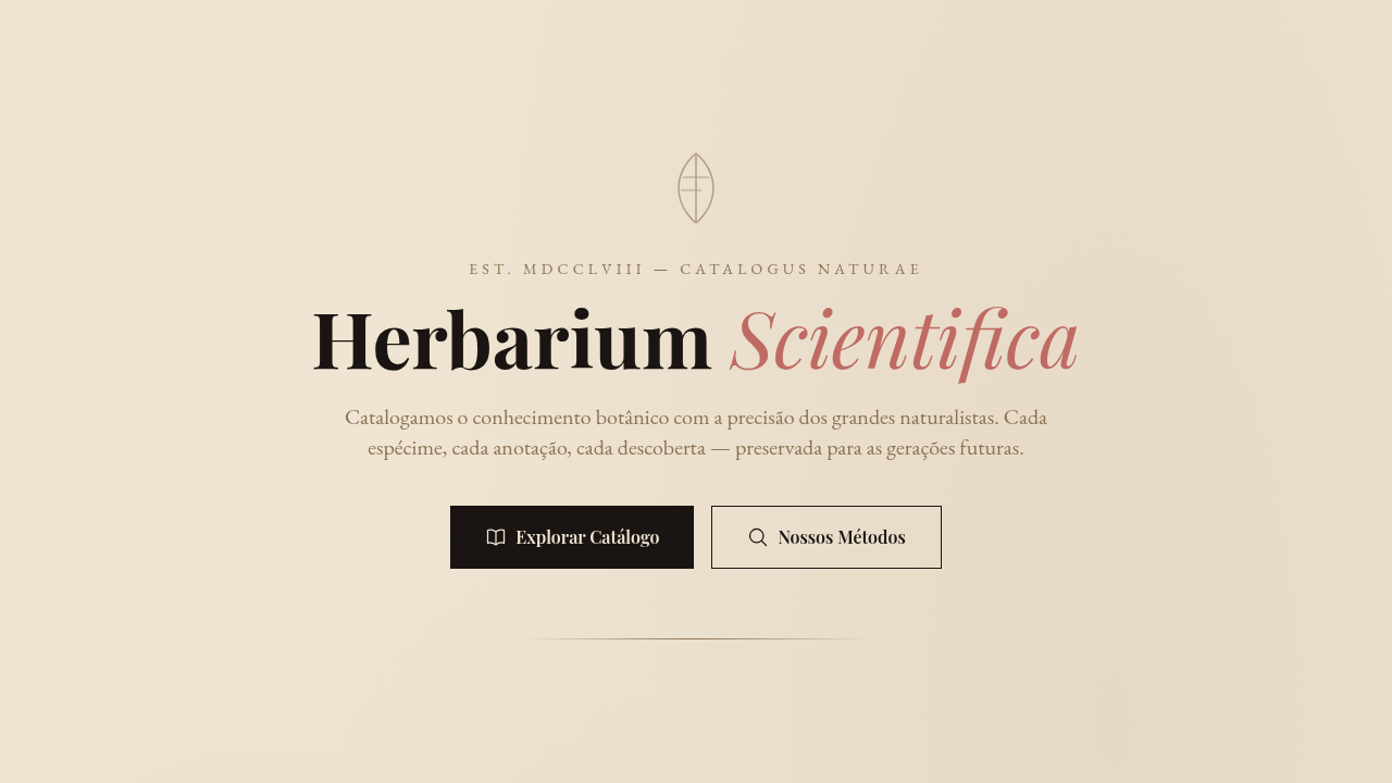
Vintage Botanical / Scientific
Vintage botanical scientific interface. Ideal for landing pages, saas. AI-ready template.
Use case: Landing pages, SaaS
Historical Context
Before photography existed, science depended on artists who could render nature with obsessive precision. Maria Sibylla Merian sailed to Suriname in 1699 — alone, as a woman, in the 17th century — to document insect metamorphosis through watercolors that were simultaneously rigorous data and breathtaking art. Two centuries later, Ernst Haeckel's lithographs in 'Kunstformen der Natur' turned radiolarians and jellyfish into geometric compositions so perfect they influenced Art Nouveau architecture. These illustrations carried an implicit message: nature is worth studying slowly. That ethos never really left. Fast-forward to the 2010s. Aesop wraps brown apothecary bottles in serif typography and lets the ingredient list do the talking. Le Labo hand-writes labels like specimen tags. Grown Alchemist prints molecular diagrams on packaging. The botanical-scientific aesthetic became shorthand for 'we respect the raw material.' It signals craft without shouting. Intelligence without pretension. The visual language says: this product has lineage, and so does the knowledge behind it.
When to Use
Reach for this when the brand needs to feel studied, intentional, unhurried. Natural skincare, apothecary-style wellness, herbal supplements, botanical gin — anything where provenance matters. Works beautifully for educational contexts too: field guides, museum exhibits, science communication that wants warmth instead of clinical coldness. Luxury cosmetics use it to signal ingredient transparency. The key qualifier: your product must actually have substance behind it. This aesthetic punishes emptiness — if there's no real story, the specimen labels just look like costume.
Design Principles
- Precision over decoration — every line, label, and annotation should feel like it serves a documentary purpose, not an ornamental one
- Asymmetric composition with generous negative space — botanical plates breathe; they never crowd the specimen against the frame edge
- Typography as taxonomy — use serif or didone type for specimen names, monospaced or condensed sans for data labels, and let the hierarchy feel like a naturalist's notebook
- Muted, specimen-accurate color — pull palettes from actual dried herbarium sheets: ochres, sage greens, faded indigos, parchment whites. Saturated color should feel like a rare bloom, not a default
- Visible craft artifacts — engraving crosshatching, hand-numbered plates, ink bleed on cotton paper. The texture communicates that a human hand was involved before the machine
Technical Specs
Colors
Primary
Secondary
Effects
Natural soft lighting, scholarly presentation, specimen reveal animations, annotation line drawing, subtle parallax on illustrations
Light/Dark
✓ Full / ◐ Partial
Related

Last synced: 4/1/2026