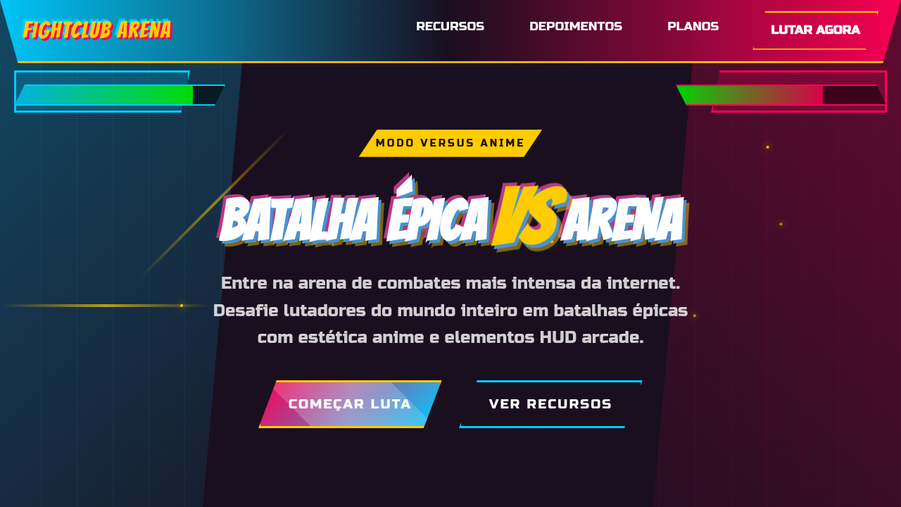
Versus Mode Anime Aesthetic
Versus mode landing page, anime fighting game style, split screen design, dynamic diagonals, high contrast, hud elements. Ideal for landing pages, modern websites. AI-ready template.
Use case: Landing pages, Modern websites
Historical Context
The VS screen is one of the most enduring UI patterns in gaming. Street Fighter II didn't invent it, but it codified the grammar: two portraits, a crackling divider, names in bold type, the whole thing vibrating with anticipation. That split-second before the fight starts? Pure tension design. Dragon Ball Z games pushed it further — speed lines, ki auras bleeding off the frame, typography that looks like it might explode. Guilty Gear and BlazBlue turned the entire interface into sequential art. Every meter, every health bar, every round indicator was drawn like a manga panel. The UI wasn't separate from the action. It was the action. This energy migrated. Esports broadcasts borrowed the split composition. Competitive apps adopted the diagonal slash. Twitch overlays, tournament brackets, player cards — all descendants of that original VS screen. The pattern works because it's fundamentally about opposition. Two forces, one frame. No ambiguity about what's happening next.
When to Use
When your product needs to feel like a challenge accepted. Fighting game tournaments, esports platforms, competitive leaderboards, PvP matchmaking screens, gaming content creators. Works for anything where two sides face off — debate apps, head-to-head comparisons, rivalry narratives. Kill it if your context demands calm. This aesthetic only knows one volume.
Design Principles
- Diagonal energy — slashes, speed lines, and angular dividers create movement even in static layouts. Nothing sits horizontal.
- Maximum contrast portraits — characters or players occupy opposing halves with clashing color temperatures. Cool vs warm. Dark vs light. The tension is chromatic.
- Typography as impact — text doesn't inform, it hits. Condensed, italic, outlined, shadowed. Letters lean forward like they're about to throw a punch.
- Controlled chaos — particle effects, halftone dots, manga screentones, burst shapes. Layer them densely but keep the focal point (the VS moment) absolutely clear.
- Frame-breaking composition — elements bleed past boundaries, overlap containers, ignore safe zones. The design should feel like it can't be contained by the viewport.
Technical Specs
Colors
Primary
Secondary
Effects
Split-screen dichotomy, character avatars, fighting game HUD elements, elemental visual effects, cel-shaded illustration, jagged comic book aesthetic.
Light/Dark
✗ No / ✓ Full
Related
Last synced: 4/1/2026