Vercel Geist Minimal
Vercel-inspired minimal landing page. Ideal for infraestrutura developer, plataformas de deploy, ferramentas frontend, ci/cd. AI-ready template.
Use case: Infraestrutura developer, Plataformas de deploy, Ferramentas frontend, CI/CD
Historical Context
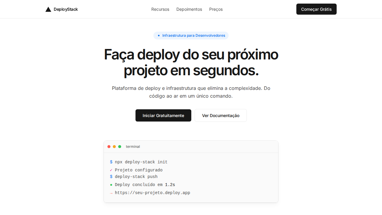
Vercel didn't invent black-and-white interfaces, but they made them feel inevitable. When Guillermo Rauch's team released Geist in 2023 — a sans-serif and monospace pair designed specifically for code and UI — they weren't just shipping a typeface. They were codifying an aesthetic that had been brewing since Zeit's early days: the idea that developer tools should look like they were designed by someone who actually reads terminal output. The lineage traces back to Swiss modernism, obviously. Univers, Helvetica, the whole Zurich school obsession with grids and negative space. But Vercel's interpretation strips even that tradition down further. No warm grays. No subtle brand colors hiding in the background. Just pure black on white, monospace for data, sans-serif for hierarchy, and enough whitespace to make every element feel considered rather than decorated. What's remarkable is how this became the default. Linear adopted it. Raycast adopted it. Half the YC batch ships with black-and-white landing pages now. Geist made minimalism feel like a technical decision rather than an aesthetic one — as if color itself were technical debt.
When to Use
When your product speaks to developers or technical users who associate visual restraint with competence. Perfect for deployment platforms, CLI tools, API documentation, and anything where the interface should feel like an extension of the terminal. Works best when your product's complexity lives in the functionality, not the chrome — when you want users focused on their code, their data, their output, not your brand expression.
Design Principles
- Absolute chromatic restraint — black, white, and functional grays only. Color is reserved exclusively for system states (error red, success green) and never for decoration.
- Monospace as information hierarchy — Geist Mono signals 'this is data, this is code, this matters technically' while the sans-serif handles navigation and labels.
- Density through typography, not through UI chrome — let font weight, size, and spacing create hierarchy instead of borders, cards, or background fills.
- Transitions over animations — subtle opacity fades and position shifts. Nothing bounces, nothing overshoots. Movement should feel like a state change, not a performance.
- Generous negative space as confidence signal — empty space communicates that every element earned its place. Cramped layouts suggest the designer didn't trust the content.
Technical Specs
Colors
Primary
Secondary
Effects
Shadow-as-border: box-shadow 0px 0px 0px 1px rgba(0,0,0,0.08) substituindo bordas tradicionais. Multi-layer shadow stacks para cards (border + elevation + ambient + inner highlight). Geist Sans com letter-spacing extremo negativo (-2.4px a -2.88px em display). Ligatures (liga) habilitadas globalmente. Cores de workflow: Ship Red, Preview Pink, Develop Blue. Canvas quase branco puro com texto #171717.
Light/Dark
✓ Full / ✗ Not Recommended
Related
Last synced: 4/1/2026