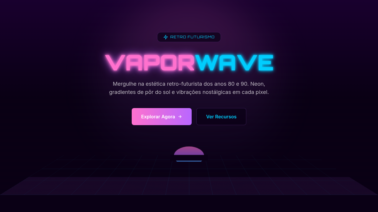
Vaporwave
Vaporwave aesthetic interface. Ideal for landing pages, saas. AI-ready template.
Use case: Landing pages, SaaS
Historical Context
Vaporwave didn't start as a design movement. It started as a joke — or maybe a critique disguised as one. Around 2010-2012, anonymous producers on Bandcamp and Reddit began chopping up forgotten muzak, Japanese city pop, and late-night infomercial audio into something deliberately uncanny. The visuals followed: Roman busts, Windows 95 dialogs, dead mall interiors, all rendered in that signature pink-purple haze. Tumblr ran with it. Hard. The thing is, beneath the irony sat a genuine observation about consumer culture. Vaporwave was sampling the aesthetic residue of hypercapitalism — the smooth jazz of hold music, the empty promises of 80s advertising, the hollow optimism of early digital interfaces. It asked: what happens when you strip commercial media of its intent and just... stare at it? What nobody expected was longevity. By the mid-2010s, vaporwave's palette and spatial language had migrated into legitimate brand work, album art, indie games, and UI experiments. The meme became a vocabulary. Designers who'd never heard of Macintosh Plus were pulling from its color theory — those saturated cyans against deep magentas, the deliberate digital decay. It proved that internet subcultures could produce lasting visual frameworks, not just disposable trends.
When to Use
Reach for vaporwave when the project needs to feel like a memory you're not sure you actually have. Music platforms, gaming interfaces, art-adjacent brands — anywhere nostalgia is the product, not just decoration. It works beautifully for projects that want emotional texture without taking themselves too seriously. Avoid it for anything requiring trust signals or corporate credibility. This aesthetic whispers "late night" and "personal" — it falls apart under fluorescent boardroom lighting.
Design Principles
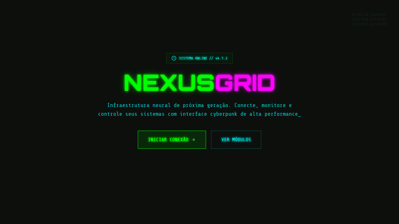
- Chromatic saturation as emotion — pink, purple, and cyan aren't decorative, they're structural. The palette carries the entire mood; remove it and the design collapses.
- Deliberate digital decay — glitch artifacts, scan lines, and compression noise are compositional tools, not afterthoughts. Place them with the same intention you'd place typography.
- Spatial emptiness borrowed from dead commerce — vaporwave breathes through negative space that feels abandoned rather than minimal. Think empty mall atrium, not Swiss grid.
- Temporal layering — mix era-specific artifacts freely. A 3D chrome logo next to a VHS timestamp next to a pixel-art palm tree. The anachronism is the point.
- Sincerity through irony — the aesthetic only works when there's genuine affection underneath the pastiche. Pure mockery reads hollow. Pure nostalgia reads naive. The tension between them is where vaporwave lives.
Technical Specs
Colors
Primary
Effects
text-shadow glow, linear-gradient, filter: hue-rotate(), glitch animations, retro scan lines
Light/Dark
✓ Full / ✓ Dark focused
Related
Last synced: 4/1/2026