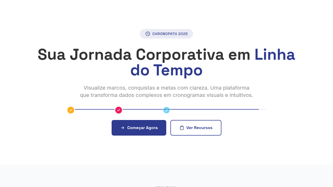
Timeline Horizontal Corporativo
Horizontal corporate timeline. Ideal for landing pages, modern websites. AI-ready template.
Use case: Landing pages, Modern websites
Historical Context
Timelines went horizontal the moment screens got wide enough to justify it. For decades, the vertical stack dominated — annual reports, résumés, org charts — because print was portrait and scrolling was vertical. But widescreen monitors and landscape presentations flipped the default. Suddenly left-to-right meant forward, and the spatial metaphor clicked with how Western readers already parse progress. The real shift came from product tools. Linear's roadmap view, Notion's timeline databases, Gantt descendants in Monday and Asana — they all trained an entire generation of knowledge workers to expect horizontal time. Swimlanes. Color-coded phases. Hover states revealing scope. These tools didn't just display timelines; they made them interactive, filterable, zoomable. That raised the bar for what a static corporate timeline needs to feel like. So now when you drop a horizontal timeline into a company history page or a product changelog, you're competing with muscle memory from daily project tools. The component has to feel that fluid, that scannable — even if it's purely presentational. Flat vector icons and geometric modules help because they reduce cognitive load to shape recognition. No ornament, just signal.
When to Use
Reach for this when time is the primary axis and the audience reads left-to-right. Company milestones across years. Sprint-level roadmaps in pitch decks. Product changelogs where sequence matters more than detail. Process flows with discrete, countable steps — onboarding, deployment pipelines, approval chains. Skip it when you have more than 12 nodes (it collapses), when mobile is the primary viewport, or when events overlap heavily in time. Vertical handles density better. Horizontal handles clarity.
Design Principles
- Left-to-right equals forward — never reverse chronological order on a horizontal axis, it breaks spatial intuition.
- Geometric consistency over decorative variety — use a single icon style (flat vector, uniform stroke weight) so the eye tracks the line, not individual nodes.
- Whitespace is pacing — uneven spacing between nodes can imply duration; use it intentionally or keep it mathematically even. No in-between.
- Progressive disclosure over information density — show dates and titles at rest, reveal descriptions on interaction. The timeline is a map, not the territory.
- Anchor the baseline — the connecting line must be visually dominant enough to unify nodes but quiet enough to not compete with content. 1-2px, muted color, no gradients.
Technical Specs
Colors
Primary
Secondary
Effects
Flat 2D illumination, no shadows/gradients, milestone pop-in animations, timeline draw animation, module slide-in, color-coded category reveals
Light/Dark
✓ Full / ✓ Full
Related


Last synced: 4/1/2026