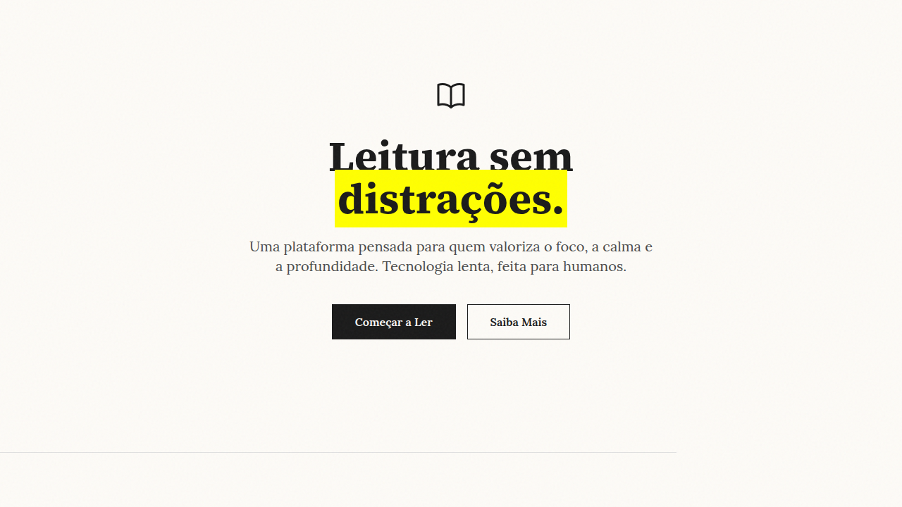
The Barely-There UI
Design an ultra-minimal AI-native interface inspired by OpenAI and Perplexity. Ideal for plataformas de ia, saas b2b enterprise, dashboards analiticos, ferramentas de produtividade, interfaces de dados. AI-ready template.
Use case: Plataformas de IA, SaaS B2B enterprise, Dashboards analiticos, Ferramentas de produtividade, Interfaces de dados
Historical Context
The barely-there UI didn't emerge from nowhere — it's the logical endpoint of a conversation Swiss designers started in the 1950s. Müller-Brockmann and his grid obsessives proved that restraint communicates more than decoration ever could. But where International Typographic Style still announced itself through bold structure, the barely-there approach takes that philosophy to its vanishing point. The real catalyst was the reading app boom of the early 2010s. Instapaper, iA Writer, Medium's original design — they all asked the same question: what if the interface just... got out of the way? Not hidden behind hamburger menus, but dissolved into near-invisibility through opacity hierarchies and ultra-thin strokes. The chrome didn't disappear; it became translucent. What makes this trend genuinely interesting is its confidence. It takes a designer who trusts their content hierarchy completely to reduce UI elements to 40% opacity hairlines. There's no safety net of bold borders or high-contrast containers. You're betting everything on spatial relationships and typographic weight doing the heavy lifting. When it works — and it often does — the user forgets they're looking at an interface at all.
When to Use
Deploy barely-there when your content deserves absolute primacy. Photography portfolios where a visible nav would compete with the images. Long-form reading tools where cognitive load from chrome actively degrades the experience. Meditation and wellness apps where visual quietness IS the product value. Content-first dashboards where data density demands every pixel of attention. Skip it entirely for complex workflows, e-commerce, or anything requiring clear affordances — invisible buttons are just broken buttons wearing a turtleneck.
Design Principles
- Opacity as hierarchy: Primary actions at 60-80% opacity, secondary at 30-40%, tertiary at 15-20%. Never use color weight when transparency can communicate the same relationship with less visual noise.
- Ultra-thin everything: 0.5px borders maximum. If your strokes are visible at arm's length, they're too heavy. The divider should be felt more than seen — a suggestion of structure, not a declaration.
- Negative space is the container: Stop wrapping things in boxes. Let whitespace define boundaries. A 48px gap communicates grouping more elegantly than any card border ever will.
- Typography carries all weight: With chrome dissolved, your type system becomes your entire visual hierarchy. Invest in a scale with real contrast — 11px metadata against 32px titles. The spread does the work that UI elements used to do.
- Reveal on intent: Interactive elements surface on hover/focus, not by default. The interface responds to attention rather than demanding it. But always maintain accessible focus states — invisible doesn't mean inaccessible.
Technical Specs
Colors
Primary
Secondary
Effects
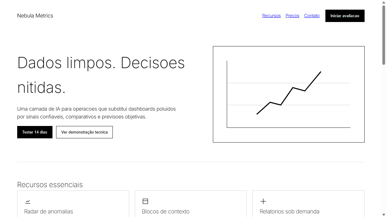
Opacidade como hierarquia (100% titulo, 87% corpo, 60% secundario), transicoes ultra-suaves 300ms, zero sombras, zero gradientes, espacamento arquitetonico generoso, visualizacoes de dados rigorosas substituindo ilustracoes
Light/Dark
✓ Full / ✓ Full
Related
Last synced: 4/1/2026