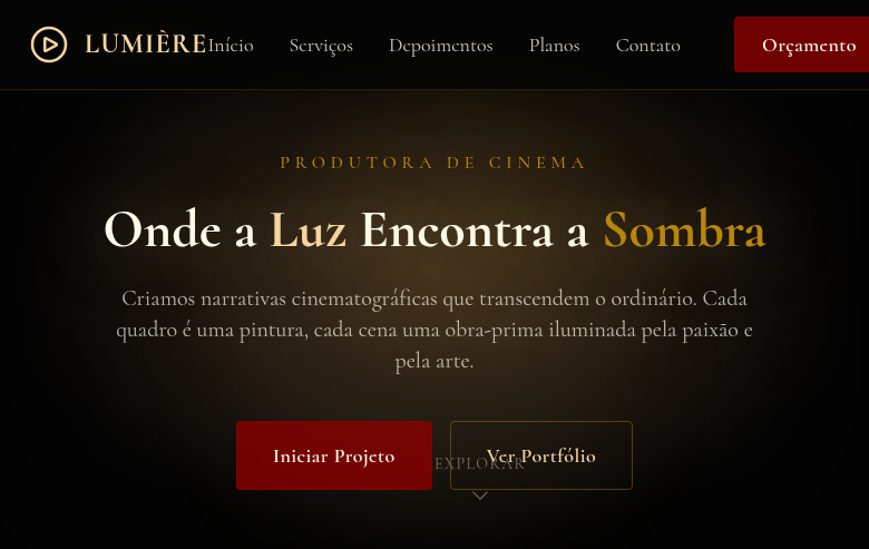
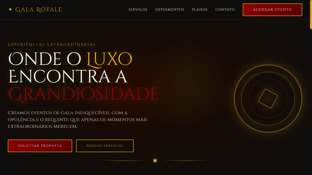
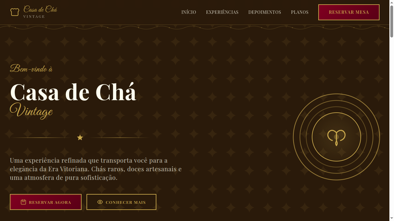
Tenebrism
Tenebrism-inspired landing page with extreme contrast between light and deep darkness. Ideal for pôsteres atmosféricos, flyers de eventos, spreads editoriais, embalagens premium. AI-ready template.
Use case: Pôsteres atmosféricos, Flyers de eventos, Spreads editoriais, Embalagens premium
Historical Context
O Tenebrismo, técnica de Caravaggio (séc. XVII), usa contraste extremo entre luz e sombra densa para criar drama intenso. O efeito 'holofote' ilumina o sujeito contra escuridão profunda.
Technical Specs
Colors
Primary
Secondary
Effects
Dramatic radial-gradient spotlight effects, deep dark backgrounds with isolated light areas, heavy vignette overlays, warm golden light accents, smooth reveal animations from darkness (800ms), text emerging from shadow with text-shadow layers
Light/Dark
✗ Not Recommended / ✓ Full
CSS
font-family: 'Cormorant', serif, background: radial-gradient(ellipse at center, #3A2A1A, #050505 70%), color: #FFF8E7, text-shadow: 0 0 40px rgba(245,213,160,0.3), box-shadow: inset 0 0 100px rgba(0,0,0,0.8) for vignette, border: 1px solid rgba(184,134,11,0.3), transition: opacity 800ms
Variables
--color-black: #050505, --color-spotlight: #F5D5A0, --color-brown: #3A2A1A, --color-ivory: #FFF8E7, --font-primary: 'Cormorant', --spotlight-gradient: radial-gradient(ellipse, #3A2A1A, #050505 70%), --vignette: inset 0 0 100px rgba(0,0,0,0.8), --spacing: 2.5rem
Checklist
☐ Extreme light/dark contrast, ☐ Radial spotlight gradient backgrounds, ☐ Deep dark base with isolated light, ☐ Heavy vignette overlays, ☐ Warm golden light accents, ☐ Text emerging from shadow, ☐ Moody dramatic atmosphere, ☐ Responsive with maintained drama
DESIGN.md
Design System: Tenebrism
1. Visual Theme & Atmosphere
Tenebrism-inspired landing page with extreme contrast between light and deep darkness. Ideal for pôsteres atmosféricos, flyers de eventos, spreads editoriais, embalagens premium. AI-ready template.
- Density: 5/10 — Balanced
- Variance: 4/10 — Moderate
- Motion: 6/10 — Expressive
2. Color Palette & Roles
- Deep Black (#050505) — Dark surface, primary background
- Warm Spotlight (#F5D5A0) — Secondary surface or text color
- Rich Brown (#3A2A1A) — Supporting palette color
- Ivory Highlight (#FFF8E7) — Light surface, card backgrounds
- Blood Red (#8B0000) — Error states, destructive actions
- Deep Gold (#B8860B) — Premium accent, decorative highlights
- Midnight Blue (#0D1B2A) — Deep contrast surface
- Warm Grey (#4A4A3A) — Secondary text, borders, muted elements
3. Typography Rules
- Display / Hero: Cormorant — Weight 700, tight tracking, used for headline impact
- Body: Cormorant — Weight 400, 16px/1.6 line-height, max 72ch per line
- UI Labels / Captions: Cormorant — 0.875rem, weight 500, slight letter-spacing
- Monospace: JetBrains Mono — Used for code, metadata, and technical values
Scale:
- Hero: clamp(2.5rem, 5vw, 4rem)
- H1: 2.25rem
- H2: 1.5rem
- Body: 1rem / 1.6
- Small: 0.875rem
4. Component Stylings
- Primary Button: Subtly rounded (0.5rem) shape. Accent color fill. Hover: 8% darken + subtle lift shadow. Active: -1px translate tactile press. Font weight 600. No outer glows.
- Secondary / Ghost Button: Outline variant. 1.5px border in muted color. Text in primary color. Hover: subtle background fill.
- Cards: Subtly rounded (0.5rem) corners. Surface background. Subtle shadow (0 2px 12px rgba(0,0,0,0.06)). 1px border stroke.
- Inputs: Label above input. 1px border stroke. Focus ring: 2px accent color offset 2px. Error text below in semantic red. No floating labels.
- Navigation: Primary surface background. Active item: accent color indicator. Font weight 500 when active.
- Skeletons: Shimmer animation matching component dimensions. No circular spinners.
- Empty States: Icon-based composition with descriptive text and action button.
5. Layout Principles
- Grid: CSS Grid primary. Max-width containment: 1280px centered with 1.5rem side padding.
- Spacing rhythm: Balanced. Base unit: 0.5rem (8px).
- Section vertical gaps: clamp(4rem, 8vw, 8rem).
- Hero layout: Split-screen (text left, visual right).
- Feature sections: Zig-zag alternating text+image rows. No 3-equal-columns.
- Mobile collapse: All multi-column layouts collapse below 768px. No horizontal overflow.
- z-index contract: base (0) / sticky-nav (100) / overlay (200) / modal (300) / toast (500).
6. Motion & Interaction
- Physics: Spring — stiffness 120, damping 20. Confident, weighted transitions.
- Entry animations: Fade + translate-Y (16px → 0) over 480ms ease-out. Staggered cascades for lists: 100ms between items.
- Hover states: Scale(1.03) + shadow lift over 200ms.
- Page transitions: Fade + slide (300ms).
- Performance: Only transform and opacity animated. No layout-triggering properties.
7. Anti-Patterns (Banned)
- No emojis in UI — use icon system only (Lucide, Heroicons)
- No pure white (#FFFFFF) backgrounds — use off-white or dark surfaces
- No oversaturated accent colors (saturation cap: 80%)
- No 3-column equal-width feature layouts — use zig-zag or asymmetric grid
- No
h-screen— usemin-h-[100dvh] - No AI copywriting clichés: "Elevate", "Seamless", "Unleash", "Next-Gen"
- No broken external image links — use picsum.photos or inline SVG
- No generic lorem ipsum in demos
AI Prompt
Act as a Senior Frontend Engineer and Expert UI Designer. Your task is to code a complete Landing Page on the first attempt.
- Landing Page Theme:
- Sections to add:
Generate the final code immediately following these definitions:
Style
- Name: Tenebrism
- Type: Extreme Contrast, Spotlight, Moody, Dramatic
- Keywords: Tenebrism, extreme contrast, light vs dark, spotlight effect, moody, dramatic, Caravaggio, chiaroscuro, intense, atmospheric
- Era: 17th Century Baroque Painting
- Light/Dark: ✗ Not Recommended / ✓ Full
Color Palette
- Primary: Deep Black #050505, Warm Spotlight #F5D5A0, Rich Brown #3A2A1A, Ivory Highlight #FFF8E7
- Secondary: Blood Red #8B0000, Deep Gold #B8860B, Midnight Blue #0D1B2A, Warm Grey #4A4A3A
Visual Effects
Dramatic radial-gradient spotlight effects, deep dark backgrounds with isolated light areas, heavy vignette overlays, warm golden light accents, smooth reveal animations from darkness (800ms), text emerging from shadow with text-shadow layers
AI Visual Direction
Design a tenebrism-inspired landing page with extreme contrast between light and deep darkness. Use deep black backgrounds with warm spotlight radial gradients illuminating key content. Blood red and deep gold accents. Heavy vignette overlays, text emerging from shadow. Caravaggio-inspired dramatic lighting. Moody, intense, atmospheric. Content appears to be lit by a single dramatic light source.
CSS Technical
font-family: 'Cormorant', serif, background: radial-gradient(ellipse at center, #3A2A1A, #050505 70%), color: #FFF8E7, text-shadow: 0 0 40px rgba(245,213,160,0.3), box-shadow: inset 0 0 100px rgba(0,0,0,0.8) for vignette, border: 1px solid rgba(184,134,11,0.3), transition: opacity 800ms
Design System Variables
--color-black: #050505, --color-spotlight: #F5D5A0, --color-brown: #3A2A1A, --color-ivory: #FFF8E7, --font-primary: 'Cormorant', --spotlight-gradient: radial-gradient(ellipse, #3A2A1A, #050505 70%), --vignette: inset 0 0 100px rgba(0,0,0,0.8), --spacing: 2.5rem
Implementation Checklist
- ☐ Extreme light/dark contrast
- ☐ Radial spotlight gradient backgrounds
- ☐ Deep dark base with isolated light
- ☐ Heavy vignette overlays
- ☐ Warm golden light accents
- ☐ Text emerging from shadow
- ☐ Moody dramatic atmosphere
- ☐ Responsive with maintained drama
Execution Rules
- Strictly follow the defined visual style.
- Use high-quality inline SVG icons (Heroicons or Lucide style) — NEVER use emojis as icons.
- Add
cursor-pointerand smoothhoverstates (transition-all) on all interactive elements. - Required Page Structure:
- Navbar (Logo + Links + CTA)
- Hero Section (Impactful Headline + Subtitle + 2 buttons + 3D/Abstract visual element via CSS)
- Features (3 cards with icons)
- Testimonials (3 cards)
- Pricing (3 tiers, highlight the middle one)
- Final CTA
- Full Footer with social links, privacy policy, terms of use, contact and SEO links.
- All text content must be in English.
- The visual must be CLEARLY distinct — do not create a "default Bootstrap" design. Force the use of the provided design system variables.
- Use
<style>tags in the head for custom classes (especially for complex backdrop-filter effects and animations) that Tailwind CDN doesn't cover. - Full Responsiveness: Layout must adapt perfectly to Mobile, Tablet and Desktop (vertical stack on mobile).
- Include basic SEO, Viewport and Open Graph meta tags in
<head>. - Footer must contain: Copyright 2026, Secondary navigation links and Social media icons.
- Make the creative decisions needed to deliver the complete, functional result now.
Related
Last synced: 4/1/2026