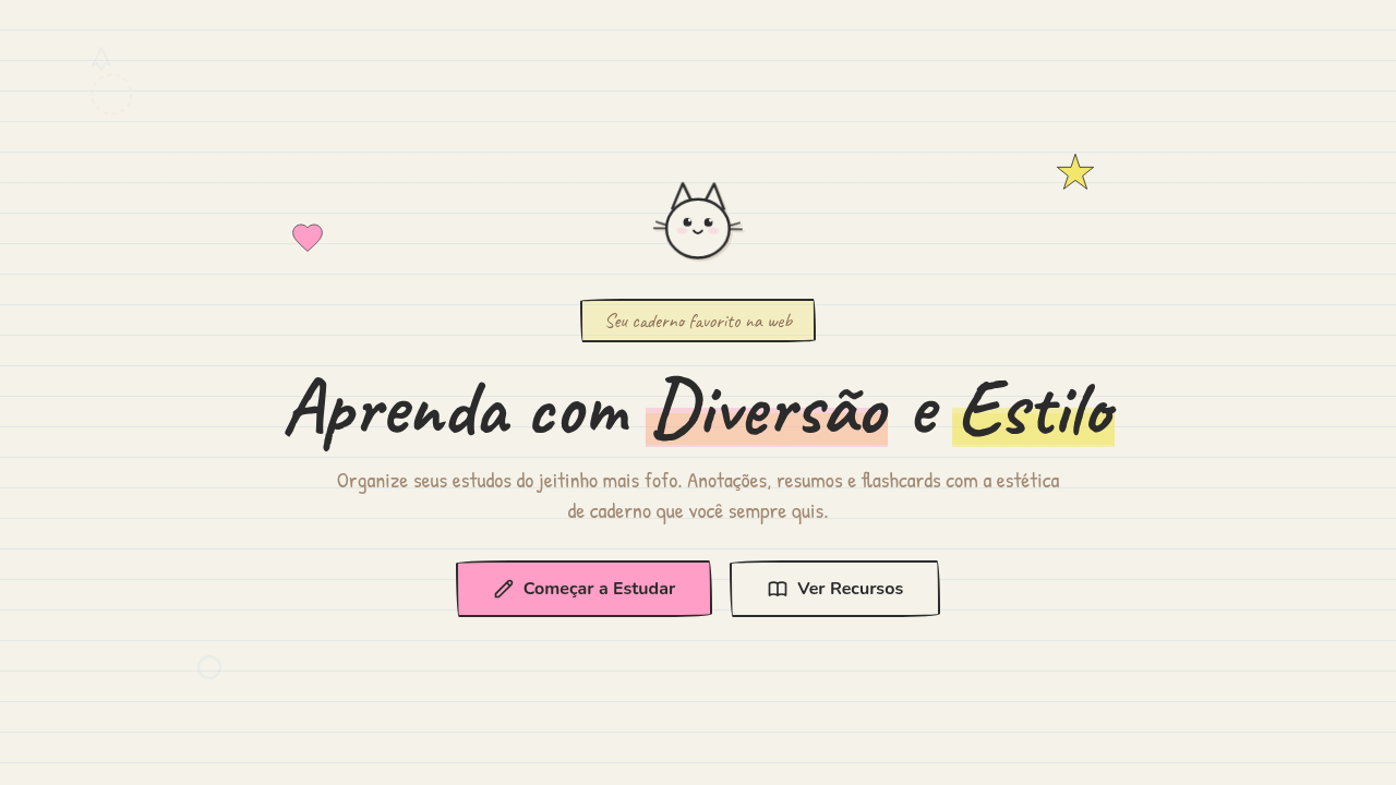
Studygram / Notebook Kawaii
Studygram notebook kawaii interface. Ideal for landing pages, saas. AI-ready template.
Use case: Landing pages, SaaS
Historical Context
Somewhere around 2016, Instagram exploded with #studygram — students posting perfectly arranged desks, color-coded notes, and hand-lettered headers. It wasn't just aesthetic flexing. It was a whole productivity subculture built on the idea that making your notes beautiful made you actually want to study. Bullet journaling fed the same beast. Ryder Carroll's system got co-opted by artists who turned task lists into illustrated spreads with washi tape borders and tiny doodle icons. The leap to UI was inevitable. Education startups noticed that Gen Z associated learning with this handmade, sticker-covered notebook vibe — not with sterile LMS interfaces. Apps like Notion (with its emoji-heavy pages), Forest, and dozens of Korean study timer apps started borrowing the visual language: ruled-paper backgrounds, hand-drawn checkboxes, kawaii mascots cheering you on. The notebook stopped being a metaphor and became an interface pattern. What makes it stick is the warmth. Digital tools feel cold. Notebook aesthetics smuggle in the tactile comfort of paper, the personality of someone's actual handwriting. It's skeuomorphism reborn — not as fake leather textures, but as illustrated stickers and wobbly grid lines that say: this space is yours to mess up.
When to Use
Reach for this style when your users are students, journalers, or anyone who associates productivity with creative expression. It works beautifully for study planners, flashcard apps, habit trackers, and educational platforms targeting teens through twentysomethings. Also strong for onboarding flows where you need to reduce intimidation — the hand-drawn quality signals low-pressure, playful, forgiving. Avoid it for anything requiring perceived authority or precision. A tax app in notebook kawaii is unhinged.
Design Principles
- Imperfection is the point — wobbly lines, slightly off-grid elements, and hand-drawn textures create warmth that pixel-perfect layouts cannot
- Layer like a real notebook — stickers overlap borders, doodles break margins, tape holds things 'in place' — depth comes from collage logic, not drop shadows
- Kawaii characters earn their space — mascots and illustrated elements must serve a UX function (feedback, wayfinding, emotional reward), never just decoration
- Constrain the palette to 4-5 highlighter colors — the aesthetic dies when you add too many hues; think Mildliner set, not rainbow explosion
- Respect the grid underneath the chaos — the notebook style looks effortless but needs rigid underlying structure to remain usable at scale
Technical Specs
Colors
Primary
Secondary
Effects
Flat ambient scanning light, hand-drawn wobble animations, doodle reveal on scroll, highlighter swipe effect, sticker pop-in animations
Light/Dark
✓ Full / ◐ Partial
Related
Last synced: 4/1/2026