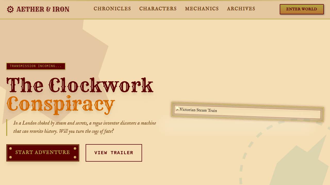
Futurista & Tech 19th Century, Industrial Revolution Fantasy

Steampunk Vitoriano

Victorian steampunk landing page. Ideal for landing pages, saas. AI-ready template.

steampunkvictorianornatemechanicaladventurousbrassgearsleatherintricateimaginative

Use case: Landing pages, SaaS

Steampunk Vitoriano

Historical Context

Steampunk Vitoriano style represents a modern trend in UI/UX web design focused on general.

Technical Specs

Colors

Primary

#B5A642
#5C0000
#704214
#F5DEB3

Secondary

#B87333
#008080
#D46A00
#FFFFF0

Effects

Intricate gear animations, brass borders, leather textures, detailed illustrations, vintage typography, gas lamp glows, schematic overlays, interactive mechanical elements

Light/Dark

✓ Full / ✗ No

CSS

background-image: url('parchment-texture.jpg'), background-color: #F5DEB3, color: #5C0000, font-family: 'IM Fell English', serif, border: 3px solid #B5A642, box-shadow: 0 0 10px rgba(0,0,0,0.5), text-shadow: 1px 1px 0 #FFFFF0, animation: gear-rotate 20s linear infinite, transform-style: preserve-3d, perspective: 1000px

Variables

--brass-steampunk: #B5A642, --mahogany-steampunk: #5C0000, --sepia-steampunk: #704214, --parchment-steampunk: #F5DEB3, --gear-animation-duration: 20s, --font-steampunk: 'IM Fell English', serif

Checklist

☐ Intricate gear animations, ☐ Brass borders, ☐ Leather textures, ☐ Detailed illustrations, ☐ Vintage typography, ☐ Gas lamp glows

DESIGN.md

Design System: Steampunk Vitoriano

1. Visual Theme & Atmosphere

Victorian steampunk landing page. Ideal for landing pages, saas. AI-ready template. Steampunk Vitoriano style represents a modern trend in UI/UX web design focused on general.

  • Density: 5/10 — Balanced
  • Variance: 8/10 — Expressive
  • Motion: 6/10 — Expressive

2. Color Palette & Roles

  • Brass (#B5A642) — Primary surface or dominant color
  • Rich Mahogany (#5C0000) — Secondary surface or text color
  • Sepia (#704214) — Supporting palette color
  • Parchment (#F5DEB3) — Supporting palette color
  • Copper (#B87333) — Metallic accent, decorative detail
  • Deep Teal (#008080) — Secondary accent
  • Clockwork Orange (#D46A00) — Warm accent, call-to-action secondary
  • Ivory (#FFFFF0) — Secondary surface

3. Typography Rules

  • Display / Hero: IM Fell English — Weight 700, tight tracking, used for headline impact
  • Body: IM Fell English — Weight 400, 16px/1.6 line-height, max 72ch per line
  • UI Labels / Captions: IM Fell English — 0.875rem, weight 500, slight letter-spacing
  • Monospace: JetBrains Mono — Used for code, metadata, and technical values

Scale:

  • Hero: clamp(2.5rem, 5vw, 4rem)
  • H1: 2.25rem
  • H2: 1.5rem
  • Body: 1rem / 1.6
  • Small: 0.875rem

4. Component Stylings

  • Primary Button: Subtly rounded (0.5rem) shape. Accent color fill. Hover: 8% darken + subtle lift shadow. Active: -1px translate tactile press. Font weight 600. No outer glows.
  • Secondary / Ghost Button: Outline variant. 1.5px border in muted color. Text in primary color. Hover: subtle background fill.
  • Cards: Subtly rounded (0.5rem) corners. Surface background. Subtle shadow (0 2px 12px rgba(0,0,0,0.06)). 1px border stroke.
  • Inputs: Label above input. 1px border stroke. Focus ring: 2px accent color offset 2px. Error text below in semantic red. No floating labels.
  • Navigation: Primary surface background. Active item: accent color indicator. Font weight 500 when active.
  • Skeletons: Shimmer animation matching component dimensions. No circular spinners.
  • Empty States: Icon-based composition with descriptive text and action button.

5. Layout Principles

  • Grid: CSS Grid primary. Max-width containment: 1280px centered with 1.5rem side padding.
  • Spacing rhythm: Balanced. Base unit: 0.5rem (8px).
  • Section vertical gaps: clamp(4rem, 8vw, 8rem).
  • Hero layout: Asymmetric composition.
  • Feature sections: Asymmetric grid with varied card sizes. No 3-equal-columns.
  • Mobile collapse: All multi-column layouts collapse below 768px. No horizontal overflow.
  • z-index contract: base (0) / sticky-nav (100) / overlay (200) / modal (300) / toast (500).

6. Motion & Interaction

  • Physics: Spring — stiffness 120, damping 20. Confident, weighted transitions.
  • Entry animations: Fade + translate-Y (16px → 0) over 480ms ease-out. Staggered cascades for lists: 100ms between items.
  • Hover states: Scale(1.03) + shadow lift over 200ms.
  • Page transitions: Fade + slide (300ms).
  • Performance: Only transform and opacity animated. No layout-triggering properties.

7. Anti-Patterns (Banned)

  • No emojis in UI — use icon system only (Lucide, Heroicons)
  • No pure black (#000000) — use off-black or charcoal variants
  • No oversaturated accent colors (saturation cap: 80%)
  • No 3-column equal-width feature layouts — use zig-zag or asymmetric grid
  • No h-screen — use min-h-[100dvh]
  • No AI copywriting clichés: "Elevate", "Seamless", "Unleash", "Next-Gen"
  • No broken external image links — use picsum.photos or inline SVG
  • No generic lorem ipsum in demos

AI Prompt

Act as a Senior Frontend Engineer and Expert UI Designer. Your task is to code a complete Landing Page on the first attempt.

  • Landing Page Theme:
  • Sections to add:

Generate the final code immediately following these definitions:

Style

  • Name: Steampunk Vitoriano
  • Type: Ornate, Mechanical, Adventurous
  • Keywords: steampunk, victorian, ornate, mechanical, adventurous, brass, gears, leather, intricate, imaginative
  • Era: 19th Century, Industrial Revolution Fantasy
  • Light/Dark: ✓ Full / ✗ No

Color Palette

  • Primary: Brass #B5A642, Rich Mahogany #5C0000, Sepia #704214, Parchment #F5DEB3
  • Secondary: Copper #B87333, Deep Teal #008080, Clockwork Orange #D46A00, Ivory #FFFFF0

Visual Effects

Intricate gear animations, brass borders, leather textures, detailed illustrations, vintage typography, gas lamp glows, schematic overlays, interactive mechanical elements

AI Visual Direction

Design a Victorian steampunk landing page. Use: brass and rich mahogany, intricate gear animations, leather textures, detailed illustrations, vintage typography, gas lamp glows, schematic overlays, interactive mechanical elements.

CSS Technical

background-image: url('parchment-texture.jpg'), background-color: #F5DEB3, color: #5C0000, font-family: 'IM Fell English', serif, border: 3px solid #B5A642, box-shadow: 0 0 10px rgba(0,0,0,0.5), text-shadow: 1px 1px 0 #FFFFF0, animation: gear-rotate 20s linear infinite, transform-style: preserve-3d, perspective: 1000px

Design System Variables

--brass-steampunk: #B5A642, --mahogany-steampunk: #5C0000, --sepia-steampunk: #704214, --parchment-steampunk: #F5DEB3, --gear-animation-duration: 20s, --font-steampunk: 'IM Fell English', serif

Implementation Checklist

  • ☐ Intricate gear animations
  • ☐ Brass borders
  • ☐ Leather textures
  • ☐ Detailed illustrations
  • ☐ Vintage typography
  • ☐ Gas lamp glows

Execution Rules

  1. Strictly follow the defined visual style.
  2. Use high-quality inline SVG icons (Heroicons or Lucide style) — NEVER use emojis as icons.
  3. Add cursor-pointer and smooth hover states (transition-all) on all interactive elements.
  4. Required Page Structure:
    • Navbar (Logo + Links + CTA)
    • Hero Section (Impactful Headline + Subtitle + 2 buttons + 3D/Abstract visual element via CSS)
    • Features (3 cards with icons)
    • Testimonials (3 cards)
    • Pricing (3 tiers, highlight the middle one)
    • Final CTA
    • Full Footer with social links, privacy policy, terms of use, contact and SEO links.
  5. All text content must be in English.
  6. The visual must be CLEARLY distinct — do not create a "default Bootstrap" design. Force the use of the provided design system variables.
  7. Use <style> tags in the head for custom classes (especially for complex backdrop-filter effects and animations) that Tailwind CDN doesn't cover.
  8. Full Responsiveness: Layout must adapt perfectly to Mobile, Tablet and Desktop (vertical stack on mobile).
  9. Include basic SEO, Viewport and Open Graph meta tags in <head>.
  10. Footer must contain: Copyright 2026, Secondary navigation links and Social media icons.
  11. Make the creative decisions needed to deliver the complete, functional result now.

Related

Last synced: 4/1/2026