Spotify Dark Immersive
Spotify-inspired dark immersive landing page. Ideal for streaming de música, plataformas de áudio, podcasts, entretenimento digital. AI-ready template.
Use case: Streaming de música, Plataformas de áudio, Podcasts, Entretenimento digital
Historical Context
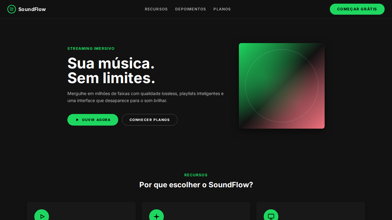
Spotify didn't invent dark UI — but they made it feel inevitable. When the app launched in 2008, most music software still clung to skeuomorphic chrome and light backgrounds. Spotify went black. Not because dark mode was trendy (it wasn't yet), but because darkness made album art pop. The content became the interface. That single decision shaped an entire generation of media players. The signature green (#1DB954) emerged as a deliberate counterpoint — electric, almost aggressive against the near-black canvas. It wasn't decorative. It was functional: a beacon for primary actions in a sea of muted grays. Over the years, Spotify refined this into something more sophisticated — layered surfaces with subtle elevation, blurred gradients pulled from album artwork, and a typographic hierarchy that breathes. The "immersive" quality comes from this layering: backgrounds that shift contextually, color extraction that makes every album feel like it owns the screen, and transitions smooth enough that navigation feels like flowing between rooms rather than clicking between pages.
When to Use
When your product lives in low-light, high-attention contexts. Music apps, podcast players, video platforms, anything where visual content needs to dominate and chrome needs to disappear. Works beautifully for entertainment discovery interfaces where mood matters more than information density. Avoid it for productivity tools or data-heavy dashboards — the low contrast and atmospheric approach trades scannability for vibe, and that's a deliberate tradeoff you need to own.
Design Principles
- Content is the interface — every surface exists to elevate artwork, not compete with it. Reduce chrome until the UI feels like a frame, not a cage.
- Color extraction over static palettes — pull accent colors from content dynamically. The interface should feel alive, shifting personality with every album or playlist.
- Layered darkness with purpose — use 3-4 surface levels (not just 'black') to create depth without borders. Elevation through luminance, not drop shadows.
- Green means go — reserve your accent color ruthlessly for primary actions and active states. The moment it appears everywhere, it means nothing.
- Motion as continuity — transitions between states should feel like camera movements, not page loads. Crossfades, parallax shifts, and contextual morphing keep the user inside the experience.
Technical Specs
Colors
Primary
Secondary
Effects
Canvas near-black imersivo (#121212, #181818, #1f1f1f) — UI desaparece para conteúdo brilhar. Spotify Green (#1ed760) como acento funcional singular — play buttons, estados ativos, CTAs. Geometria pill-and-circle: botões pill (500px-9999px), controles play circulares (50%). Botões uppercase com letter-spacing largo (1.4px-2px). Sombras heavy (rgba(0,0,0,0.5) 0px 8px 24px) para elementos elevados. Inset border-shadow combo em inputs. Album art como fonte primária de cor. Tipografia compacta (10px-24px range).
Light/Dark
✗ Not Recommended / ✓ Full
Related
Last synced: 4/1/2026