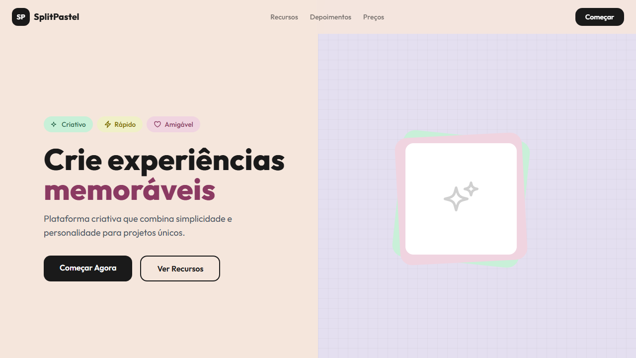
Split Pastel
Playful, modern, friendly landing page with split pastel background. Ideal for apps criativos, plataformas de design, startups friendly, ecommerce lifestyle. AI-ready template.
Use case: Apps criativos, Plataformas de design, Startups friendly, Ecommerce lifestyle
Historical Context
The split background isn't some trendy invention — it's a direct descendant of color field painting. Rothko and Barnett Newman were obsessing over how two adjacent color planes create tension and emotional weight decades before any of us touched a screen. The technique migrated into editorial print design in the 1960s, where art directors at Vogue and Harper's Bazaar used bisected color planes to create visual hierarchy without relying on imagery alone. The pastel variant — specifically the peach-lavender pairing — gained serious traction in the mid-2010s when Pantone crowned Rose Quartz and Serenity as dual Colors of the Year in 2016. That wasn't arbitrary. It reflected a cultural shift toward gender fluidity and softness in branding that fashion and beauty houses were already exploring. Glossier's visual identity, Mansur Gavriel's campaigns, and countless indie beauty brands adopted these split pastels not as decoration, but as positioning. The two-tone split says: we're refined, we're intentional, we reject the maximalist noise. Today the pattern persists because it solves a real layout problem — it divides content zones with color alone, eliminating the need for heavy borders or containers while maintaining an unmistakably editorial feel.
When to Use
Reach for split pastel when your brand lives in the feminine-forward space and needs to feel elevated without being cold. It works beautifully for fashion lookbooks, beauty product launches, lifestyle editorial, and any context where you want the layout itself to communicate softness and intentionality. Avoid it for anything that needs to feel urgent, technical, or masculine-coded. This pattern demands breathing room — cramped layouts kill it instantly. Best deployed on hero sections, feature highlights, and editorial spreads where content naturally divides into two conceptual halves.
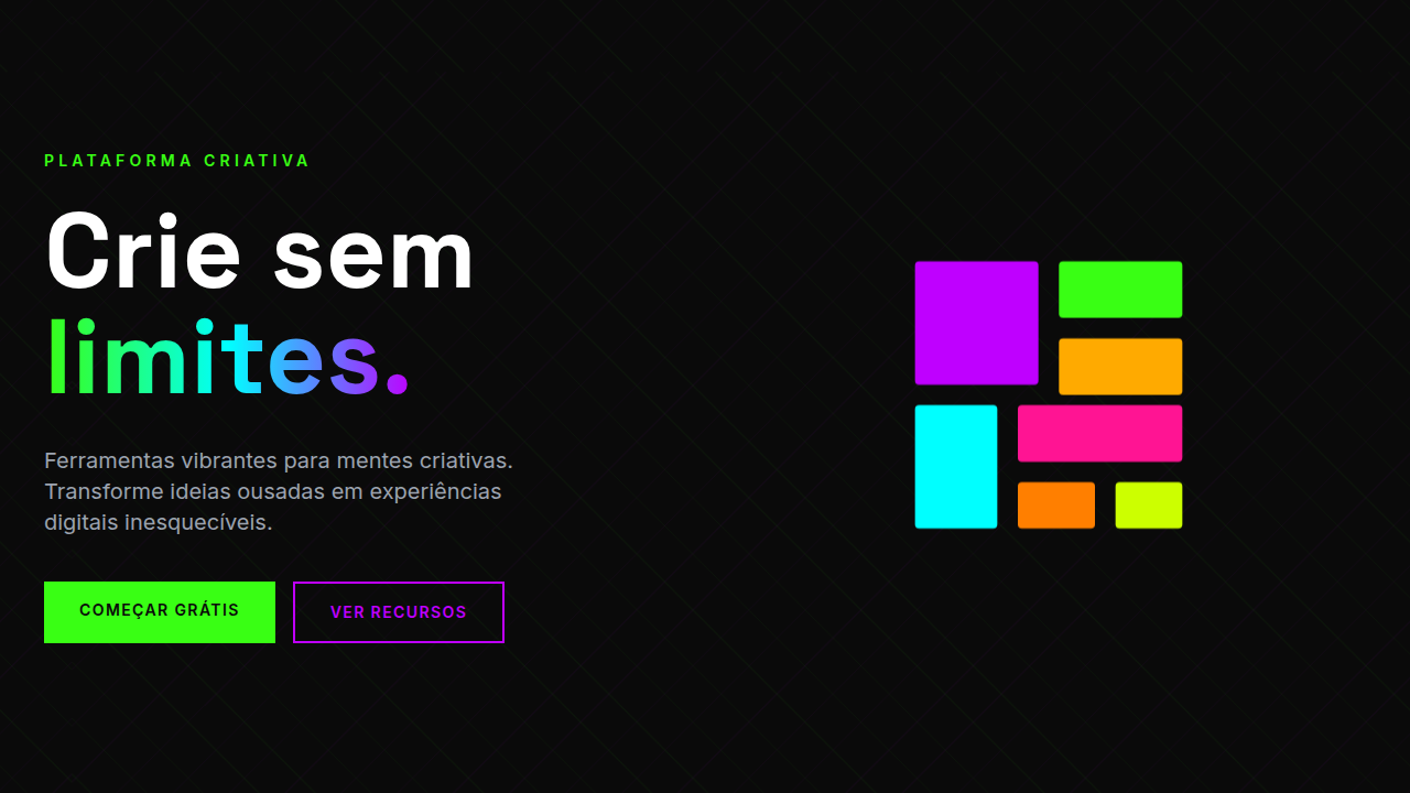
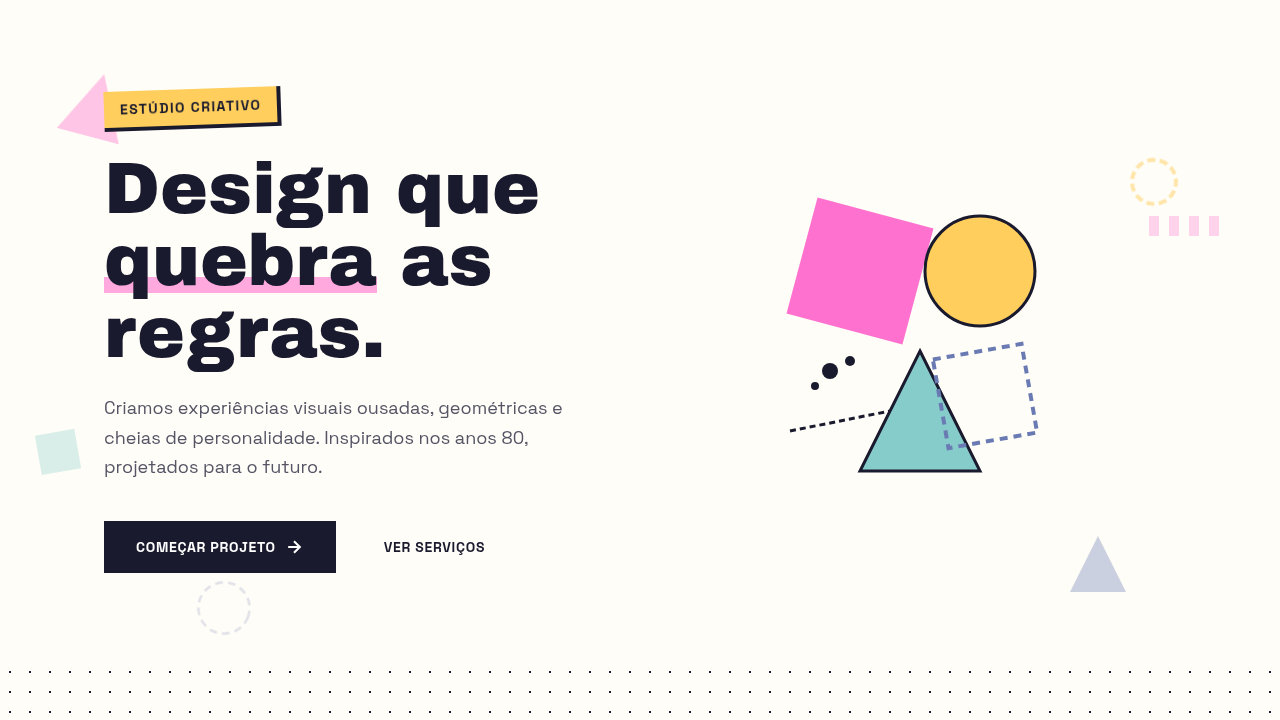
Design Principles
- Commit to asymmetry in the split ratio — 50/50 is boring. Try 40/60 or even 30/70 to create natural visual tension and guide the eye toward your primary content zone.
- Keep the palette analogous or complementary within the pastel range. Peach and lavender work because they share warmth without competing. High-contrast pastel pairings (mint and coral) risk looking juvenile rather than sophisticated.
- Typography must be decisive against soft backgrounds. Use medium-to-bold weights in a refined serif or geometric sans. Light type on pastels disappears — you lose hierarchy entirely.
- Let the split line itself become a compositional tool. Overlap imagery or type across the boundary to unify the two zones. A hard stop with no bridging element feels like two separate designs stitched together.
- Resist the urge to add texture, grain, or gradients to the color planes. The power of this pattern is in flat, confident color. Noise undermines the editorial authority you're trying to establish.
Technical Specs
Colors
Primary
Secondary
Effects
Split background colors (peach left, lavender right), playful badge pills with icons, grid pattern overlay on right panel, rounded CTA buttons, smooth transitions 250ms
Light/Dark
✓ Full / ✗ No
Related
Last synced: 4/1/2026