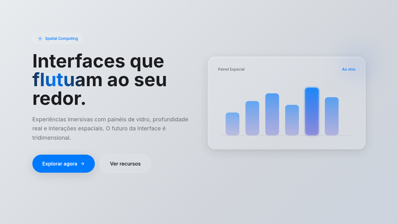
Spatial UI (VisionOS)
VisionOS-style spatial interface. Ideal for landing pages, saas. AI-ready template.
Use case: Landing pages, SaaS
Historical Context
When Apple dropped Vision Pro in early 2024, spatial UI stopped being a concept deck and became a shipping platform. Overnight, designers had to reckon with a new canvas — one where windows float, backgrounds don't exist, and depth is literal, not metaphorical. visionOS broke from iOS in ways that matter. Gone is the opaque surface. In its place: glass. A dynamic, light-responsive material that refracts the user's actual environment. Elements don't sit on a screen — they hover in a room. The design guidelines read less like a style guide and more like a physics lesson. Z-axis spacing, eye-tracking hit targets, ergonomic gaze angles. It's a different discipline. For 2D designers, the shift is uncomfortable and exciting in equal measure. Your Figma muscle memory still applies — hierarchy, typography, contrast — but the mental model is architectural now. You're placing objects in space, not pixels on a plane. The glass material system forces restraint: if everything is translucent, nothing can scream. Subtlety becomes structural.
When to Use
Reach for spatial UI when you're designing for headsets, mixed reality experiences, or any context where the interface shares space with the physical world. It's the right call for Apple Vision Pro apps, AR overlays that need to feel native rather than bolted-on, and immersive environments where flat panels would feel like a regression. Also useful as a design language for forward-looking brand work — tech companies signaling where they're headed. Skip it for traditional screens. Glass without depth is just frosted blur.
Design Principles
- Depth is information — use z-axis positioning to communicate hierarchy, not decoration
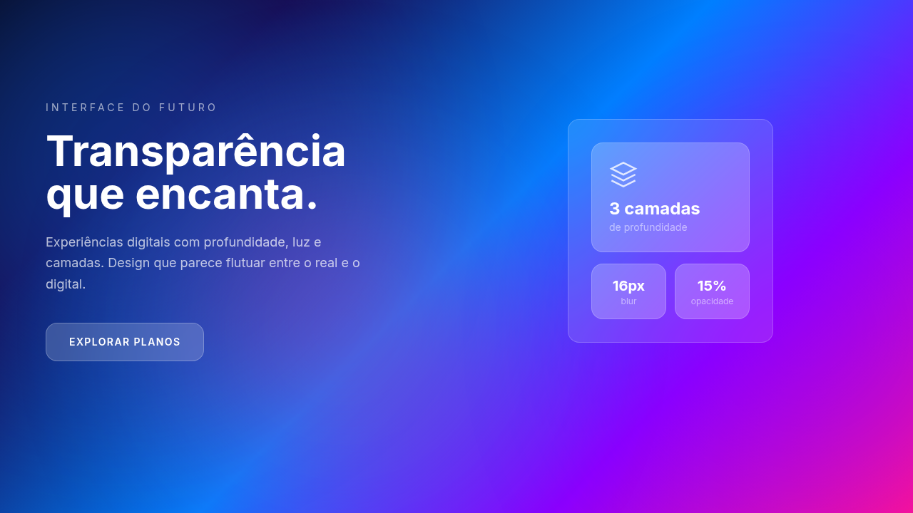
- Glass is earned — translucent materials only work when the content behind them adds context, never use glass to hide emptiness
- Respect the room — spatial UI coexists with physical space, designs must feel placed, not projected
- Eyes are the cursor — size, spacing, and interactive zones must account for gaze precision, not finger precision
- Restraint over spectacle — immersion comes from coherence, not from throwing every 3D trick at the user simultaneously
Technical Specs
Colors
Primary
Effects
Parallax depth, dynamic lighting response, gaze-hover effects, smooth scale on focus
Light/Dark
✓ Full / ✓ Full
Related
Last synced: 4/1/2026