Soft Maximalism
Soft maximalist landing page with CONTROLLED CHAOS energy. Ideal for marcas jovens, agencias criativas, lancamentos de produto, portfolios ousados, eventos e festivais. AI-ready template.
Use case: Marcas jovens, Agencias criativas, Lancamentos de produto, Portfolios ousados, Eventos e festivais
Historical Context
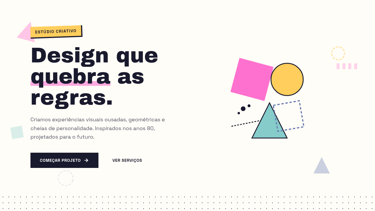
Soft maximalism emerged as a direct rebellion against the sterile minimalism that dominated digital design through the 2010s. Designers got bored — and rightfully so. But instead of swinging into full visual anarchy like the early-2000s rave flyer aesthetic, soft maximalism introduced restraint into excess. Think of it as maximalism that went to art school and actually paid attention. The movement draws heavily from 1960s pop art, Memphis Group's irreverence, and the layered editorial layouts of magazines like The Face and Emigre. What makes it distinct from pure chaos is intentional hierarchy — every oversized headline, every clashing color block, every overlapping element still serves a reading order. You can pile textures, mix type scales aggressively, and stack visual layers without losing the user. It's controlled chaos with a grid underneath. The density is the point, but legibility is never sacrificed for spectacle. That's the discipline most people miss when they attempt this style.
When to Use
Deploy soft maximalism when your brand needs to feel alive, opinionated, and unapologetically loud — but still functional. Fashion labels, lifestyle brands, creative agencies, and bold consumer products thrive here. It works when your audience expects visual richness and interprets density as confidence rather than confusion. Avoid it for utility-first interfaces or contexts where cognitive load is already high. This style rewards browsing, not task completion.
Design Principles
- Layer with intent — every overlapping element must have a clear z-index purpose, never stack for decoration alone
- Oversized typography anchors the chaos — one dominant type element per section acts as the reader's entry point
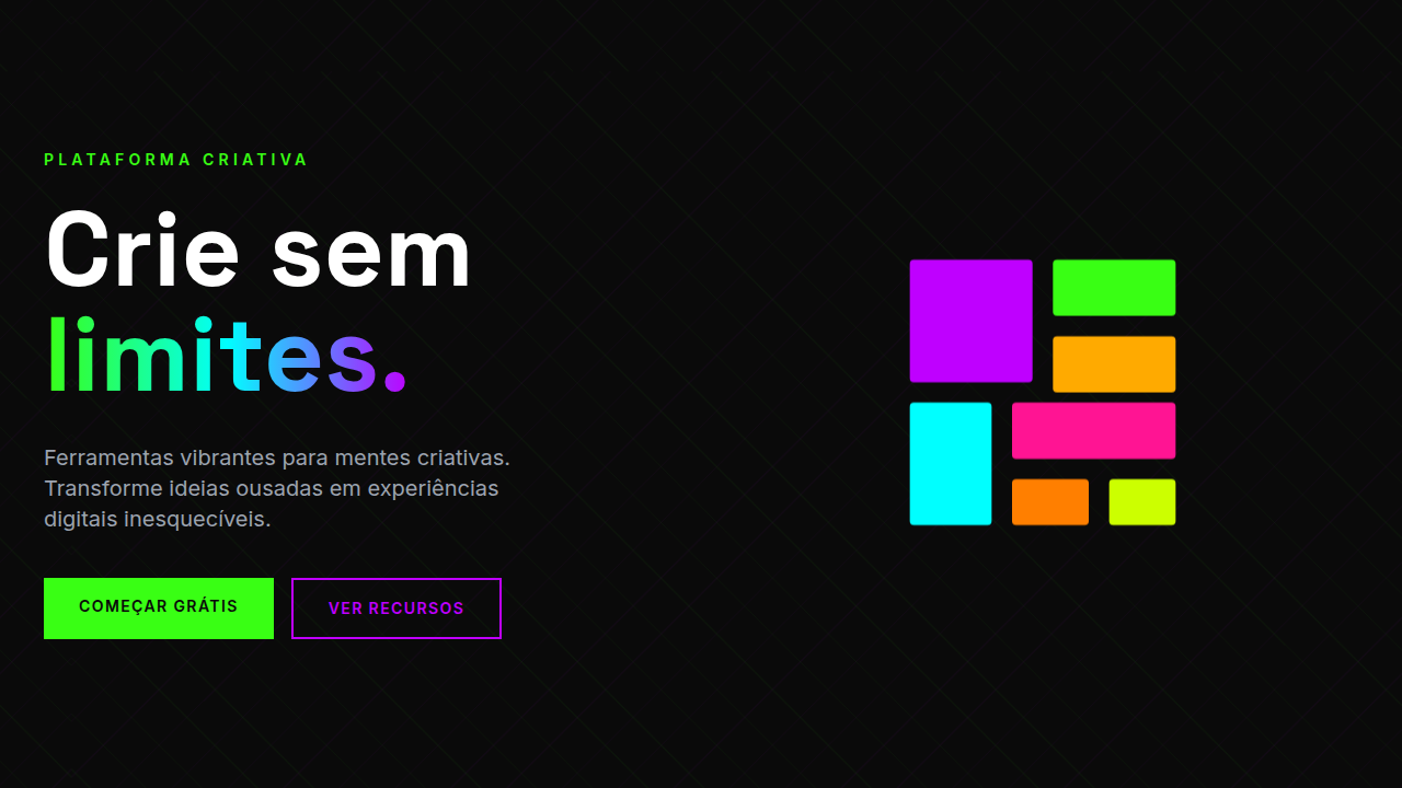
- Color clashes are deliberate pairings, not random — limit your palette to 4-5 bold hues and rotate them systematically
- Maintain invisible structure — the grid exists, it's just not obvious. Alignment points keep density from becoming noise
- Whitespace is a weapon, not a filler — strategic breathing room between dense sections amplifies the maximalist moments
Technical Specs
Colors
Primary
Secondary
Effects
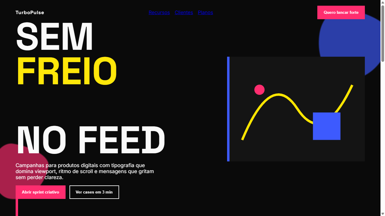
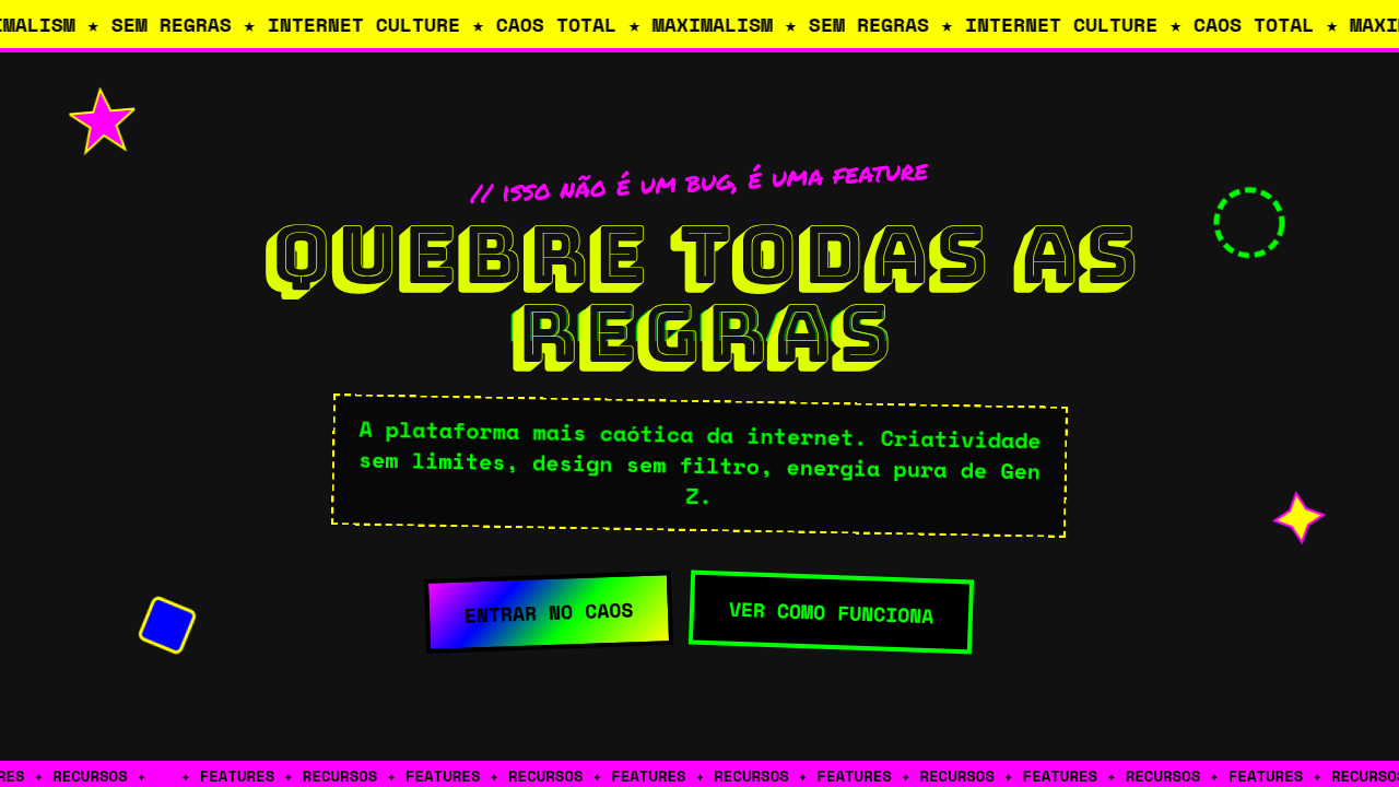
Tipografia gigantesca ocupando 80% da viewport, animacoes em camadas reagindo ao scroll, componentes dinamicos com parallax, pops de cor unicos e disruptivos por secao, transicoes bold 400-600ms com easing dramatico, mix-blend-mode para sobreposicoes
Light/Dark
✓ Full / ✓ Full
Related
Last synced: 4/1/2026