Soft Editorial
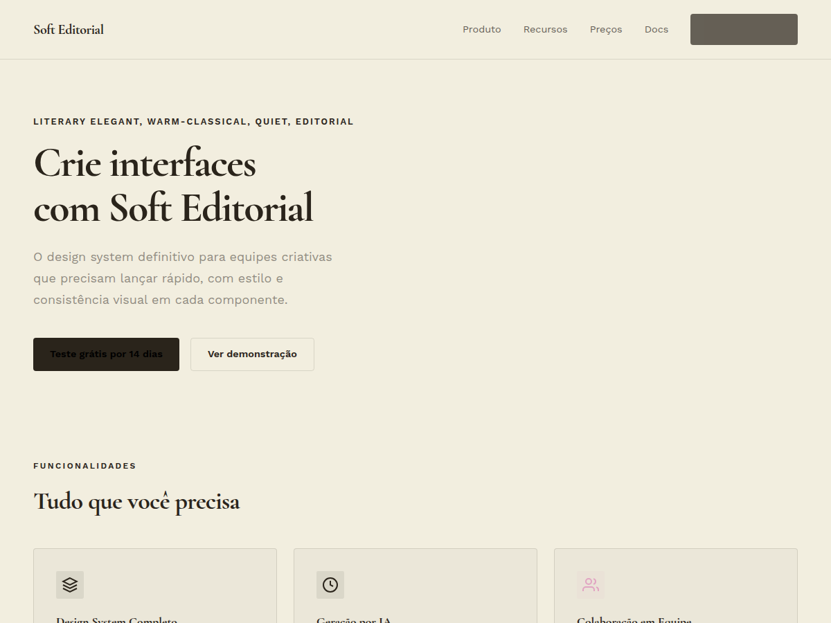
Soft Editorial — Cormorant Garamond serif on warm paper with sage, blush, and lemon accents. Cormorant Garamond typography. warm paper canvas with deep ink type, accented by soft pink, lemon, blush, and s. Best for editorial feature, longform brand story, gallery or museum. AI-ready design system.
Use case: editorial feature, longform brand story, gallery or museum, literary pitch, advisory deliverable, wedding / lifestyle media
Historical Context
Cormorant Garamond belongs to a lineage that stretches back to Claude Garamond's sixteenth-century punches — type cut for the page, not the screen. What makes Cormorant interesting is that it was drawn specifically for display sizes, with hairlines that would snap on a laser printer but sing on high-resolution screens. It carries the DNA of old-style French Renaissance type without pretending to be a faithful revival. The soft editorial aesthetic pairs this typeface with palettes borrowed from still-life painting: warm paper tones that recall unbleached cotton stock, sage greens pulled from dried eucalyptus, blush pinks that sit between skin and petal, and lemon yellows muted enough to read as sunlight rather than highlighter. This is the visual language of the slow living movement — editorial that breathes, that leaves margins generous and lets the serif do the talking. Historically, this territory was owned by print magazines like Kinfolk and Cereal, publications that proved whitespace sells when paired with confident typography. The digital translation demands restraint: fewer weights, larger optical sizes, and color used as punctuation rather than decoration.
When to Use
Reach for this system when the brand whispers rather than shouts. Lifestyle editorial, wellness platforms, boutique hospitality, clean beauty, slow fashion — anywhere the audience expects taste over volume. It works when content is image-led and long-form, where the typography needs to feel inevitable rather than designed. Avoid it for anything requiring density, urgency, or masculine energy. This palette and type pairing collapses under information-heavy interfaces.
Design Principles
- Let the serif carry authority — set Cormorant at display sizes (48px+) and never below 18px body; pair with a neutral sans for UI chrome, never let two serifs compete on the same spread.
- Warm paper as foundation, not white — use off-white (#FAF8F5 or warmer) as your canvas; true white creates clinical tension that fights the organic palette of sage, blush, and lemon.
- Color as accent grammar — sage for containers and dividers, blush for interactive states, lemon sparingly as editorial highlight; never fill large areas with saturated color, let negative space dominate.
- Generous vertical rhythm over tight grids — line-height at 1.6–1.8 for body, section spacing that feels like turning a magazine page; density is the enemy of this aesthetic.
- Photography dictates layout, not the reverse — design the grid around editorial imagery; crops should feel intentional and cinematic, never constrained by rigid column structures.
Technical Specs
Colors
Primary
Secondary
Effects
display font Cormorant Garamond for hero headlines, subtle hover (opacity 0.8, 200ms), refined focus rings, Cormorant Garamond serifs on warm paper, sage/blush/lemon block accents, generous whitespace, clamp(4rem,8vw,8rem) section gaps
Light/Dark
✓ Full / ✗ None
Related
Last synced: 5/6/2026