Skeuomorphism
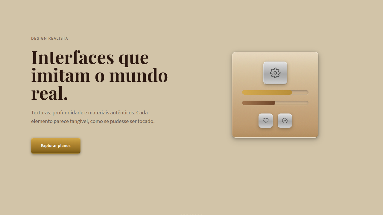
Realistic, textured interface with 3D depth, real-world metaphors (leather, wood, metal), complex gradients (8-12 stops), realistic shadows, grain/texture overlays, tactile press animations. Ideal for landing pages, saas. AI-ready template.
Use case: Landing pages, SaaS
Historical Context
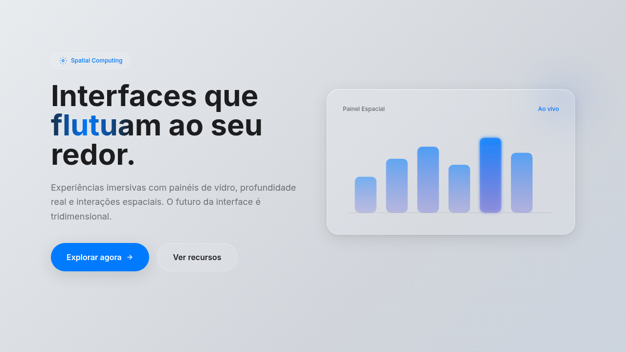
Between 2007 and 2012, Apple's interface design was obsessed with making digital things look real. The Notes app had yellow legal pad lines. Game Center was wrapped in wood grain and green felt. iCal wore stitched leather. Steve Jobs believed that if software looked like something you already understood, you'd trust it faster. And honestly? He was right. People who'd never touched a smartphone knew what a bookshelf full of books meant. Then Jony Ive took over software in 2013 and burned it all down with iOS 7. The argument was simple: people don't need training wheels anymore. Flat won. Skeuomorphism became a punchline at design conferences for nearly a decade. But here we are in 2025, and it's back. Not as a copy of the old Apple stuff, but as a deliberate aesthetic choice. Spatial computing needs depth cues that flat design simply cannot provide. VisionOS uses subtle shadows, glass refraction, real lighting. Designers building for AR and mixed reality are rediscovering that texture and dimension aren't decoration. They're wayfinding.
When to Use
Use skeuomorphic elements when the texture communicates something. A leather-bound interface for a premium journaling app tells users this space is personal, crafted. A wooden dashboard for a vinyl record tracker makes emotional sense. But slapping a metal bezel on your B2B analytics tool? That's costume, not communication. The test is simple: remove the texture. If the interface loses meaning or emotional resonance, keep it. If nothing changes except aesthetics, you're decorating. Skeuomorphism works best on landing pages selling craft, nostalgia products, and spatial interfaces where depth is functional.
Design Principles
- Texture must carry meaning. Every material choice should tell users something about the content or interaction it wraps.
- Light sources stay consistent. Pick one direction and commit. Mixed lighting kills the illusion instantly.
- Depth serves hierarchy. Elements closer to the user (higher z-index, stronger shadow) should be more interactive or more important.
- Restraint over maximalism. One or two skeuomorphic elements surrounded by clean space hit harder than an entire interface drowning in texture.
- Reference real materials accurately. If you're doing leather, study how leather actually catches light, creases, and ages. Half-committed textures look worse than no texture at all.
Technical Specs
Colors
Effects
Realistic shadows (layers), depth (perspective), texture details (noise, grain), realistic animations (300-500ms)
Light/Dark
◐ Partial / ◐ Partial
Related


Last synced: 4/1/2026