Símbolos Ambientais Brasileiros
Design an urgent and informative landing page for an Amazon preservation campaign, inspired by Brazilian graphic symbolism. Ideal for landing pages, saas. AI-ready template.
Use case: Landing pages, SaaS
Historical Context
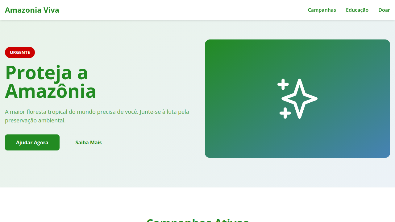
Brazilian environmental design didn't emerge from aesthetics. It emerged from loss. The Amazon burns made global headlines, but designers in São Paulo and Belém had been translating ecological collapse into visual language for decades — long before the international press caught up. Chico Mendes' murder in 1988 catalyzed an entire generation of graphic work: urgent, raw, unapologetic. The rubber tapper's face became shorthand for resistance. What makes Brazilian conservation branding distinct is the tension between paradise and destruction. The Pantanal's flooded plains, the Atlantic Forest's remaining 12%, the cerrado nobody talks about — these aren't decorative backdrops. They're arguments. Designers working with IBAMA, SOS Mata Atlântica, and indigenous land campaigns learned early that beauty without data is tourism, and data without beauty is a PDF nobody reads. The visual vocabulary pulls from scientific illustration traditions — Maria Sibylla Merian's legacy filtered through tropical maximalism. Biodiversity isn't minimized into clean icons. It overwhelms. That's the point. You're supposed to feel the weight of what's disappearing.
When to Use
When the brief demands emotional weight alongside scientific credibility. Conservation campaigns, environmental policy advocacy, sustainable brand identities rooted in Brazilian biomes. Works for NGO fundraising where you need donors to feel before they think. Also strong for eco-tourism that refuses to be generic — brands that want to say 'this specific place' rather than 'nature in general.' Avoid if the project treats environmentalism as lifestyle decoration.
Design Principles
- Density over minimalism — biodiversity is complex, let the composition reflect that. Empty space reads as already-cleared land.
- Scientific specificity beats generic green. Name the species. Show the morphology. A harpy eagle is not a leaf icon.
- Color palettes from actual biomes, not 'nature green.' The cerrado is burnt orange and silver. The igapó is black water and white sand.
- Urgency through contrast — pair the lush with the scorched. Before/after isn't cliché when satellite imagery proves it.
- Typography carries institutional weight. Conservation needs authority. Hand-lettered charm undermines the legal and scientific backbone these organizations depend on.
Technical Specs
Colors
Primary
Secondary
Effects
Ícones e símbolos que representam a flora e fauna amazônica, tipografia sans-serif que transmite urgência, fotografias impactantes da natureza, micro-interações de hover com destaque de dados ou fatos, transições de seção com efeito de "crescimento" ou "revelação" de elementos naturais.
Light/Dark
✓ Full / ✗ No
Related

Last synced: 4/1/2026