Sales Intelligence Dashboard
Sales intelligence dashboard. Ideal for landing pages, modern websites. AI-ready template.
Use case: Landing pages, Modern websites
Historical Context
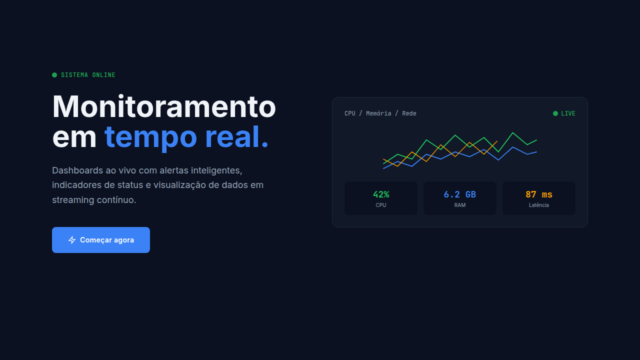
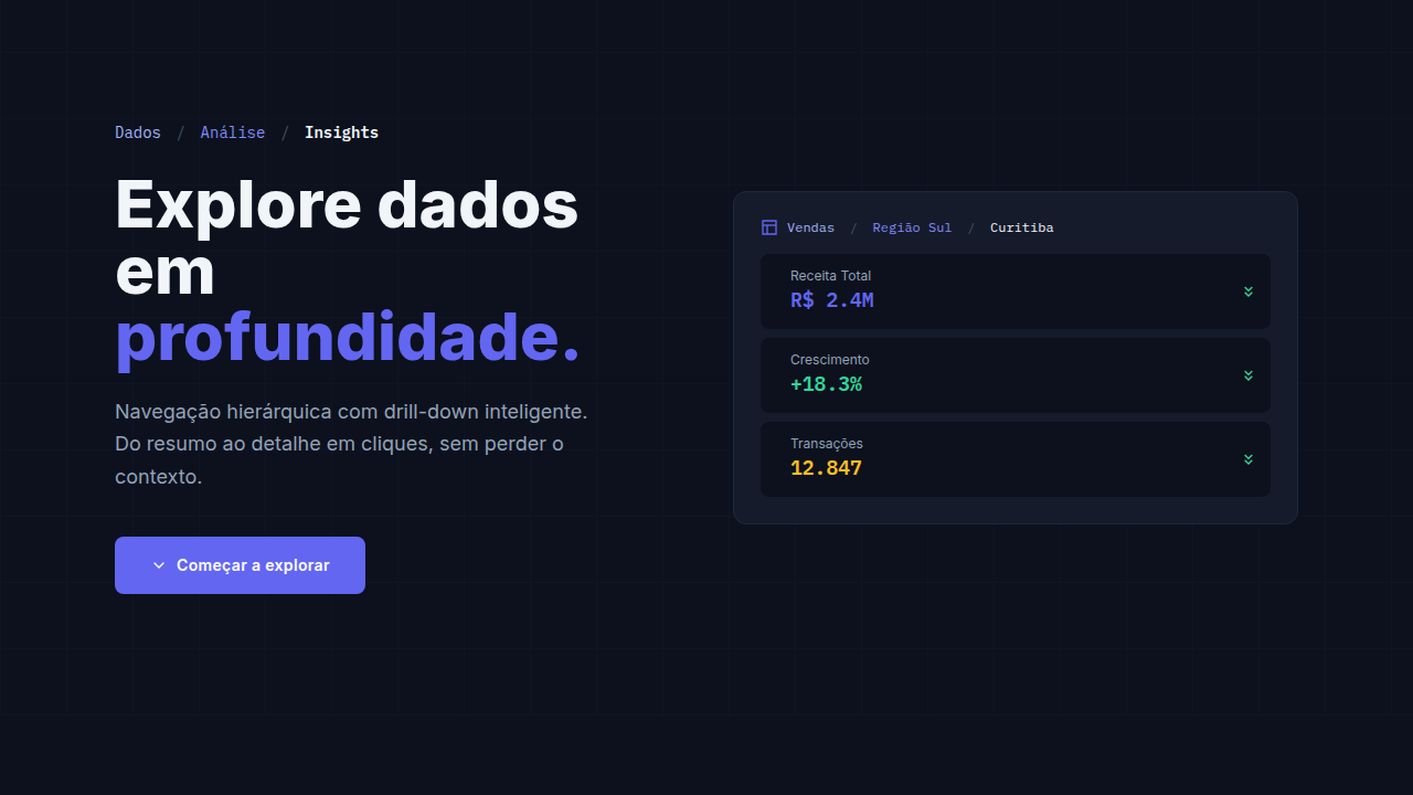
Salesforce didn't invent the CRM dashboard — but they made it everyone's problem. Before 2010, pipeline views were glorified spreadsheets with a coat of paint. Reps hated them. Managers lived in them. The disconnect was real. Then came the wave: HubSpot, Pipedrive, Close, Gong. Each one tried to answer the same question differently — where's the money, and when is it coming? Pipeline visualization shifted from static bar charts to kanban-style deal flows, weighted forecasts, and territory heat maps. The design language borrowed heavily from project management tools. Drag. Drop. Close. Here's what most dashboard redesigns miss: sales teams don't sit and analyze. They glance between calls. They need the number, the trend, the outlier — in that order. The best sales dashboards aren't beautiful. They're fast. They surface the one thing that's off so someone can fix it before the quarter ends.
When to Use
When your users need to track revenue in motion — not static reports, but living data. Pipeline dashboards work for CRM interfaces where reps manage deals, sales ops teams monitoring conversion rates across stages, territory performance comparisons, and quarterly forecasting views. Use this pattern when the audience makes decisions under time pressure and needs hierarchy that screams 'look here first.' Not ideal for deep analytical exploration — that's a different tool entirely.
Design Principles
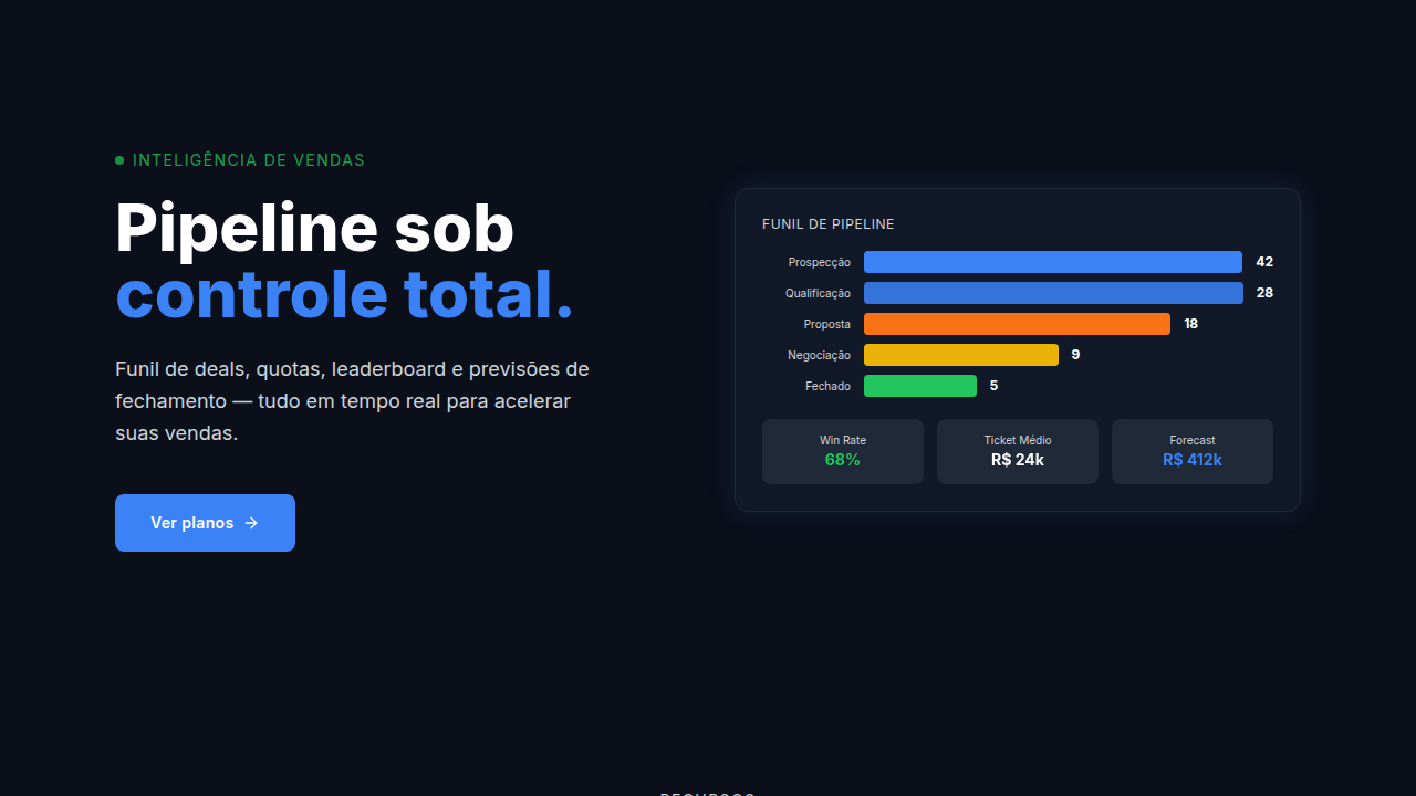
- Hierarchy by urgency — surface at-risk deals and anomalies before totals. The number that needs action comes first.
- Scannable in 3 seconds — if a rep can't get the gist between calls, the layout failed. Dense but not cluttered.
- Pipeline as spatial metaphor — stages flow left to right, value scales vertically. Respect the mental model salespeople already carry.
- Color with intent — red means behind, green means closed. Don't get creative with status colors in sales contexts. Convention wins.
- Forecast confidence as a first-class element — weighted pipeline, commit vs. best-case, and historical accuracy should be visible, not buried in a dropdown.
Technical Specs
Colors
Effects
Deal movement animations, metric updates, leaderboard ranking changes, gauge needle movements, status change highlights
Light/Dark
✓ Full / ✓ Full
Related
Last synced: 4/1/2026