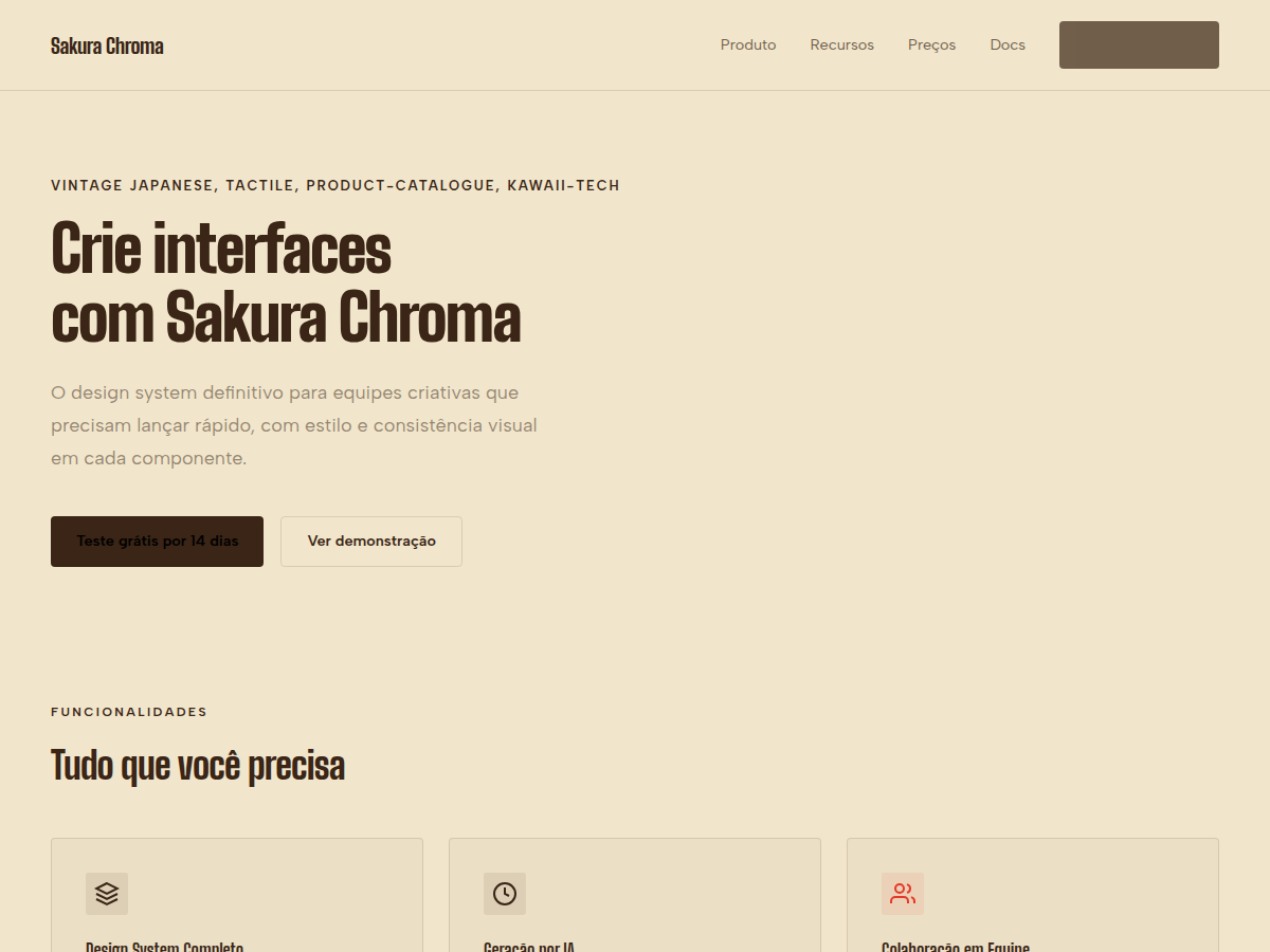
Sakura Chroma
Sakura Chroma — Vintage Japanese cassette-package aesthetic: cream paper, diagonal rainbow ribbons, condensed bold type, JIS-style spec checkboxes. Big Shoulders Display typography. warm cream paper canvas with dark warm-brown ink and a six-colour primary palett. Best for product launch or catalogue, indie hardware or analog studio brand, music label or release schedule. AI-ready design system.
Use case: product launch or catalogue, indie hardware or analog studio brand, music label or release schedule, creative studio annual report, magazine or zine pitch, vintage-flavored brand campaign
Historical Context
The Japanese cassette tape wasn't just a medium — it was a canvas. Throughout the 1980s and early 90s, independent labels in Tokyo and Osaka turned tape packaging into miniature graphic design exhibitions. Rainbow-spectrum gradients, holographic foils, and condensed sans-serifs crammed onto J-cards created a visual language that screamed maximalism before the word entered design discourse. These weren't accidents of taste; they were deliberate acts of rebellion against the sterile minimalism already creeping into corporate Japan. Barlow Condensed lives in that same tension — industrial bones dressed in pop clothing. It's a typeface that wants to be loud without shouting, dense without suffocating. Pair it with chromatic ribbon motifs and you get something that feels like finding a pristine City Pop cassette in a Shimokitazawa record shop. The nostalgia is real, but the energy is forward-facing. Sakura Chroma takes this lineage seriously. It doesn't cosplay as retro — it understands why those designers made those choices and translates the intent, not just the aesthetic, into a system that works on screens.
When to Use
Reach for Sakura Chroma when the brief says "colorful" but the client means "intentional." It's built for music brands that need shelf presence in digital spaces, Japanese pop culture projects that respect their source material, and any product bold enough to use a full rainbow without looking like a children's toy. Works beautifully for audio hardware brands, vinyl reissue campaigns, festival identities, and merch lines that need to pop at thumbnail scale.
Design Principles
- Chromatic density over whitespace — fill the frame with purpose, let color do the breathing
- Condensed type at scale creates rhythm; never set Barlow Condensed small and expect it to whisper
- Rainbow gradients must follow spectral logic — no random color stops, respect the physics of light splitting through a prism
- Ribbon motifs work as structural elements, not decoration — they divide, contain, and direct the eye
- Retro reference without retro limitation — borrow the confidence of 80s Japanese graphic design, leave the technical constraints behind
Technical Specs
Colors
Primary
Secondary
Effects
display font Big Shoulders Display for hero headlines, playful hover animations (scale 1.03, 200ms), bouncy click states, diagonal rainbow ribbon stripes, condensed display lockups, JIS checkbox specs
Light/Dark
✓ Full / ✗ None
Related
Last synced: 5/6/2026