SaaS Enterprise Analytics
SaaS landing, analytics dashboard, metrics cards, corporate blue, b2b, business intelligence, charts, integrations, trust, clean UI, glassmorphism, data visualization. Ideal for landing pages, modern websites. AI-ready template.
Use case: Landing pages, Modern websites
Historical Context
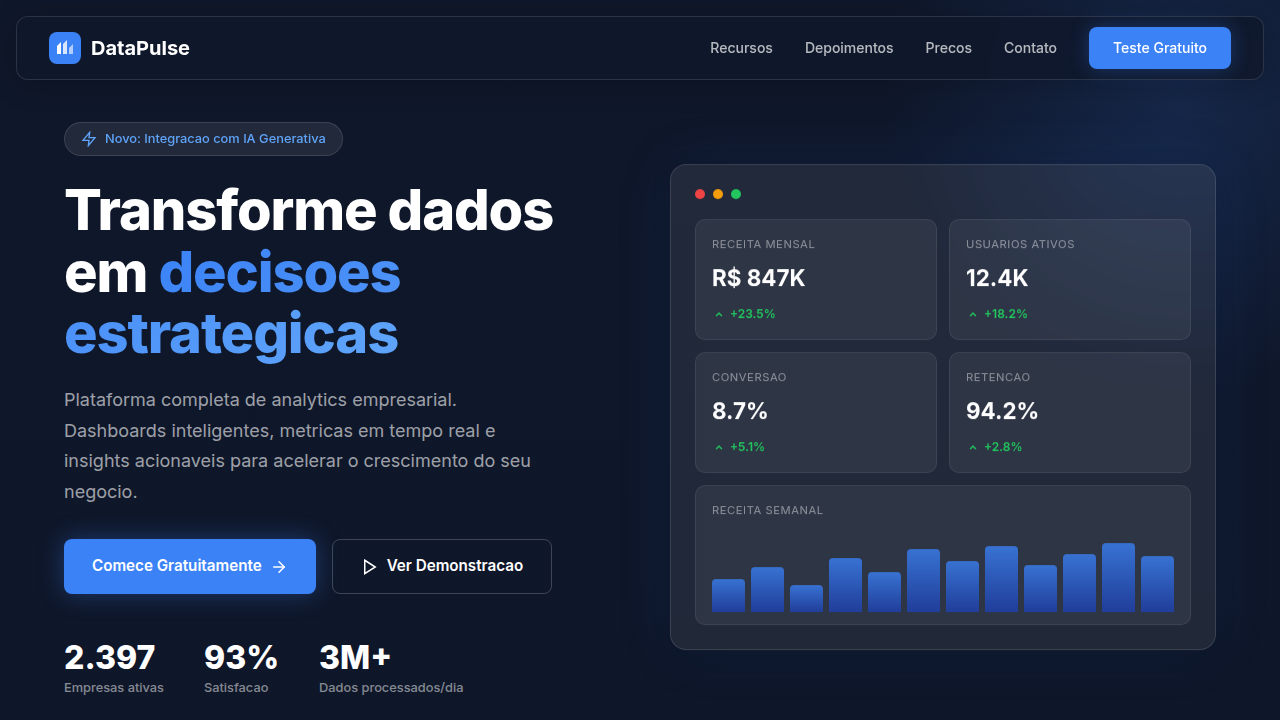
Somewhere around 2016, analytics SaaS stopped looking like spreadsheets bolted onto a web page. Amplitude and Mixpanel figured out the same thing independently: if you put a gorgeous dashboard screenshot above the fold, prospects stop asking for a demo and start imagining themselves using the product. The dashboard-as-hero was born — not from design theory, but from conversion pressure. Looker pushed it further by leaning into the enterprise trust aesthetic: muted palettes, generous whitespace, typography that whispers "we handle Fortune 500 data." Suddenly every analytics startup adopted the same visual shorthand — dark sidebar navigation, metric cards with subtle trend arrows, charts that feel alive but never overwhelming. It became a shared language. You land on the page and instantly know: this is serious software for serious teams. What's interesting is how this visual language bridges two contradictions. It needs to feel powerful enough for data engineers yet approachable enough for a VP who just wants one number. That tension shaped everything — from card density to color saturation to how much chrome surrounds a chart.
When to Use
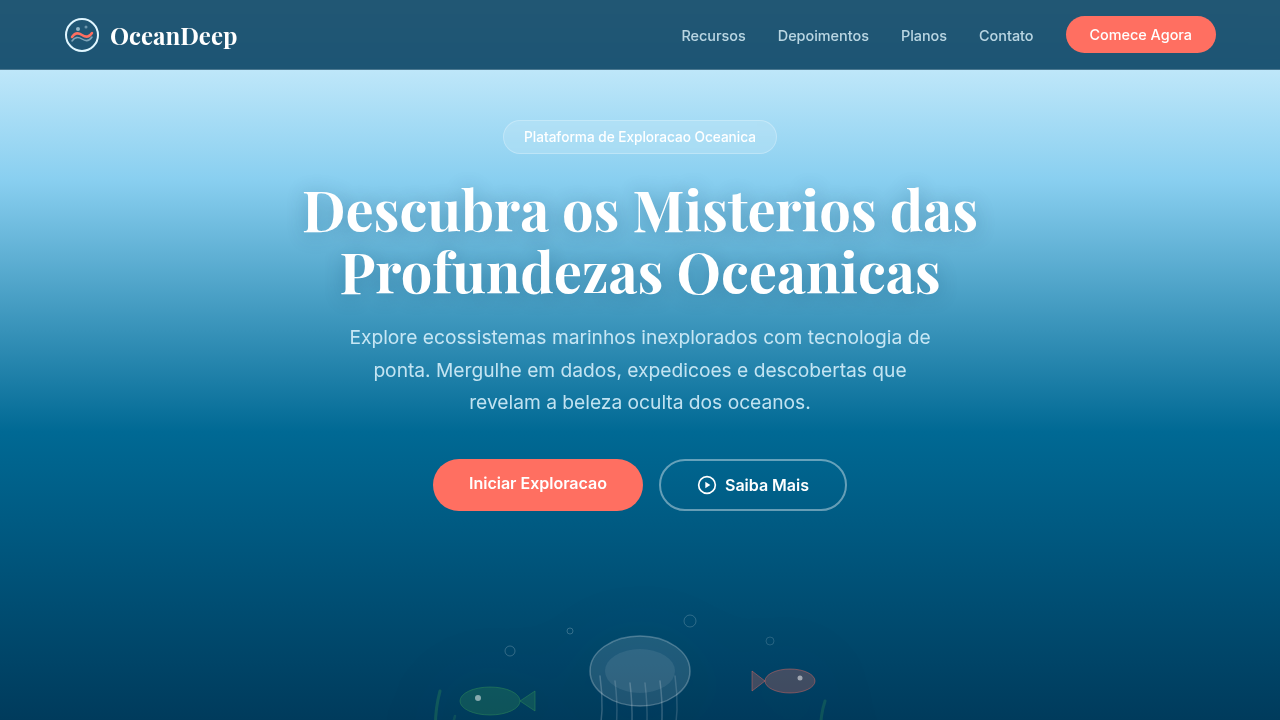
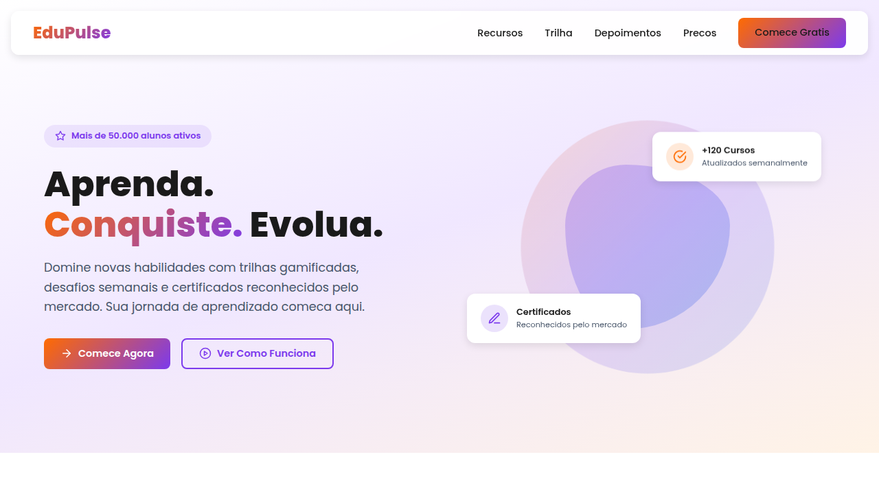
Reach for this theme when you're building a B2B analytics product, data platform, or business intelligence tool that needs to communicate competence before the user ever logs in. It works when your audience expects dashboards, when trust signals matter more than delight, and when the product's complexity needs to feel manageable at first glance. Also appropriate for internal tools that need executive buy-in — the enterprise aesthetic does half the selling.
Design Principles
- Data density without claustrophobia — pack information tight but let each metric breathe through consistent spacing and restrained borders
- Hierarchy through weight, not decoration — use type scale and subtle background shifts to guide the eye, never gradients or drop shadows for emphasis
- Motion as meaning — animate only when a number changes or a state transitions; idle dashboards should feel calm, not performative
- Trust through restraint — limit your palette to 2-3 hues plus neutrals; enterprise buyers read visual noise as immaturity
- Progressive disclosure over feature walls — show the headline metric first, let users drill down; complexity is earned, not dumped
Technical Specs
Colors
Primary
Secondary
Effects
Cards com glassmorphism (backdrop-filter: blur), animação de counters com JS, hover shadow suave, glow sutil em CTAs, fade/slide ao scroll.
Light/Dark
✓ Full / ✗ No
Related
Last synced: 4/1/2026