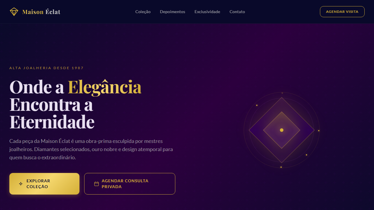
Temas & Verticais Timeless Opulence

Roxo Veludo Real

Luxurious and sophisticated UI with a royal feel. Ideal for marcas de luxo, joalherias, moda premium, hotéis boutique, eventos exclusivos. AI-ready template.

Royalvelvetluxuryrichdeepsophisticatedelegantberrymysteriousopulentpremium

Use case: Marcas de luxo, Joalherias, Moda premium, Hotéis boutique, Eventos exclusivos

Roxo Veludo Real

Historical Context

Inspirado na opulência da realeza e no veludo como símbolo de riqueza, o Roxo Veludo Real combina tons profundos de púrpura com acentos metálicos para criar interfaces que transmitem exclusividade, mistério e sofisticação atemporal.

Technical Specs

Colors

Primary

#4B0082
#2C003E
#0A0A2A

Secondary

#8E44AD
#D4AF37
#36454F
#C0C0C0

Effects

Soft, plush textures, subtle metallic sheen, deep and dramatic shadows, elegant serif typography for headlines, refined sans-serif for body, smooth and flowing transitions, focus on depth and richness

Light/Dark

✓ Full

CSS

font-family: 'Playfair Display', serif; --font-body: 'Lato', sans-serif; color: #4B0082; background-color: #0A0A2A; border-radius: 12px; box-shadow: 0 10px 30px rgba(0,0,0,0.4); transition: all 0.5s ease-in-out;

Variables

--color-royal-purple: #4B0082; --color-deep-berry: #2C003E; --color-midnight-blue: #0A0A2A; --font-serif-primary: 'Playfair Display', serif; --font-sans-body: 'Lato', sans-serif; --border-radius-xl: 12px; --shadow-deep: 0 10px 30px rgba(0,0,0,0.4);

Checklist

☐ Royal Velvet Purple primary #4B0082, ☐ Deep and rich color palette, ☐ Elegant serif typography for headlines, ☐ Deep, dramatic shadows, ☐ Plush textures (e.g., velvet, silk), ☐ Responsive design for all devices

DESIGN.md

Design System: Roxo Veludo Real

1. Visual Theme & Atmosphere

Luxurious and sophisticated UI with a royal feel. Ideal for marcas de luxo, joalherias, moda premium, hotéis boutique, eventos exclusivos. AI-ready template.

  • Density: 5/10 — Balanced
  • Variance: 4/10 — Moderate
  • Motion: 4/10 — Subtle

2. Color Palette & Roles

  • Royal Velvet Purple (#4B0082) — Accent color, emphasis elements
  • Deep Berry (#2C003E) — Secondary surface or text color
  • Midnight Blue (#0A0A2A) — Dark surface, primary background
  • Plum (#8E44AD) — Extended palette, decorative use
  • Antique Gold (#D4AF37) — Premium accent, decorative highlights
  • Charcoal Grey (#36454F) — Deep contrast surface
  • Silver Mist (#C0C0C0) — Extended palette, decorative use

3. Typography Rules

  • Display / Hero: Playfair Display — Weight 700, tight tracking, used for headline impact
  • Accent: Lato — Used for decorative or emphasis text
  • Body: Playfair Display — Weight 400, 16px/1.6 line-height, max 72ch per line
  • UI Labels / Captions: Playfair Display — 0.875rem, weight 500, slight letter-spacing
  • Monospace: JetBrains Mono — Used for code, metadata, and technical values

Scale:

  • Hero: clamp(2.5rem, 5vw, 4rem)
  • H1: 2.25rem
  • H2: 1.5rem
  • Body: 1rem / 1.6
  • Small: 0.875rem

4. Component Stylings

  • Primary Button: Rounded (12px) shape. Accent color fill. Hover: 8% darken + subtle lift shadow. Active: -1px translate tactile press. Font weight 600. No outer glows.
  • Secondary / Ghost Button: Outline variant. 1.5px border in muted color. Text in primary color. Hover: subtle background fill.
  • Cards: Rounded (12px) corners. Surface background. Subtle shadow (0 2px 12px rgba(0,0,0,0.06)). 1px border stroke.
  • Inputs: Label above input. 1px border stroke. Focus ring: 2px accent color offset 2px. Error text below in semantic red. No floating labels.
  • Navigation: Primary surface background. Active item: accent color indicator. Font weight 500 when active.
  • Skeletons: Shimmer animation matching component dimensions. No circular spinners.
  • Empty States: Icon-based composition with descriptive text and action button.

5. Layout Principles

  • Grid: CSS Grid primary. Max-width containment: 1280px centered with 1.5rem side padding.
  • Spacing rhythm: Balanced. Base unit: 0.5rem (8px).
  • Section vertical gaps: clamp(4rem, 8vw, 8rem).
  • Hero layout: Split-screen (text left, visual right).
  • Feature sections: Zig-zag alternating text+image rows. No 3-equal-columns.
  • Mobile collapse: All multi-column layouts collapse below 768px. No horizontal overflow.
  • z-index contract: base (0) / sticky-nav (100) / overlay (200) / modal (300) / toast (500).

6. Motion & Interaction

  • Physics: Ease-out curves, 200-300ms duration. Smooth and predictable.
  • Entry animations: Fade + translate-Y (16px → 0) over 420ms ease-out. Staggered cascades for lists: 80ms between items.
  • Hover states: Subtle color shift + shadow adjustment over 200ms.
  • Page transitions: Fade only (200ms).
  • Performance: Only transform and opacity animated. No layout-triggering properties.

7. Anti-Patterns (Banned)

  • No emojis in UI — use icon system only (Lucide, Heroicons)
  • No pure black (#000000) — use off-black or charcoal variants
  • No oversaturated accent colors (saturation cap: 80%)
  • No 3-column equal-width feature layouts — use zig-zag or asymmetric grid
  • No h-screen — use min-h-[100dvh]
  • No AI copywriting clichés: "Elevate", "Seamless", "Unleash", "Next-Gen"
  • No broken external image links — use picsum.photos or inline SVG
  • No generic lorem ipsum in demos

AI Prompt

Act as a Senior Frontend Engineer and Expert UI Designer. Your task is to code a complete Landing Page on the first attempt.

  • Landing Page Theme:
  • Sections to add:

Generate the final code immediately following these definitions:

Style

  • Name: Roxo Veludo Real
  • Type: Luxury & Sophisticated
  • Keywords: Royal, velvet, luxury, rich, deep, sophisticated, elegant, berry, mysterious, opulent, premium
  • Era: Timeless Opulence
  • Light/Dark: ✓ Full

Color Palette

  • Primary: Royal Velvet Purple #4B0082, Deep Berry #2C003E, Midnight Blue #0A0A2A
  • Secondary: Plum #8E44AD, Antique Gold #D4AF37, Charcoal Grey #36454F, Silver Mist #C0C0C0

Visual Effects

Soft, plush textures, subtle metallic sheen, deep and dramatic shadows, elegant serif typography for headlines, refined sans-serif for body, smooth and flowing transitions, focus on depth and richness

AI Visual Direction

Create a luxurious and sophisticated UI with a royal feel. Use royal velvet purple (#4B0082) as the primary color, complemented by deep berry tones and midnight blue. Incorporate soft, plush textures, subtle metallic accents (gold/silver), elegant serif typography for headlines, and refined sans-serif for body. Focus on deep shadows and smooth transitions to convey opulence and mystery.

CSS Technical

font-family: 'Playfair Display', serif; --font-body: 'Lato', sans-serif; color: #4B0082; background-color: #0A0A2A; border-radius: 12px; box-shadow: 0 10px 30px rgba(0,0,0,0.4); transition: all 0.5s ease-in-out;

Design System Variables

--color-royal-purple: #4B0082; --color-deep-berry: #2C003E; --color-midnight-blue: #0A0A2A; --font-serif-primary: 'Playfair Display', serif; --font-sans-body: 'Lato', sans-serif; --border-radius-xl: 12px; --shadow-deep: 0 10px 30px rgba(0,0,0,0.4);

Implementation Checklist

  • ☐ Royal Velvet Purple primary #4B0082
  • ☐ Deep and rich color palette
  • ☐ Elegant serif typography for headlines
  • ☐ Deep
  • dramatic shadows
  • ☐ Plush textures (e.g.
  • velvet
  • silk)
  • ☐ Responsive design for all devices

Execution Rules

  1. Strictly follow the defined visual style.
  2. Use high-quality inline SVG icons (Heroicons or Lucide style) — NEVER use emojis as icons.
  3. Add cursor-pointer and smooth hover states (transition-all) on all interactive elements.
  4. Required Page Structure:
    • Navbar (Logo + Links + CTA)
    • Hero Section (Impactful Headline + Subtitle + 2 buttons + 3D/Abstract visual element via CSS)
    • Features (3 cards with icons)
    • Testimonials (3 cards)
    • Pricing (3 tiers, highlight the middle one)
    • Final CTA
    • Full Footer with social links, privacy policy, terms of use, contact and SEO links.
  5. All text content must be in English.
  6. The visual must be CLEARLY distinct — do not create a "default Bootstrap" design. Force the use of the provided design system variables.
  7. Use <style> tags in the head for custom classes (especially for complex backdrop-filter effects and animations) that Tailwind CDN doesn't cover.
  8. Full Responsiveness: Layout must adapt perfectly to Mobile, Tablet and Desktop (vertical stack on mobile).
  9. Include basic SEO, Viewport and Open Graph meta tags in <head>.
  10. Footer must contain: Copyright 2026, Secondary navigation links and Social media icons.
  11. Make the creative decisions needed to deliver the complete, functional result now.

Related

Last synced: 4/1/2026