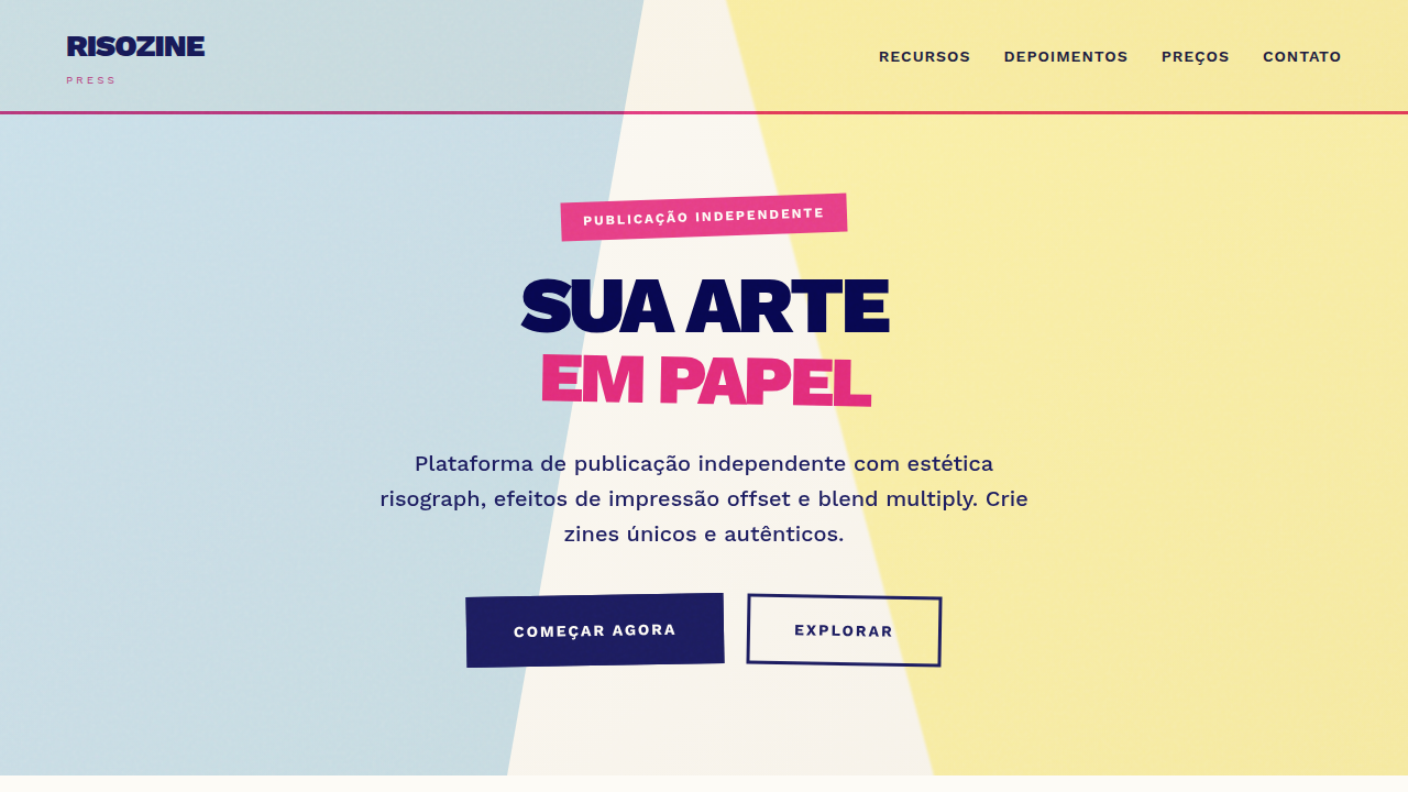
Risograph Zine Aesthetic
Risograph landing page, zine aesthetics, grainy texture, multiply blending mode, retro print style, bright pink and blue ink. Ideal for landing pages, modern websites. AI-ready template.
Use case: Landing pages, Modern websites
Historical Context
Zines never needed permission. From the punk photocopied pamphlets of the late '70s to the riot grrrl manifestos of the '90s, the zine was always the medium of people who couldn't wait for gatekeepers to let them in. Cheap, fast, imperfect on purpose. Then risograph entered the picture — or rather, re-entered it. Originally a Japanese office duplicator from the 1980s, the Riso machine found a second life in the 2010s among artists, illustrators, and small publishers who craved that specific look: soy-based inks with a grain you can almost feel through the page, misregistered layers that turn accidents into texture. Studios like Hato Press in London and Perfectly Acceptable in Minneapolis turned the machine into a creative tool, not just a reproduction one. What makes the risograph revival stick is economics meeting aesthetics. Short runs of 50–500 copies become viable. Each print carries slight variation — no two copies identical. That imperfection became the point. In a world of pixel-perfect screens, riso reminded people that print could breathe.
When to Use
Reach for this when the project needs to feel handmade without being precious. Indie record sleeves, poetry chapbooks, exhibition catalogs, event posters for venues that smell like beer and creativity. It works when your audience values authenticity over polish — when a slightly off-register cyan layer isn't a mistake, it's a statement. Terrible for corporate annual reports. Perfect for anything that should feel like it was made by humans who care more about the work than the margins.
Design Principles
- Embrace misregistration — offset your color layers by 1-3px intentionally. Perfect alignment kills the entire mood.
- Limit your palette to 2-3 spot colors. Riso inks are not CMYK. Think fluorescent pink, teal, yellow, and the beautiful muddy overlaps where they meet.
- Let paper texture show through. Backgrounds should never be fully opaque. The stock is part of the design, not something to cover up.
- Grain is structure, not decoration. Apply halftone dots and noise as compositional elements — they define hierarchy, not just surface.
- Design for the fold. Zines are physical objects with spines, staples, and pages that wrap. Even on screen, honor that physicality with asymmetric margins and bleed that suggests something beyond the viewport.
Technical Specs
Colors
Primary
Secondary
Effects
Simulated offset printing, varying opacity layers (multiply effect), coarse paper grain, ink bleed, rough stamp-like stroke edges.
Light/Dark
✓ Full / ✗ No
Related
Last synced: 4/1/2026