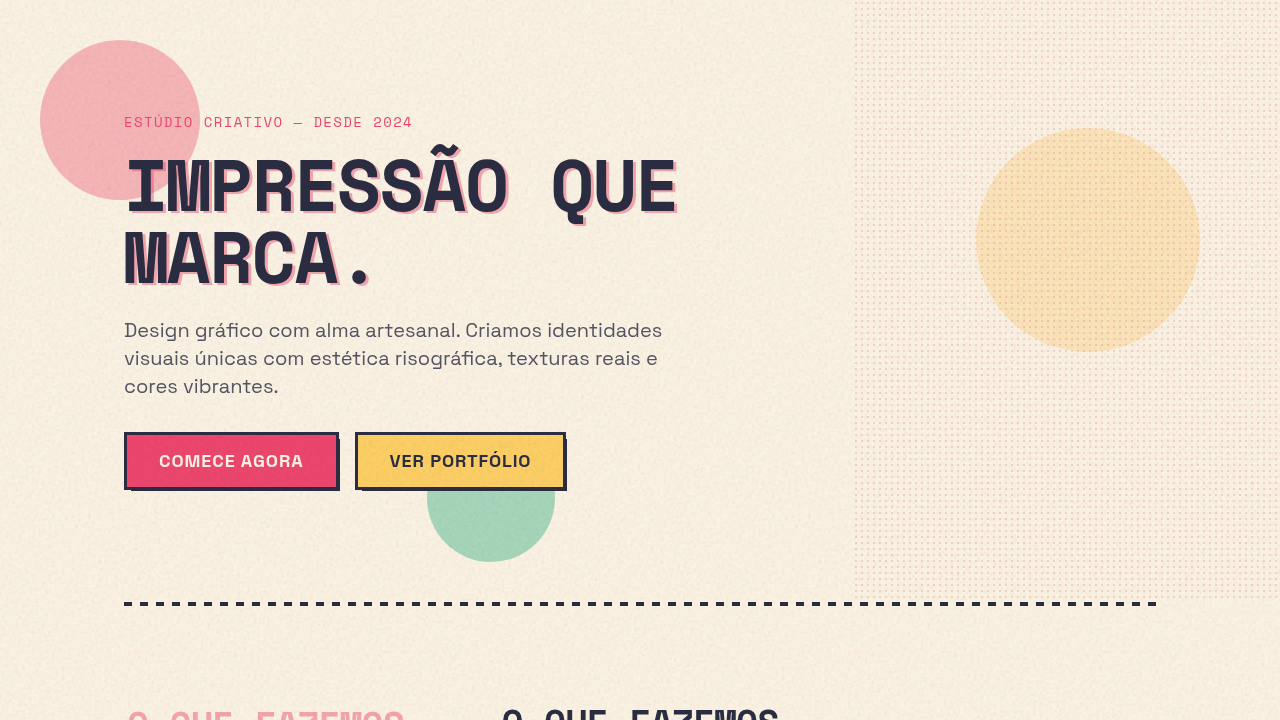
Risograph / Retro-Pop
Risograph retro-pop interface. Ideal for landing pages, saas. AI-ready template.
Use case: Landing pages, SaaS
Historical Context
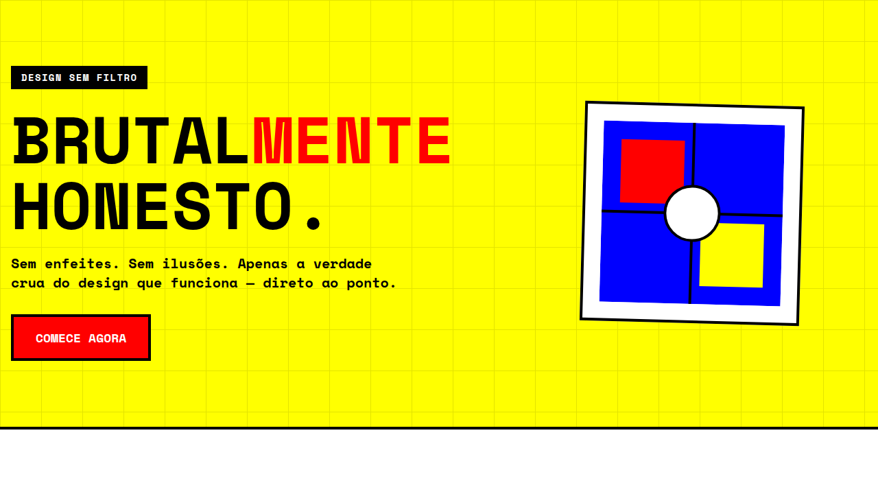
The Risograph is a Japanese stencil duplicator — born in the 1980s as a cheap, fast alternative to offset printing. Think of it as a photocopier that uses soy-based inks, one color at a time, each pass through the drum laying a single layer. It was never meant to be beautiful. It was meant to be economical. But here's the thing about constraints: they breed style. The limited color palette (you pick your drums — fluorescent pink, teal, gold, whatever's loaded), the slight misregistration between passes, the halftone grain that emerges at lower densities — all of these 'flaws' became the entire point. Indie publishers in the 2010s grabbed Risographs and turned zine production into an art form. Small studios in Brooklyn, Tokyo, Berlin started printing short runs that felt alive in a way laser printing never could. Translating this to screen means embracing what digital usually eliminates: imprecision, texture, the visible mechanics of production. You're designing with the ghost of a physical process — halftone dots that shouldn't be smooth, colors that overlap into unexpected thirds, edges that don't quite line up. It's anti-perfection as a deliberate stance.
When to Use
Reach for this when the project needs to feel handmade, independent, slightly rough around the edges — in a good way. Zines, art prints, indie music, community events, small-press publishing. Anything where polish would actually work against you. It signals 'we made this ourselves' and 'we care about craft over corporate sheen.' Works beautifully for event posters, editorial layouts, and any brand that wants to sit closer to the DIY end of the spectrum without looking unfinished.
Design Principles
- Limit your palette to 2-3 spot colors maximum — Riso drums don't do gradients, and neither should you. Pick bold, unexpected combinations and let overprint do the mixing.
- Embrace misregistration. Offset your color layers by 1-3 pixels deliberately. Perfect alignment kills the entire illusion — the slight drift is what makes it breathe.
- Use halftone patterns instead of opacity for tonal variation. Dots, not transparency. This is how the machine actually works, and faking it with alpha channels looks flat.
- Let colors overprint rather than knock out. When your teal overlaps your pink, you get a dark unexpected third — that's the magic. Multiply blend modes are your friend here.
- Keep textures granular and mechanical, never painterly. Paper grain, ink saturation inconsistencies, drum artifacts. The aesthetic is industrial reproduction, not handcraft illustration.
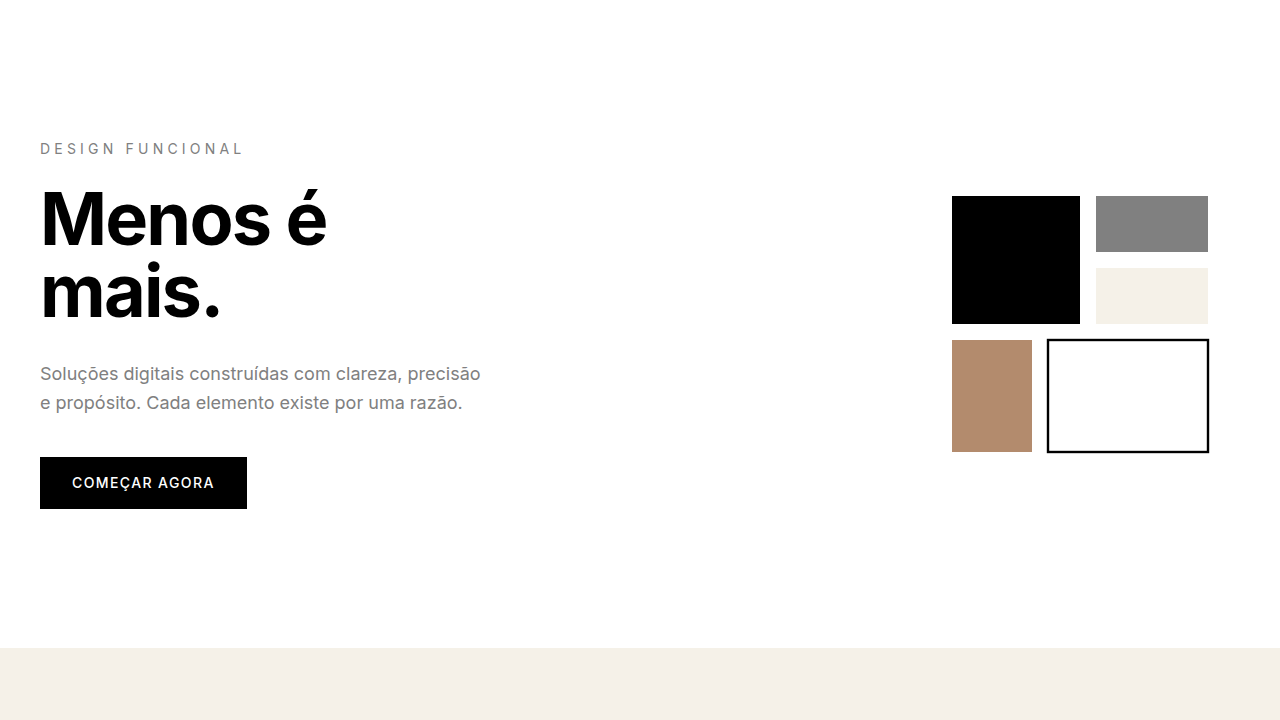
Technical Specs
Colors
Primary
Secondary
Effects
No smooth gradients (use halftone), registration offset effect (2-3px misalignment), grain texture overlay, instant transitions, bold shape reveals
Light/Dark
✓ Full / ◐ Partial
Related

Last synced: 4/1/2026