Revolut Billboard Fintech
Revolut-inspired billboard fintech landing page. Ideal for banking digital, fintechs, plataformas financeiras, neobanks. AI-ready template.
Use case: Banking digital, Fintechs, Plataformas financeiras, Neobanks
Historical Context
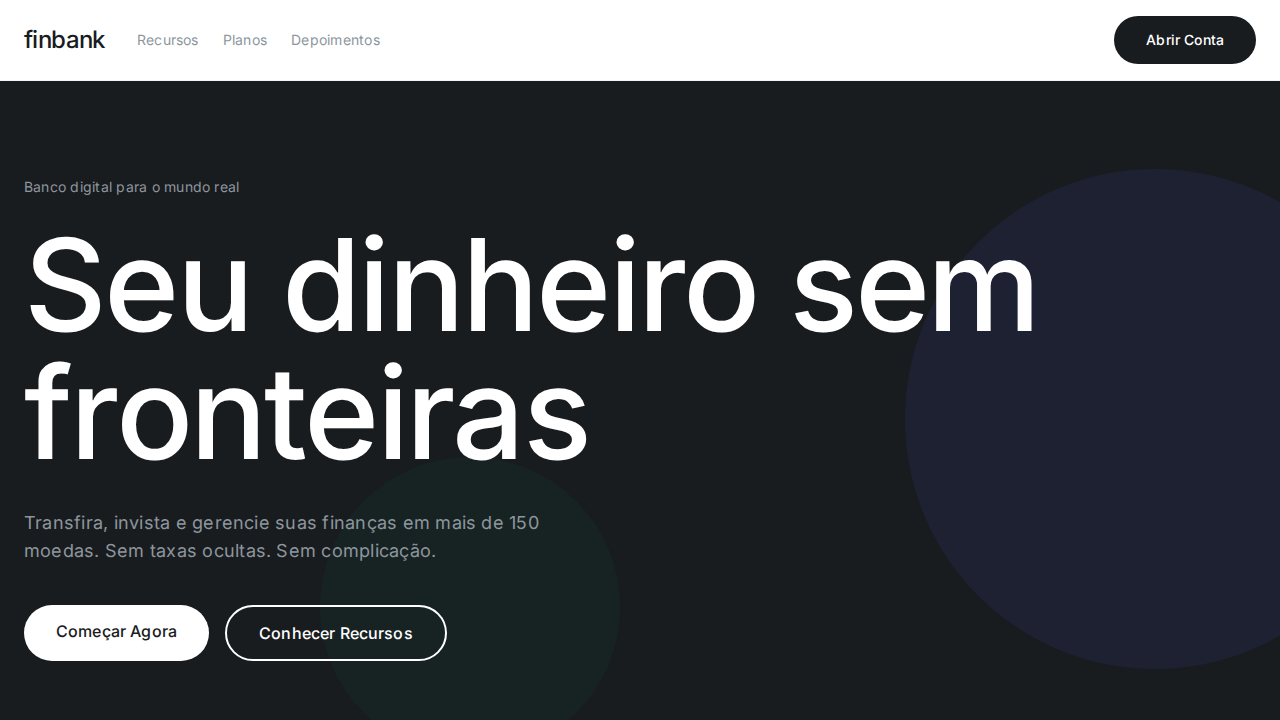
Revolut's billboard campaigns represent a deliberate rejection of the friendly, illustration-heavy aesthetic that dominated fintech marketing through the late 2010s. Where competitors leaned into soft gradients and cartoon characters to appear approachable, Revolut went the opposite direction — massive type, stark contrast, zero decoration. The message was clear: we're not your quirky startup bank, we're infrastructure. The approach borrows heavily from Swiss International Style but strips it further. Josef Müller-Brockmann's grid discipline meets the raw confidence of 1960s Helvetica posters, scaled to urban billboards where you have exactly two seconds of attention. There's no illustration to hide behind. The typography IS the design. What makes this work in fintech specifically is the trust signal embedded in restraint. When you're asking people to move their money, visual noise reads as uncertainty. Revolut's billboards communicate institutional confidence through typographic scale alone — the kind of authority that used to belong exclusively to legacy banks with marble lobbies.
When to Use
Deploy this when your product needs to project scale and seriousness without corporate stuffiness. It works for neobanks fighting the 'toy money app' perception, fintech products targeting high-value customers, or any bold brand that wants to own a category rather than compete within it. Particularly effective for outdoor media, hero sections, and any context where you need to stop someone mid-scroll with pure typographic force. Avoid if your product still needs to explain what it does — this style assumes brand recognition or extreme clarity of proposition.
Design Principles
- Typography as architecture — treat letterforms as structural elements, not decoration. Scale them until they become the environment.
- Radical subtraction — remove every element that doesn't earn its pixel. If the message survives without it, it was never needed.
- Contrast as hierarchy — use weight and scale differentials aggressively. No medium weights, no gentle transitions. Bold against light, massive against small.
- Monochromatic confidence — restrict your palette to black, white, and one brand accent maximum. Color restraint signals institutional authority.
- Negative space as statement — empty space isn't wasted space, it's the loudest thing on the canvas. Let the type breathe until the silence becomes uncomfortable.
Technical Specs
Colors
Primary
Secondary
Effects
Tipografia billboard: Aeonik Pro 136px weight 500 com tracking -2.72px — escala de estádio. Near-black (#191c1f) e branco como paleta binária para marketing. Botões pill universais (9999px) com padding generoso (14px 32px). Zero sombras — profundidade apenas via contraste de cor. Inter para body com tracking positivo (+0.16px a +0.24px). Sistema de cores semânticas rico (--rui-*) reservado para produto. Hover com opacity 0.85. Seções alternando dark/white.
Light/Dark
✓ Full / ✓ Full
Related
Last synced: 4/1/2026