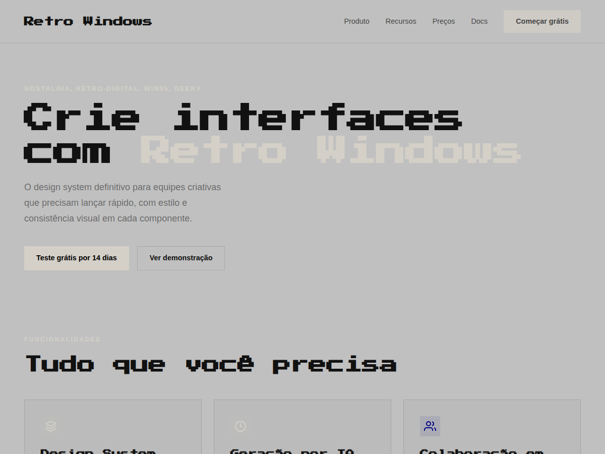
Retro Windows
Retro Windows — Windows 95 chrome: gray title bars, MS Sans Serif, pixel typography, full nostalgia. Press Start 2P typography. Windows 95 system palette: 3D-button gray, navy title bars, pixel-perfect inset/. Best for retro gaming pitch, Y2K brand, creator portfolio (90s aesthetic). AI-ready design system.
Use case: retro gaming pitch, Y2K brand, creator portfolio (90s aesthetic), tech-history talk, shitpost-but-make-it-fancy deck
Historical Context
Windows 95 wasn't just an operating system — it was the entire visual vocabulary of personal computing for a decade. That grey chrome, those beveled buttons, the inset borders that made every panel feel like a physical object you could press. Microsoft's design team built a UI language rooted in skeuomorphism before we had a word for it: raised surfaces caught light from the top-left, depressed areas fell into shadow at the bottom-right. It was consistent, learnable, and brutally systematic. The aesthetic died slowly through XP's Fisher-Price curves and Vista's glass fetish, but it never fully disappeared from collective memory. Millennials who grew up dragging Solitaire cards and customizing Winamp skins carry this visual language in their bones. When developers put Windows 95 dialogs in their portfolio sites or indie games ship with pixel-perfect title bars, they're not just being ironic — they're tapping into a shared understanding of what "computer" looked like before everything went flat. Today the style functions as both genuine nostalgia and deliberate anti-design statement. It says: we remember when interfaces had texture, weight, and a 16-color palette that somehow felt like enough.
When to Use
Deploy this when your audience grew up defragmenting hard drives and knows what a .BMP is. It works for developer tools that want personality without pretension, indie games leaning into retro computing aesthetics, and millennial-targeted brands that want instant emotional recognition. Also effective for humor — error dialogs, fake BSOD screens, loading bars that never finish. Avoid if your users need to actually complete complex tasks efficiently; the chunky borders and system fonts eat screen real estate fast.
Design Principles
- Every surface needs a light source: top-left highlight, bottom-right shadow. No exceptions. The entire illusion collapses if you skip one border.
- System grey (#C0C0C0) is your canvas, not white. The background IS the material — buttons rise from it, wells sink into it.
- Borders do the heavy lifting. Outset for raised elements, inset for input fields and status bars. Two-pixel borders minimum or the 3D effect reads as a rendering glitch.
- Stick to bitmap-friendly type. MS Sans Serif, Tahoma, or their modern equivalents. Anti-aliased display fonts break the illusion immediately.
- Respect the grid of the era: 16px increments, hard pixel alignment, no sub-pixel anything. If it wouldn't render on a 640×480 CRT, reconsider.
Technical Specs
Colors
Primary
Secondary
Effects
display font Press Start 2P for hero headlines, playful hover animations (scale 1.03, 200ms), bouncy click states, Win95 grey title bars, inset 3D borders (ridge/groove), MS Sans Serif
Light/Dark
✓ Full / ✗ None
Related
Last synced: 5/6/2026