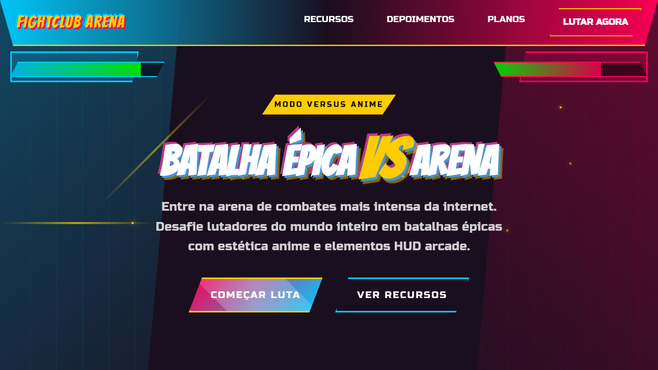
Retro-Comic Action Blueprint
Retro comic landing page, superhero style, pop art, halftone dots, speech bubbles, bold black outlines, bright primary colors. Ideal for landing pages, modern websites. AI-ready template.
Use case: Landing pages, Modern websites
Historical Context
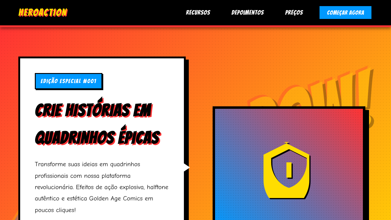
The retro-comic action blueprint draws from a lineage that most designers reference but few truly understand. It starts with Jack Kirby's explosive page compositions in the 1960s — those crackling energy fields, the forced perspective, the unapologetic dynamism that made static pages feel like they'd punch through the paper. Kirby didn't do subtlety. Neither does this system. But the real DNA here isn't just Golden or Silver Age comics. It's the collision point: Ben-Day dots meeting screenprint aesthetics, Lichtenstein's pop art appropriation feeding back into the source material it stole from. By the 1980s, comics themselves had absorbed their own parody. Bold outlines got bolder. Colors went flatter. Action lines multiplied. The visual language became self-aware without losing its punch. What makes this blueprint distinct from generic "comic book" theming is the structural rigor underneath the chaos. Every splash of halftone, every speed line, every knockout type treatment follows compositional rules borrowed from propaganda posters and pulp covers — media designed to grab attention at newsstand distance. That's not decoration. That's information hierarchy weaponized.
When to Use
Deploy this when your brand needs to hit hard and fast — zero ambiguity, maximum energy. Gaming launches, esports events, entertainment apps targeting 16-30 demographics, streetwear drops, energy drink campaigns. It works when your audience already speaks visual shorthand: they see a starburst and read "impact" without thinking. Terrible for anything requiring trust signals, financial services, or healthcare. This system assumes your user wants to feel something loud. If your brief says "sophisticated" or "minimal," walk away.
Design Principles
- Maximum contrast, minimum hesitation — every element either dominates or supports, nothing floats in limbo between roles
- Halftone and texture as structural elements, not decorative afterthoughts — dots define depth, grain defines hierarchy
- Typography must shout before it speaks — display type at action-figure scale, body copy tight and secondary
- Color palettes limited to 4-5 flat, saturated hues with black keyline containment — CMYK logic even in RGB execution
- Motion and implied kinetics in every static composition — if it doesn't feel like it's about to leap off the frame, push harder
Technical Specs
Colors
Primary
Secondary
Effects
Thick black ink outlines, Ben-Day dot shading patterns, speech bubbles, explosive action bursts, vintage newsprint aesthetic.
Light/Dark
✓ Full / ✗ No
Related
Last synced: 4/1/2026