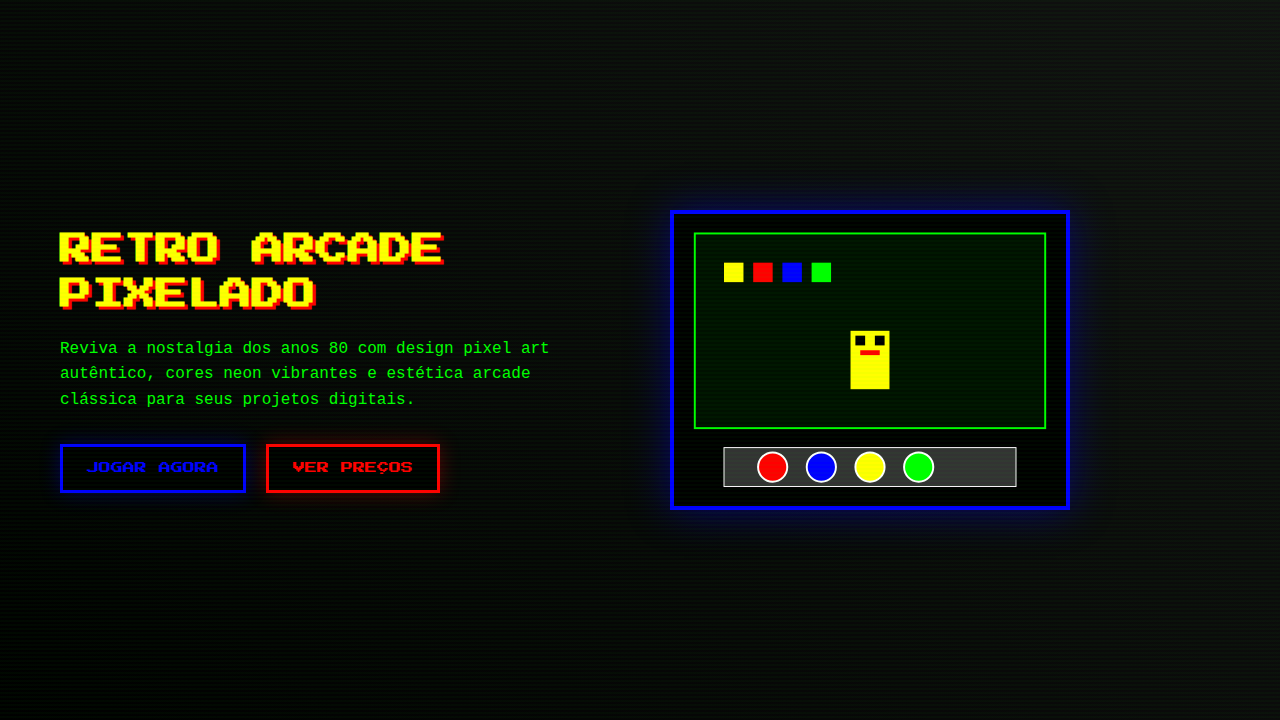
Retro Arcade Pixelado
Nostalgic and playful retro landing page for an online classic arcade. Ideal for landing pages, modern websites. AI-ready template.
Use case: Landing pages, Modern websites
Historical Context
The pixel wasn't a choice. It was a constraint. When Namco shipped Pac-Man in 1980, those chunky 8×8 tile grids weren't aesthetic decisions — they were the literal ceiling of what hardware could render. Designers worked within brutal limitations: 16 colors, fixed palettes, sprites measured in single-digit pixels. And yet, within those constraints, they built an entire visual language. The glow of a CRT scan line. The flicker of a ghost turning blue. Every pixel earned its place. What's remarkable is how that language refused to die. When indie developers in the late 2000s reached for pixel art, they weren't just being nostalgic — they were choosing clarity. A pixel-art character reads instantly at any scale. The grid enforces intentionality: you can't hide behind anti-aliasing or gradients. Every single dot is a decision. Today the aesthetic lives in places its creators never imagined. Arcade bars in Brooklyn. Crypto projects chasing 8-bit credibility. Streetwear brands printing sprite sheets on hoodies. The constraint became the style. The limitation became the look.
When to Use
Reach for this when your project needs to feel handmade and intentional without feeling precious. It works for indie game studios that want credibility with retro-literate audiences. It works for arcade bars and entertainment venues selling nostalgia as experience. It's strong for brands targeting millennials who grew up feeding quarters into cabinets. But be honest with yourself — if your audience has no emotional connection to the source material, you're just cosplaying.
Design Principles
- Honor the grid. Pixels snap to whole units — no sub-pixel rendering, no fractional positioning. If it doesn't align to the grid, it doesn't belong.
- Limit your palette ruthlessly. Original hardware forced 16-color constraints. You don't need to match that exactly, but a restricted palette is what separates pixel art from low-resolution art.
- Let the CRT breathe. Scan lines, subtle glow, slight color bleed — these artifacts aren't decoration, they're context. Use them sparingly or the nostalgia turns into parody.
- Scale without smoothing. Nearest-neighbor interpolation only. The moment you apply bilinear filtering to pixel art, you've destroyed the entire point.
- Design at 1x, present at Nx. Build your assets at native resolution first. Scaling up is trivial. Scaling down from high-res to fake pixel art always looks wrong — and people notice.
Technical Specs
Colors
Primary
Secondary
Effects
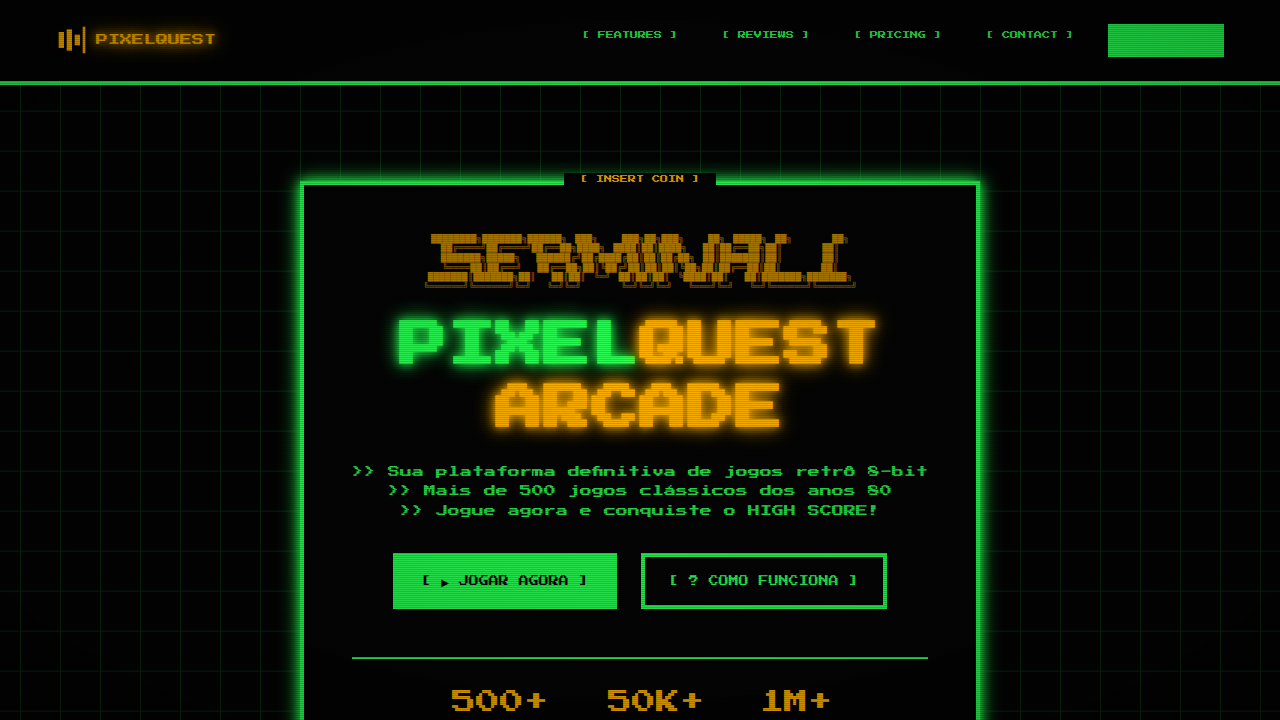
Pixel art em elementos gráficos, tipografia de 8-bit, texturas de tela CRT, bordas com efeito de scanline, micro-interações de clique com som de "blip", animações de transição de tela com efeito de "glitch" ou "fade" rápido.
Light/Dark
✗ No / ✓ Full
Related

Last synced: 4/1/2026