Resume Journey Oregon Trail
Career resume landing page in Oregon Trail retro game style. Ideal for currículos criativos, portfólios de desenvolvedores, páginas pessoais, apresentações de carreira. AI-ready template.
Use case: Currículos criativos, Portfólios de desenvolvedores, Páginas pessoais, Apresentações de carreira
Historical Context
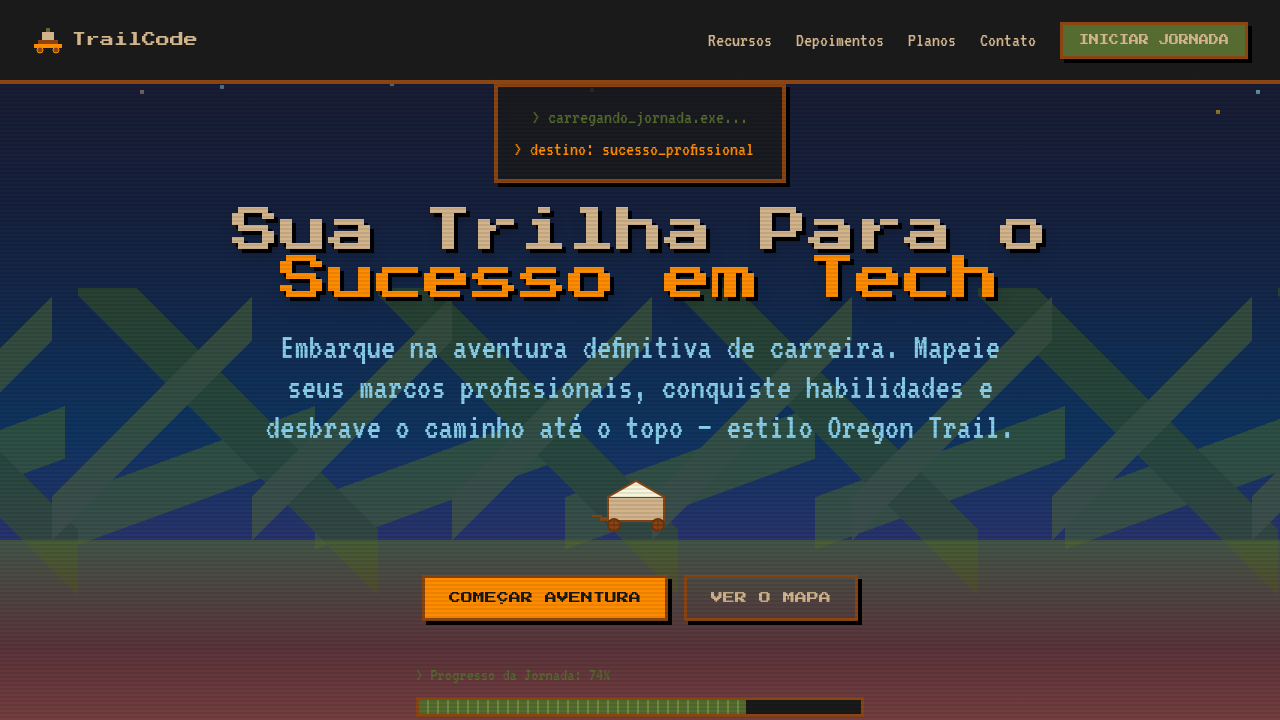
Oregon Trail isn't just a game — it's a shared cultural memory for an entire generation of computer users. Released in 1971 and popularized through school computer labs in the 80s and 90s, it became the first video game most Americans ever played. The green-and-black pixel art, the brutal decision-making, the infamous dysentery — these aren't just nostalgia triggers, they're a universal language. What makes the Oregon Trail metaphor work so well for resumes and portfolios is that it reframes a career as a journey with real stakes. You forded rivers (pivoted careers), lost oxen (failed projects), and somehow made it to Oregon (landed the role). The trail format gives narrative structure to what's usually a flat, lifeless document. It turns a list of jobs into a story of survival and progress. Gamers-turned-developers immediately get it. Recruiters who grew up with it get it too. That's rare overlap, and it's worth exploiting.
When to Use
Best deployed by developers and creatives who want their resume to be remembered, not skimmed. Works beautifully for portfolio sites where the journey matters as much as the destination — career changers, bootcamp grads, indie devs with non-linear paths. Also strong for gamified onboarding experiences or interactive timelines. Skip it if your audience is strictly corporate finance. Lean into it if you're applying somewhere that values personality over polish.
Design Principles
- Commit to the bit — use authentic 4-color palettes and bitmap fonts, not 'retro-inspired' gradients that betray the theme
- Pixel art demands pixel-perfect alignment; sub-pixel rendering is the enemy, so snap everything to a grid and disable anti-aliasing on key assets
- Pace the journey with meaningful checkpoints — each career milestone should feel like reaching a fort, not just another bullet point
- Contrast the lo-fi aesthetic with modern interaction patterns; the visuals are 1985 but the UX should be 2025 — smooth scrolling, responsive breakpoints, accessible contrast ratios
- Leave room for humor and personality in microcopy — 'You have mass-applied to 47 jobs. Your motivation has dysentery' hits harder than any skills matrix
Technical Specs
Colors
Primary
Secondary
Effects
Pixel art rendering (image-rendering: pixelated), scrolling trail/path animation connecting milestones, retro terminal-style typography, milestone markers as pixel waypoints, parallax landscape layers, 8-bit style progress bars for skills
Light/Dark
✓ Full / ✓ Full
Related
Last synced: 4/1/2026