Portfolio Dev Full-Stack
Developer portfolio, full-stack, projects gallery, clean layout, minimal, dark and cyan, code, tech stack, personal brand. Ideal for landing pages, modern websites. AI-ready template.
Use case: Landing pages, Modern websites
Historical Context
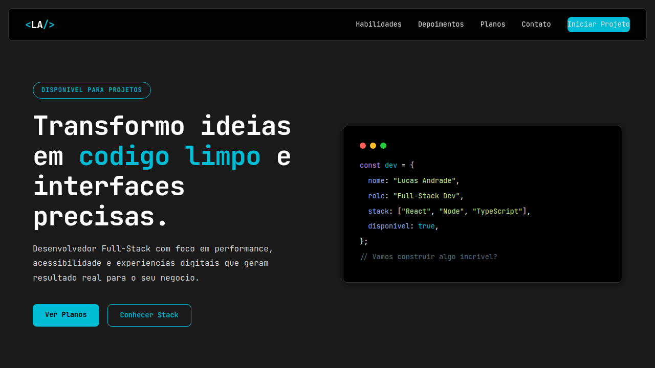
Developer portfolios used to be an afterthought. A WordPress theme, maybe a Behance page if you were feeling fancy. Then GitHub became the resume. Contribution graphs, pinned repos, README aesthetics — suddenly your commit history was your portfolio. The personal site felt redundant for a while. Then the pendulum swung. Developers realized a grid of green squares doesn't communicate taste. The terminal aesthetic emerged — monospace type, dark backgrounds, blinking cursors, ASCII art headers. It was a way to say "I live in the command line" without saying it. Some went minimal to the point of hostility. Others built elaborate interactive CLIs in the browser. Both were statements. What's interesting now is the full-stack developer portfolio as proof of craft. The site itself is the project. How it loads, how it deploys, what framework it uses — recruiters might not notice, but other developers will. The portfolio became a technical flex disguised as a personal page. Your stack choices are your design choices.
When to Use
When you're building a personal site that needs to signal technical depth without looking like a template. Ideal for developers who ship side projects and want a gallery that feels intentional, not just a grid of screenshots. Works for freelancers positioning themselves as technical partners rather than hired hands. Also fits the developer who wants their site to feel like an extension of their toolchain — terminal vibes, code references, monospace everything — without sacrificing usability for visitors who don't speak bash.
Design Principles
- The site is the portfolio piece — performance, architecture, and deploy pipeline should be visible signals of competence
- Monospace typography and terminal references earn their place through function, not costume — use them where they aid scannability, not just for aesthetic cosplay
- Project cards need hierarchy: what you built matters more than what stack you used, but both should be discoverable
- Dark mode is the default expectation, but contrast ratios still apply — legibility over atmosphere every time
- Interactions should feel engineered, not designed — subtle state changes, keyboard navigation, reduced motion respect
Technical Specs
Colors
Primary
Secondary
Effects
Layout duas colunas desktop (bio/projetos), cards de projetos com tech stack badges, hover com underline animado e escala suave, CSS grid/flex para galeria.
Light/Dark
✗ No / ✓ Full
Related
Last synced: 4/1/2026