Playful
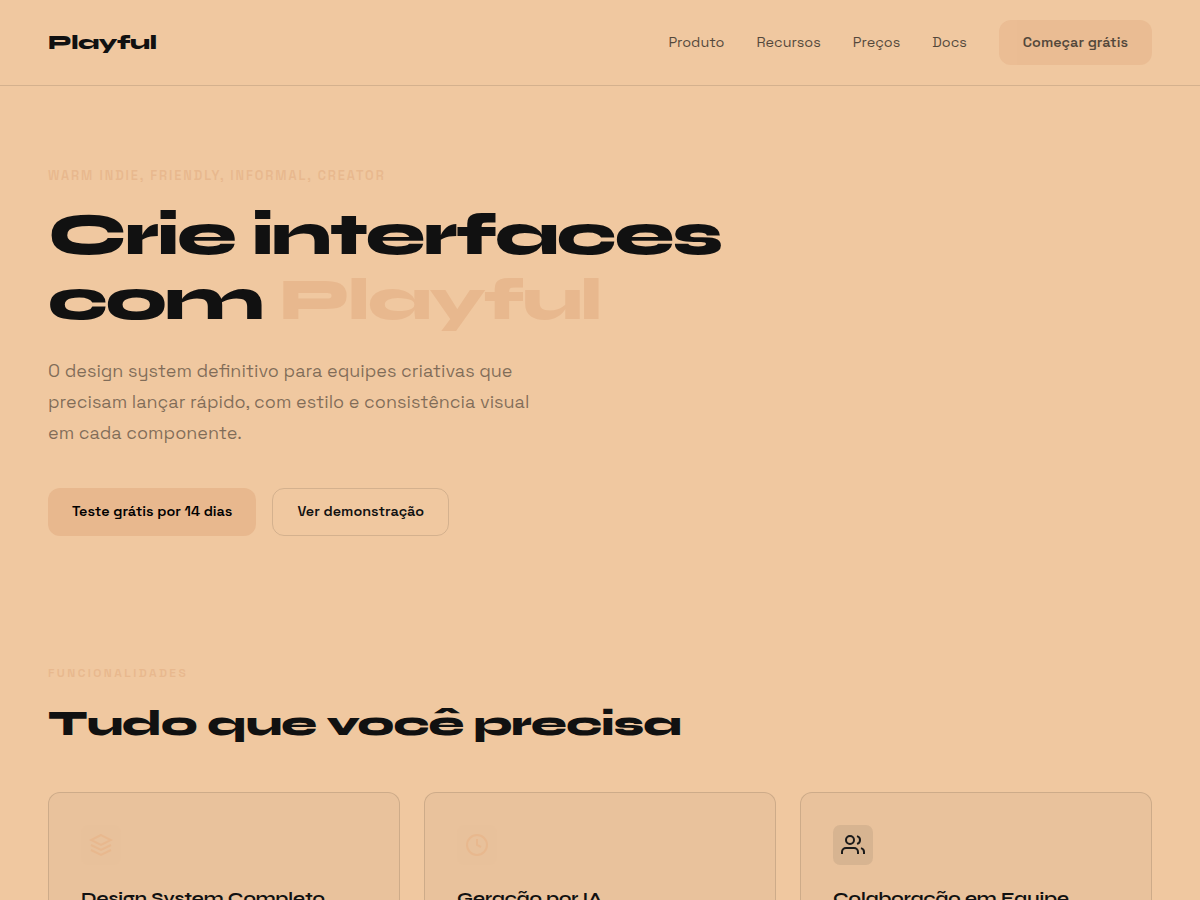
Playful — Sun-warm peach background with Syne display: a friendly indie launch deck. Syne typography. warm peach / sand backgrounds with ink-black structure and lighter cream cards. Best for creator portfolio, indie product launch, lifestyle brand. AI-ready design system.
Use case: creator portfolio, indie product launch, lifestyle brand, small-business pitch, newsletter / community
Historical Context
Flat design killed skeuomorphism, but it also killed warmth. The first wave of flat UI was cold — stark whites, thin grays, surgical precision. It took years for designers to realize you could be flat without being sterile. Somewhere around 2019, indie makers started pushing back. They brought color back — not the neon gradients of startup culture, but softer tones. Peach. Cream. Muted coral. The kind of palette you'd find in a Wes Anderson set, not a Silicon Valley pitch deck. Syne landed as a typeface that refused to behave like a system font. Its quirky geometry gave headlines personality without resorting to hand-lettered chaos. Paired with generous border-radius and soft shadows (or none at all), it became the backbone of a visual language that said: we're a real product, built by real people, and we don't take ourselves too seriously. This aesthetic owes as much to zine culture and Japanese stationery design as it does to any UI framework. It's design that feels handpicked, not generated. Intentionally imperfect. Deliberately cozy.
When to Use
When your product needs to feel approachable before it feels powerful. Ideal for consumer apps where trust comes from warmth — habit trackers, journaling tools, community platforms, small-batch e-commerce. Works beautifully for indie SaaS that competes on personality rather than feature count. If your onboarding should feel like a friend showing you around (not a corporate training module), this is your system. Avoid it for enterprise dashboards or anything where users expect clinical neutrality.
Design Principles
- Warmth over neutrality — peach and cream backgrounds replace sterile whites; every surface should feel like it has temperature
- Rounded everything — border-radius is generous and consistent; sharp corners are reserved for intentional contrast moments only
- Typography with character — Syne or similarly opinionated geometric typefaces for headlines; the font should have a point of view
- Flat but not lifeless — skip drop shadows in favor of subtle elevation through color shifts and soft borders; depth comes from layered hues, not fake light sources
- Intentional imperfection — asymmetric spacing, slightly off-grid illustrations, hand-drawn accents; the system should feel curated by a human, not extruded by a machine
Technical Specs
Colors
Primary
Secondary
Effects
display font Syne for hero headlines, playful hover animations (scale 1.03, 200ms), bouncy click states, sun-warm peach canvas, Syne geometric sans, friendly indie warmth
Light/Dark
✓ Full / ✗ None
Related
Last synced: 5/6/2026