Pinterest Warm Discovery
Pinterest-inspired warm discovery landing page. Ideal for marketplaces visuais, galerias de inspiração, plataformas de descoberta, e-commerce visual. AI-ready template.
Use case: Marketplaces visuais, Galerias de inspiração, Plataformas de descoberta, E-commerce visual
Historical Context
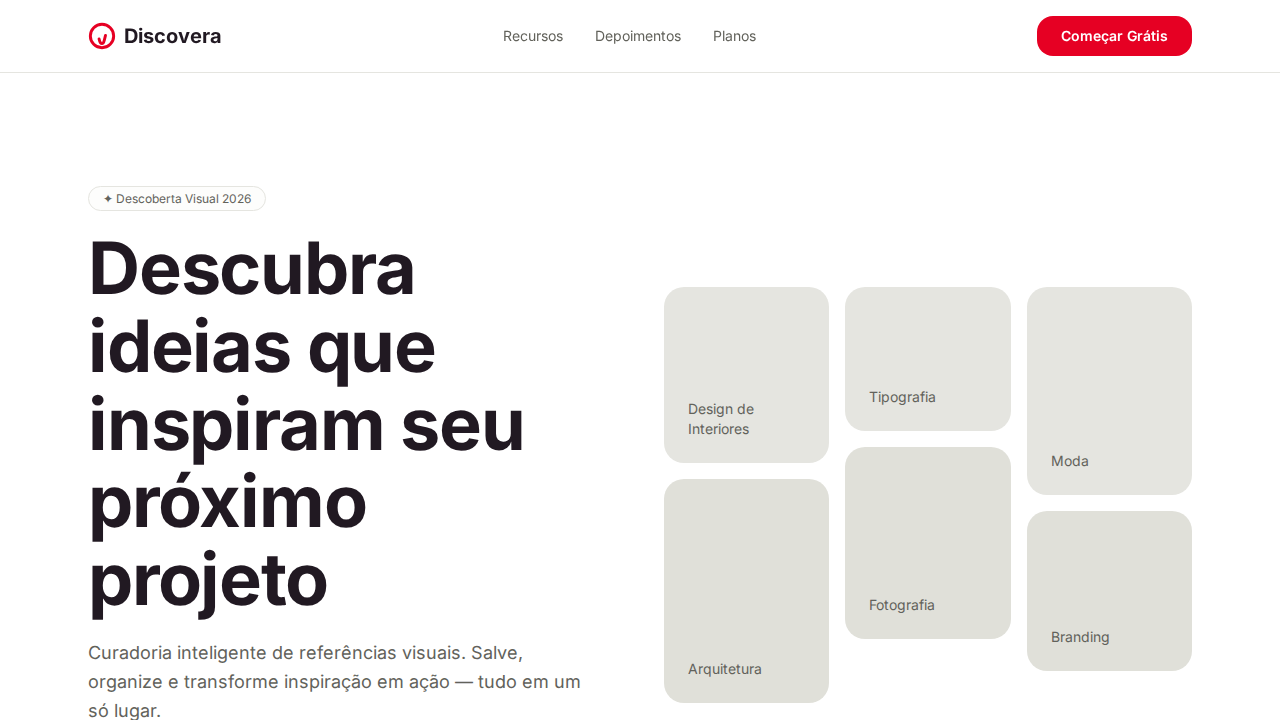
Pinterest didn't invent the mood board — but they mass-produced the feeling of one. When Ben Silbermann launched the platform in 2010, the masonry grid wasn't a layout choice, it was a philosophical statement: content has no fixed aspect ratio, and discovery shouldn't be constrained by uniformity. The waterfall of images mimicked the chaos of a corkboard in a way that felt intentional rather than messy. The introduction of Pin Sans in 2017 marked Pinterest's shift from borrowed identity (Helvetica Neue, then their brief fling with a custom geometric) to owning their typographic voice. Pin Sans is quietly rounded, warm without being childish — it reads like a recommendation from a friend rather than a command from a brand. The weight distribution favors medium over bold, reinforcing suggestion over assertion. What makes Pinterest's system genuinely interesting is how it treats negative space as invitation. The gutters between pins aren't margins — they're breathing room that says 'there's more.' The warm palette (soft reds, muted creams, that signature #E60023) creates urgency without anxiety. Every pixel is calibrated to keep you in a state of pleasant anticipation, never quite satisfied, always one scroll away from the thing you didn't know you needed.
When to Use
Reach for this when your product lives in the space between browsing and buying — where users don't have a query, they have a mood. Visual discovery platforms, lifestyle editorial, recipe collections, travel inspiration, interior design tools. Anywhere the user's intent is 'show me things I'll love' rather than 'find me this specific thing.' Works beautifully when content is heterogeneous in dimension and you refuse to crop it into submission. Terrible for data-dense interfaces or anything requiring scannable hierarchy.
Design Principles
- Masonry over uniformity — let content dictate its own container height; never force aspect ratios that betray the source material
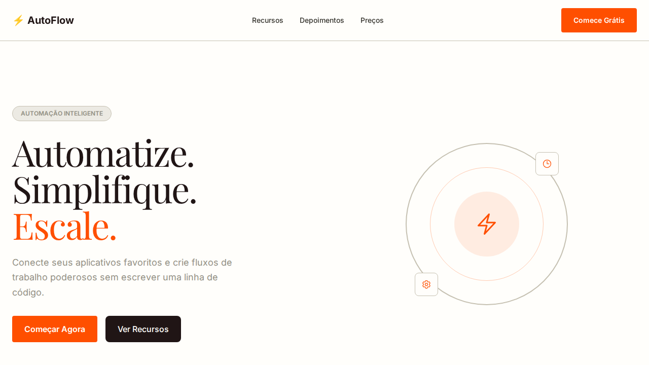
- Warmth through restraint — use the red sparingly as action color, let cream and white do the emotional heavy lifting across surfaces
- Typography as tone of voice — Pin Sans at medium weight suggests rather than shouts; reserve bold for moments of genuine importance, not visual habit
- Negative space as invitation — gutters and padding aren't wasted pixels, they're the silence between notes that makes the melody legible
- Progressive disclosure through scroll — reveal content in waves that reward continued exploration without overwhelming the initial viewport
Technical Specs
Colors
Primary
Secondary
Effects
Canvas branco com neutrals olive/sand quentes (#91918c, #62625b, #e5e5e0) criando atmosfera craft acolhedora. Pinterest Red (#e60023) como acento singular bold e confiante. Texto plum black (#211922) — near-black com subtom ameixa quente. Botões secundários sand (#e5e5e0) com tom quente. Radius generoso: 16px botões, 20px+ cards. Botões circulares (50%) para controles. Masonry grid para conteúdo fotográfico. Badges com fundo warm wash (hsla(60,20%,98%,0.5)). Pin Sans como fonte única.
Light/Dark
✓ Full / ✗ Not Recommended
Related
Last synced: 4/1/2026