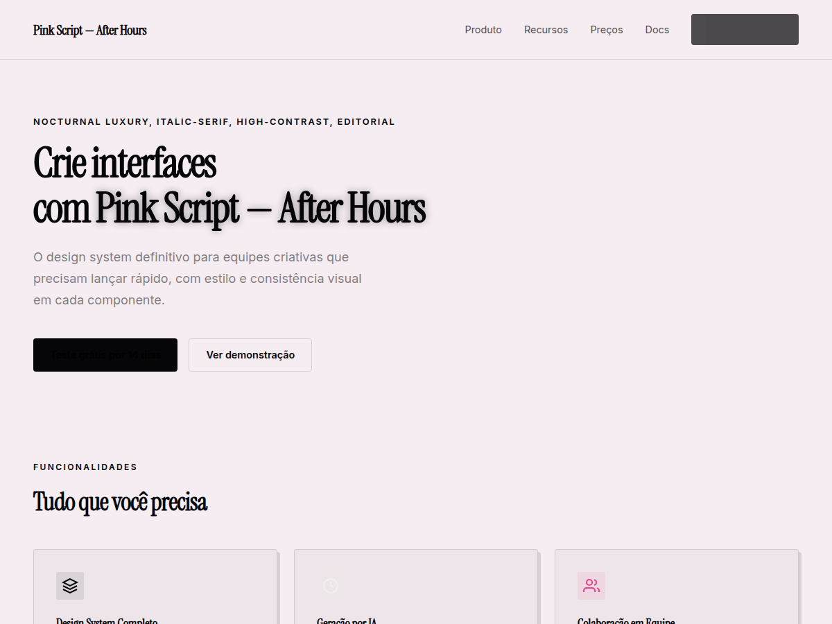
Pink Script — After Hours
Pink Script — After Hours — Black canvas, hot pink accent, pearl-cream paper, Instrument Serif headlines: late-night editorial luxury. Instrument Serif typography. near-black canvas with one saturated hot pink accent and a pearl-cream paper for. Best for fashion brand deck, creator personal brand, after-hours product (nightlife / dating / spirits). AI-ready design system.
Use case: fashion brand deck, creator personal brand, after-hours product (nightlife / dating / spirits), luxury launch, editorial feature
Historical Context
Hot pink as a typographic color has always been confrontational. It refuses to sit quietly on a page. The pairing with near-black backgrounds traces back to 1980s nightclub flyers and punk zines — spaces where legibility was secondary to attitude. Designers like Neville Brody and the Face magazine era understood that fluorescent hues against dark fields created an almost phosphorescent glow, mimicking neon signage viewed through rain-slicked streets. Instrument Serif in italic carries a specific weight here. Unlike the overwrought script faces that dominate nightlife branding, it maintains editorial credibility while still moving. The italic slant suggests forward motion, late nights, momentum. It's the difference between a cocktail menu that looks like a wedding invitation and one that looks like it belongs in a dimly lit room where interesting people gather. This combination — hot pink, near-black canvas, serif italic — is essentially a distillation of after-hours culture into typographic form. It's the visual equivalent of a whispered invitation to somewhere better.
When to Use
Deploy this when the brand lives after sunset. Cocktail bars with no signage. Members-only lounges. Late-night editorial. Feminine luxury that isn't precious — think Rihanna's Fenty, not Tiffany's. It works for event invitations, menu design, social content for nightlife venues, and editorial mastheads that want to signal sophistication without stuffiness. Avoid it for anything that needs to function before 9pm or communicate trustworthiness to a broad audience.
Design Principles
- Let the pink breathe — never fill more than 15% of the canvas. Scarcity creates desire. The near-black does the heavy lifting; pink is the punctuation.
- Italic only for display. The moment you set body copy in Instrument Serif italic on a dark background, you've killed readability and the entire mood collapses into a parody of itself.
- Reject pure black (#000). Use a warm near-black (think #0D0A0B or #1A1118) that carries a subtle warmth — it makes the pink feel intentional rather than slapped on.
- Scale creates hierarchy, not weight. At display sizes, let the serif's thin strokes do their work. Going bold defeats the elegance. Think 72pt minimum for headlines, whisper-thin.
- Pair with restraint. One sans-serif for utility text, nothing decorative. The script-like quality of the italic serif is your single indulgence — everything else serves it silently.
Technical Specs
Colors
Primary
Secondary
Effects
display font Instrument Serif for hero headlines, smooth hover transitions (200-250ms), subtle lift shadows, dark canvas with glow/shadow accents, hot-pink italic accent on near-black canvas, pearl-cream paper slides, generous whitespace, clamp(4rem,8vw,8rem) section gaps
Light/Dark
✗ None / ✓ Full
Related
Last synced: 5/6/2026