People's Platform (Block & Bold)
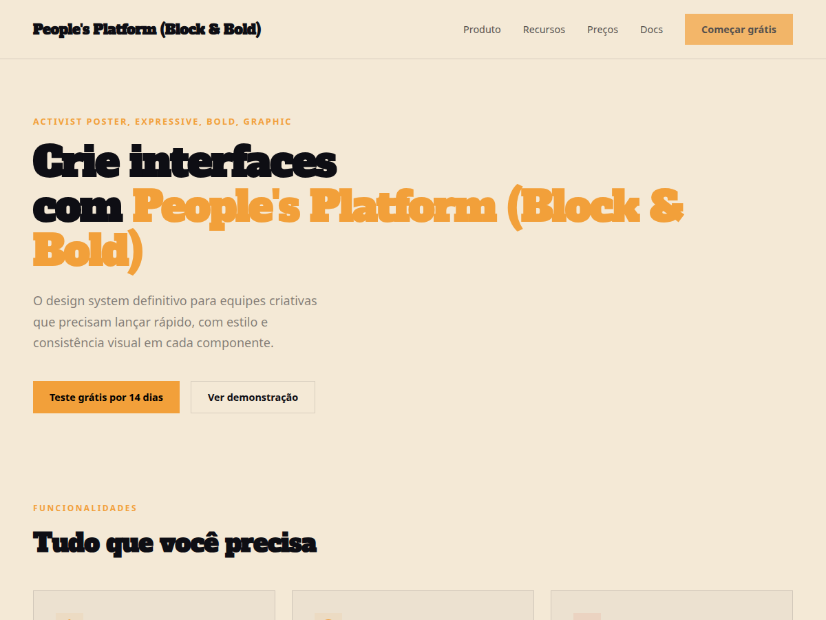
People's Platform (Block & Bold) — Activist poster energy: blue, orange, red on cream, with Alfa Slab + Caveat Brush. Alfa Slab One typography. saturated political-poster palette: cobalt blue, signal orange, warning red, on . Best for cultural commentary, manifesto, community / civic deck. AI-ready design system.
Use case: cultural commentary, manifesto, community / civic deck, design talk, campaign pitch, founder vision
Historical Context
The activist poster tradition didn't emerge from design schools — it came from urgency. From the Atelier Populaire screenprints of May '68 to ACT UP's silence=death triangle, the most powerful political graphics were made by people who needed to be heard yesterday. Bold slab serifs weren't chosen for aesthetic reasons; they were chosen because they could be read from across a street, stenciled onto a wall, or photocopied a hundred times without losing legibility. This pairing — Alfa Slab One's unapologetic weight against Caveat's raw handwritten energy — captures that duality perfectly. The slab says institution, authority, demand. The handwriting says human, personal, urgent. Together they recreate the visual language of movements that understood something most brands never will: typography is a political act. Every zine cover, every wheat-pasted broadsheet, every hand-lettered banner at a march carries this DNA. The block-and-bold approach isn't decorative. It's functional dissent. It exists because marginalized voices learned that whispered messages get ignored, and that the combination of structural boldness with human imperfection is what makes people stop, read, and act.
When to Use
Deploy this when your project serves people organizing for change — not corporations cosplaying activism. It works for mutual aid networks, grassroots campaigns, community land trusts, labor unions, and NGOs that actually do the work. Use it when the message matters more than the polish, when you need to communicate across language barriers and literacy levels, and when your audience expects authenticity over refinement. Avoid it for anything that would feel exploitative borrowing this visual language without the politics behind it.
Design Principles
- Legibility is solidarity — if someone can't read it from ten feet away or on a cracked phone screen, you've failed the people you claim to serve
- Imperfection is proof of life — the handwritten elements aren't decorative, they signal that a human made this and a human is asking you to care
- Contrast carries conviction — pair maximum typographic weight against open space; let the message breathe like a chant needs silence between repetitions
- Hierarchy serves urgency — the most important information hits first and hardest, because your audience is scrolling past a hundred other demands for attention
- Color is a megaphone — use it sparingly and deliberately; one accent color at full saturation against monochrome creates the same visual punch as a raised fist in a crowd
Technical Specs
Colors
Primary
Secondary
Effects
display font Alfa Slab One for hero headlines, bold hover color shift (150ms), high-contrast active states, activist poster color blocks, slab+handwritten font collision, red/blue/orange
Light/Dark
✓ Full / ✗ None
Related
Last synced: 5/6/2026