Passport Travel UI
Passport style landing page, travel document aesthetic, ink stamps, visa stickers, paper texture, official look, travel theme. Ideal for landing pages, modern websites. AI-ready template.
Use case: Landing pages, Modern websites
Historical Context
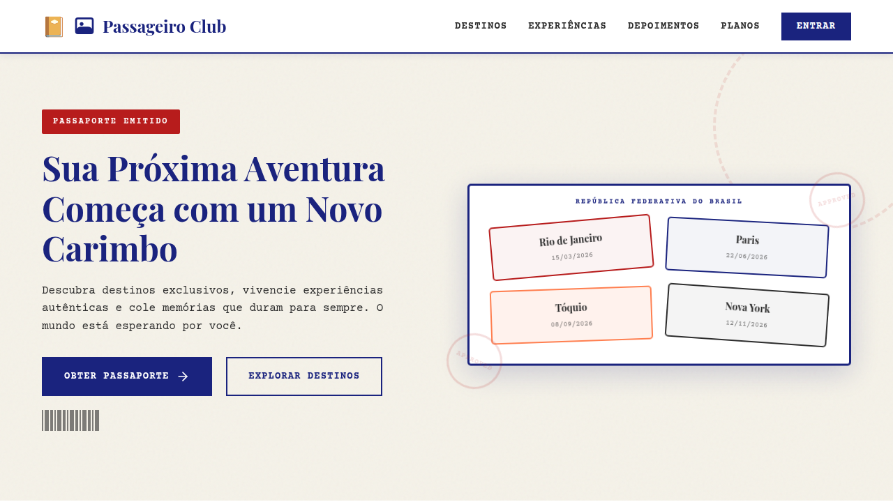
Passport aesthetics in digital design trace back to the early skeuomorphic era — when iOS apps literally rendered leather-bound booklets and stamped pages. Cheesy? Sometimes. But the impulse was right. Travel documents carry an emotional weight that few other paper artifacts match. The worn edges, the ink stamps from foreign ports, the perforated boarding pass torn at the gate — these textures signal adventure before a single word is read. The stamp collection pattern deserves its own mention. Gamification borrowed it early: unlock a city, earn a stamp. Foursquare did it. Airline loyalty apps still do. It works because it mirrors a real behavior — flipping through passport pages and remembering where you've been. The metaphor doesn't need explanation. That's rare in UI. Boarding pass layouts, meanwhile, gave designers a gift: a rigid information hierarchy baked into a familiar form. Departure. Arrival. Gate. Seat. The constraint is the feature. You don't fight the format — you lean into it, and users parse it instantly because they've held the real thing a hundred times.
When to Use
Reach for passport UI when your product needs to evoke movement, anticipation, or earned progress. Travel apps and airline interfaces are obvious fits, but tourism platforms, adventure brands, and even loyalty programs benefit from the metaphor. It's particularly strong for itinerary displays, trip summaries, achievement systems, and onboarding flows where you want users to feel like they're embarking on something. Skip it if your context has zero travel association — forced metaphors always feel hollow.
Design Principles
- Respect the document: Use real passport and boarding pass proportions, typography conventions, and information hierarchy — don't just slap a stamp texture on a card and call it travel UI.
- Wear and patina over pristine: Subtle ink bleed, rounded stamp edges, slightly uneven registration marks. Perfection kills the authenticity that makes this theme work.
- Constraint as clarity: Boarding pass layouts succeed because they're rigid. Embrace fixed zones, monospaced type for codes, and clear visual separators like perforations or tear lines.
- Stamps as progressive disclosure: Each stamp should feel earned. Use them for milestones, visited destinations, or completed steps — never decoratively without meaning.
- Color from reality: Faded navy, customs-office green, red ink, kraft paper tan. Pull your palette from actual travel documents, not from what you imagine travel 'feels like.'
Technical Specs
Colors
Primary
Secondary
Effects
Passport booklet mockup, ink stamps, visa stickers, barcode elements, matte paper grain, porous ink bleed, worn edges.
Light/Dark
✓ Full / ✗ No
Related

Last synced: 4/1/2026