Paper & Ink
Design an editorial, literary, thoughtful landing page with paper and ink aesthetic. Ideal for editoras, blogs literários, revistas culturais, portfolios de escritores. AI-ready template.
Use case: Editoras, Blogs literários, Revistas culturais, Portfolios de escritores
Historical Context
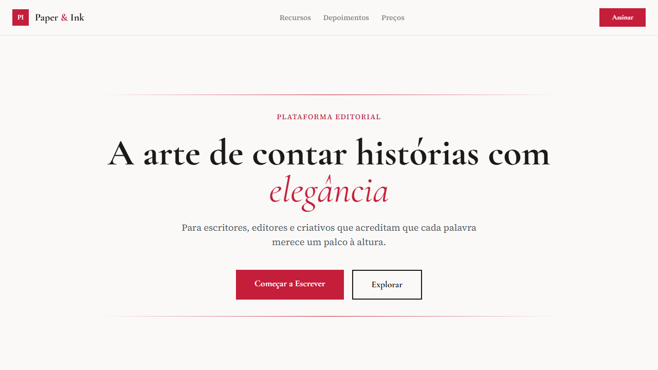
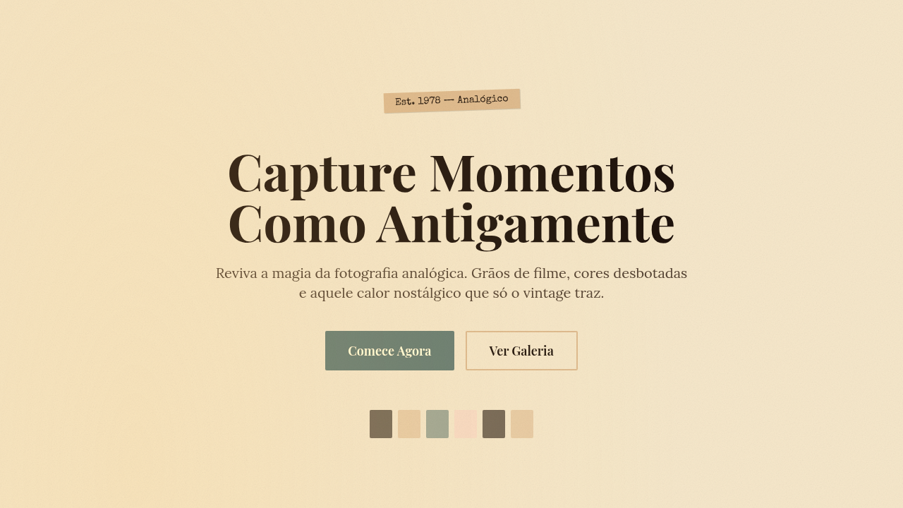
There's something almost subversive about bringing paper texture into a digital interface. For centuries, the relationship between ink and substrate was the entire design medium — letterpress operators obsessed over impression depth, printmakers chose papers that would hold ink without feathering, and book designers understood that the tooth of a page affected readability as much as the typeface itself. When screens arrived, we spent decades pretending paper didn't exist. Flat design wiped every texture clean. But the pendulum swung back because readers noticed what was missing: warmth. A screen rendering Garamond on pure white (#fff) feels clinical. That same Garamond on a cream field with subtle fiber noise feels like something you want to spend an afternoon with. The Paper & Ink aesthetic isn't skeuomorphism — nobody's adding fake leather stitching here. It's a selective reintroduction of analog signal. Ink bleed on headlines. Slight halftone grain in illustrations. Off-white backgrounds that reduce eye strain while signaling 'this content was crafted, not generated.' It borrows the authority of print without pretending the screen is a page.
When to Use
Reach for Paper & Ink when your content demands sustained reading and the interface should disappear behind the words. Literary magazines, poetry platforms, independent publishers translating their catalogs online, essay-driven blogs that refuse to look like every other Substack. It works beautifully for print-digital hybrids where brand consistency across physical books and web presence actually matters. Also strong for archival projects, typographic portfolios, and any context where you want users to slow down rather than scroll faster.
Design Principles
- Substrate first — choose your background color and texture before anything else; every element inherits its character from the 'paper' beneath it
- Ink economy — treat color like expensive ink on a press run; one or two spot colors maximum, let black do the heavy lifting through weight and size contrast
- Visible craft in typography — use optical sizing, real small caps, oldstyle figures, and proper hanging punctuation; if your type doesn't look set by hand, you've missed the point
- Texture as whisper, not shout — grain, noise, and fiber should register subconsciously; if a user consciously notices the texture, you've overdone it by half
- Respect the margins — generous whitespace isn't wasted space, it's the digital equivalent of deckle edges and French folds; let content breathe like a well-set book page
Technical Specs
Colors
Primary
Secondary
Effects
Drop caps (first letter large and decorative), pull quotes with elegant styling, elegant horizontal rules (thin lines with ornaments), literary typography hierarchy, smooth page-like transitions 300ms
Light/Dark
✓ Full / ✗ No
Related
Last synced: 4/1/2026