NVIDIA Power Green
Design an NVIDIA-inspired high-contrast landing page. Ideal for gpu computing, hardware, tecnologia de alto desempenho, data centers, gaming. AI-ready template.
Use case: GPU computing, Hardware, Tecnologia de alto desempenho, Data centers, Gaming
Historical Context
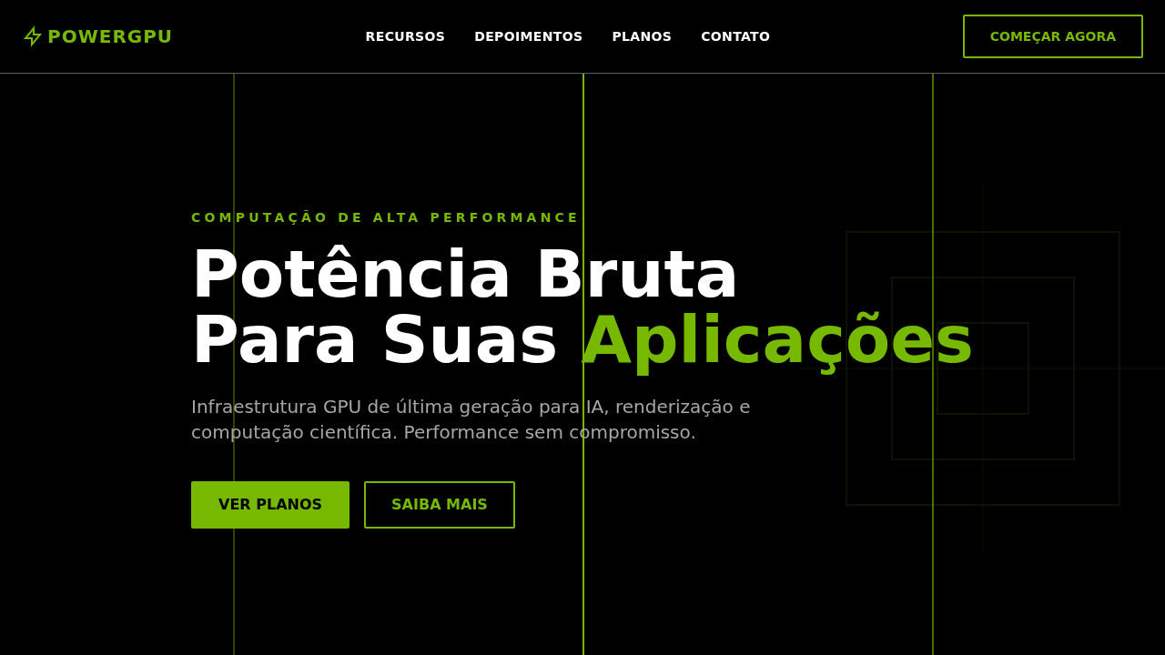
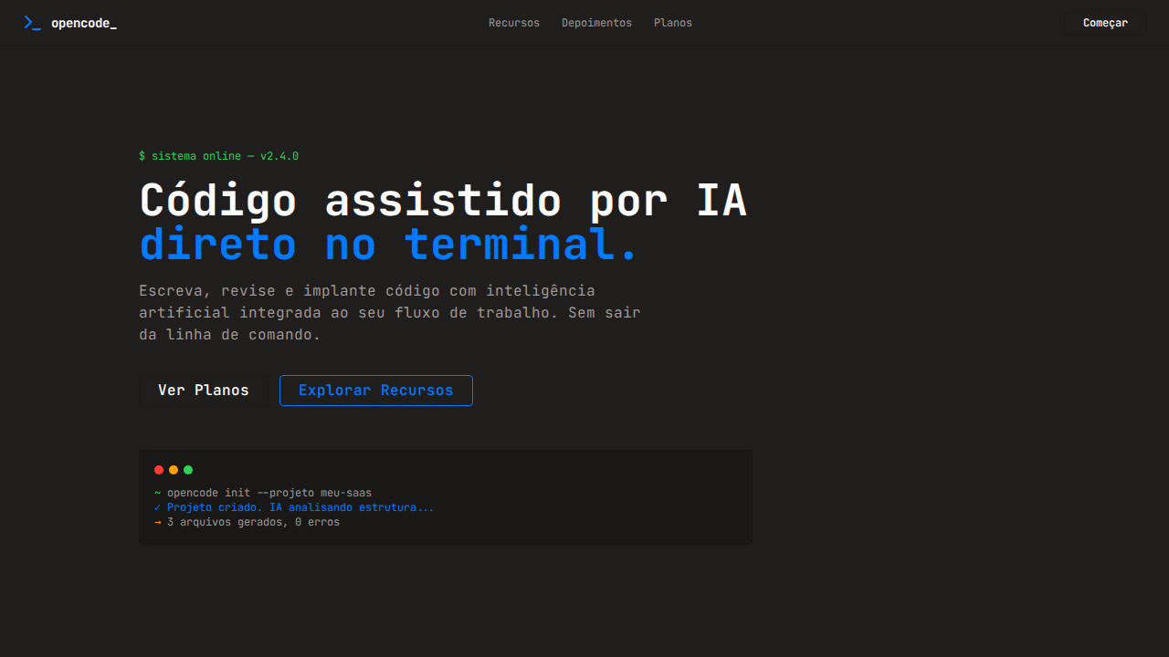
NVIDIA's green didn't start as a brand color — it started as a statement. When Jensen Huang founded the company in 1993, the GPU was a niche component for gamers who wanted smoother frame rates. The green was loud, almost aggressive, deliberately chosen to cut through the beige-and-gray monotony of 90s computing hardware. It said: this isn't your office PC. This is something else entirely. Fast-forward three decades and that same green now represents the backbone of artificial intelligence infrastructure. The color carried NVIDIA from gaming peripherals to trillion-dollar market cap without ever getting a rebrand. That's rare. Most tech companies soften their palette as they mature — NVIDIA doubled down. The green got darker, more saturated, more confident. It went from "look at me" to "you already know." What makes Power Green interesting from a design perspective is its refusal to be neutral. In an industry obsessed with minimalism and safe grays, NVIDIA kept pushing a color that demands attention. It's become shorthand for computational power itself — when you see that green glow, you expect performance numbers that make other hardware look quaint.
When to Use
Reach for Power Green when you're designing for raw performance and want the interface to feel it. GPU dashboards, AI training monitors, hardware spec pages, gaming overlays — anywhere the user expects power under the hood. It works best as an accent against deep blacks or charcoal backgrounds. Don't flood the layout with it. A little goes far. Use it for status indicators, progress bars, key metrics, and CTAs that need to feel electric. Avoid pairing with pastels or organic palettes — it'll look confused.
Design Principles
- High-contrast or nothing — Power Green dies on mid-tone backgrounds. Push it against near-black (#0a0a0a to #1a1a1a) and let it burn.
- Accent, not wallpaper — treat it like neon signage. The moment it covers more than 15% of your canvas, it stops feeling powerful and starts feeling cheap.
- Pair with monospace and technical typography — this green belongs next to data, specs, and metrics. Serif body text will fight it.
- Motion reinforces energy — subtle glow pulses, scan-line effects, or terminal-style reveals amplify the tech narrative without being gimmicky.
- Respect the darkness — the negative space around Power Green is what gives it authority. Dense layouts dilute the impact. Let it breathe in black.
Technical Specs
Colors
Primary
Secondary
Effects
Verde NVIDIA (#76b900) como acento puro — bordas, underlines e highlights interativos, nunca como superfície. Fundo preto dominante com texto branco em seções escuras. Tipografia industrial pesada (weight 700 padrão para headlines). Border-radius mínimo (1-2px) — cantos afiados e engenheirados. Botões com borda verde 2px solid #76b900. Nav uppercase weight 700. Seções alternando preto/branco. Sombra mínima rgba(0,0,0,0.3) 0px 0px 5px.
Light/Dark
✓ Full / ✓ Full
Related

Last synced: 4/1/2026