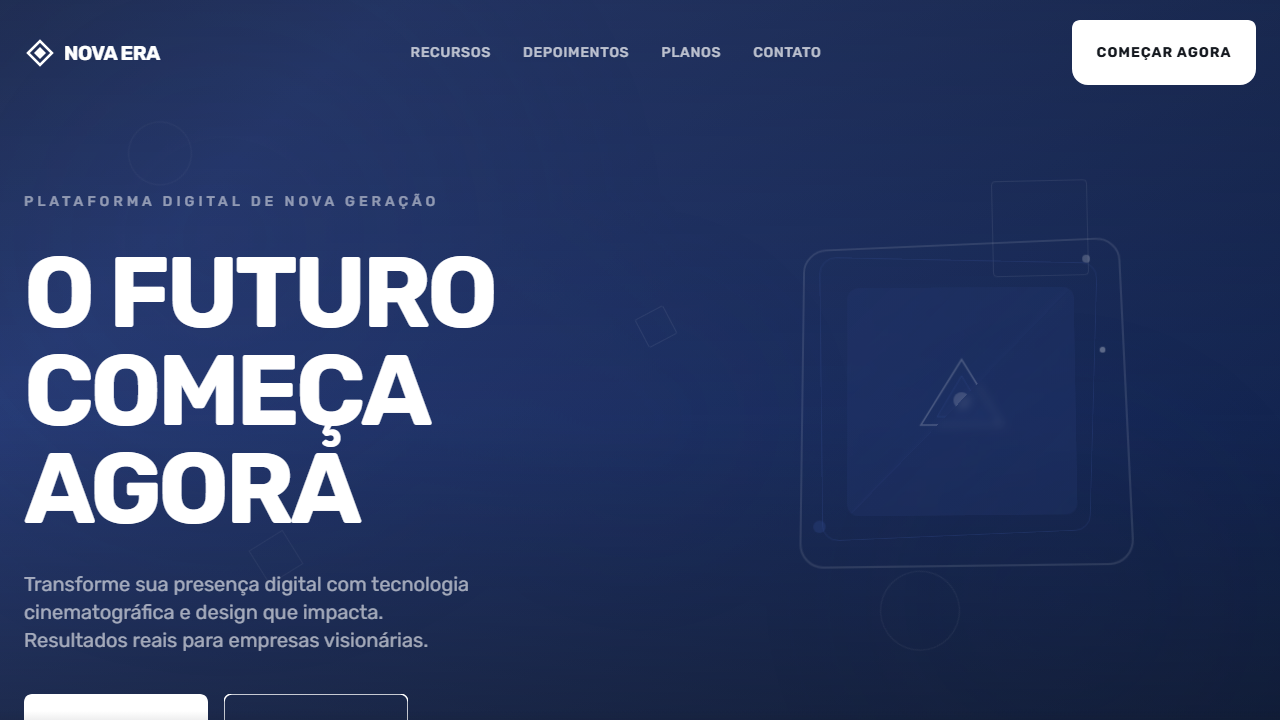
New Era Bold Hero
Bold cinematic hero with full-screen background video and dark blue fallback. Ideal for creative agencies, portfólios impactantes, landing pages editoriais, marcas de moda. AI-ready template.
Use case: Creative agencies, Portfólios impactantes, Landing pages editoriais, Marcas de moda
Historical Context
The full-screen typographic hero didn't emerge from digital design — it came from protest posters, punk zines, and the raw energy of letterpress accidents. When Neville Brody blew type to the edges of The Face in the 1980s, he wasn't decorating; he was weaponizing letterforms. The idea that a single word, set massive and unapologetic, could carry more emotional weight than any photograph was radical then and remains potent now. This pattern crystallized in the early 2010s when agencies like Huge and Collins started stripping hero sections down to nothing but oversized uppercase type on solid backgrounds. No imagery, no gradients, no safety nets. The confidence required to let typography alone carry a brand's first impression separated serious studios from template-dependent shops. It was a direct rejection of the stock-photo-plus-overlay formula that had calcified web design into visual wallpaper. Today the bold hero persists because it works on a neurological level — large-scale type triggers immediate pattern recognition, demands a pause, and creates the kind of visceral gut reaction that no carousel or auto-playing video can replicate.
When to Use
Deploy when the message is the product. Brand manifestos, agency landing pages, album drops, fashion lookbooks, political campaigns — anywhere the words themselves need to hit like a billboard at 120km/h. This pattern demands conviction: if your headline needs a subtitle to make sense, you're not ready for it. Works best when paired with extreme whitespace or a single bold background color. Avoid if your brand voice is tentative, explanatory, or committee-approved. This is for statements, not descriptions.
Design Principles
- Scale is meaning — if the type doesn't feel uncomfortably large in your design tool, it's not large enough for the viewport
- Uppercase is a volume knob, not a default — earn it with words that deserve to be shouted
- Negative space is structural, not decorative — the emptiness around massive type is what gives it gravitational pull
- One typeface, one weight, zero apologies — mixing fonts here is cowardice disguised as variety
- Motion must serve legibility — if your entrance animation makes people wait to read the headline, you've prioritized spectacle over communication
Technical Specs
Colors
Primary
Secondary
Effects
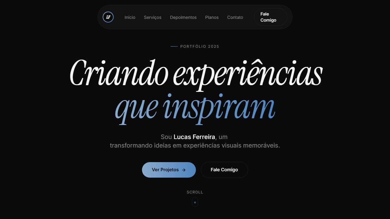
VÍDEO: Vídeo abstrato com movimento fluido e dinâmico em tons escuros azulados. Formas geométricas ou partículas em movimento criando sensação de energia e modernidade. Estilo cinematográfico com transições suaves, servindo como backdrop para tipografia bold oversized. Fallback azul escuro (#21346e) quando o vídeo não carrega. | EFEITOS CSS: Vídeo de fundo tela cheia (autoplay, loop, muted) com fallback azul escuro, tipografia massiva uppercase (text-6xl a text-[100px]) com line-height 0.98 e letter-spacing negativo (-2px a -4px), botão CTA com shape SVG customizado (184x65px, path branco, texto escuro), hover scale-105, active scale-95
Light/Dark
✗ Not Recommended / ✓ Full
Related
Last synced: 4/1/2026