Neubrutalism
Neubrutalist interface. Ideal for landing pages, saas. AI-ready template.
Use case: Landing pages, SaaS
Historical Context
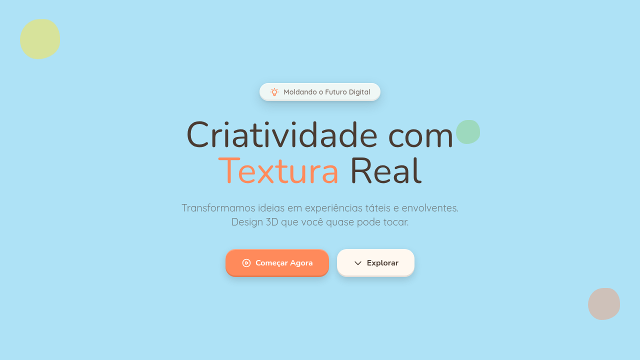
Brutalism on the web was always a provocation. Raw HTML, system fonts, zero polish — it said "I don't care about your expectations." Neubrutalism kept the attitude but ditched the hostility. It's brutalism that actually wants you to click the button. The turning point was Gumroad's 2021 redesign. Sahil Lavingia stripped the product down to thick black borders, flat primary colors, and offset drop shadows that looked like someone dragged a rectangle two pixels southeast. It was loud, playful, and unmistakably intentional. Designers noticed. Within months, the Figma community had dozens of neubrutalist UI kits climbing the charts. What separates it from classic brutalism is warmth. Where brutalism embraced ugliness as ideology, neubrutalism uses bold geometry as decoration. The borders are thick but the corners can be rounded. The shadows are hard but the palette is candy-colored. It's confrontational aesthetics made approachable — punk rock in a good mood.
When to Use
Neubrutalism works when you need to signal that you're not another bland SaaS. Startups trying to stand out in a sea of soft gradients and rounded cards. Creative agencies that want their portfolio site to have the same energy as their work. Indie makers shipping something weird and proud of it. Web3 projects that need visual identity beyond dark mode and neon. It's a style that rewards confidence — if your brand voice is bold and slightly irreverent, the aesthetic will amplify it. If you're building enterprise software for banks, keep scrolling.
Design Principles
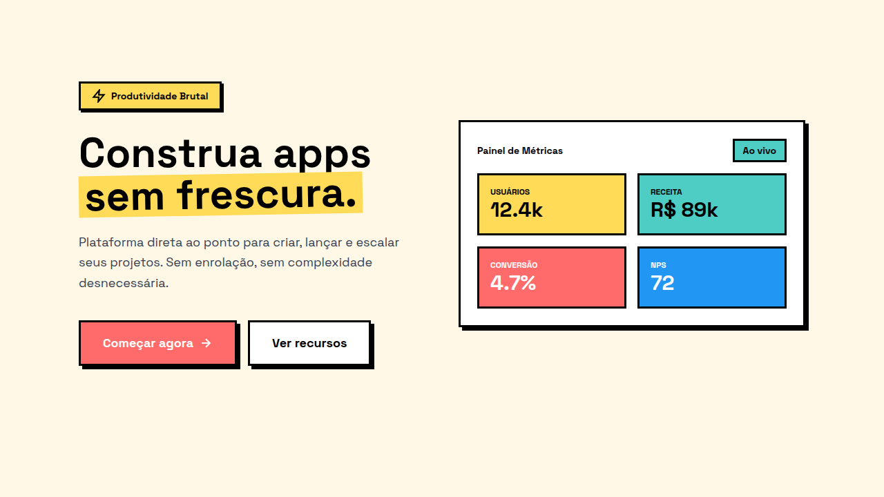
- Borders are structural, not decorative — every element gets a visible black outline that defines its boundaries with zero ambiguity
- Shadows are flat and offset — no blur, no spread, just a solid color block shifted 3-5px on both axes to create depth through geometry
- Color is unapologetic — saturated primaries and secondaries used at full intensity, white space as the only breathing room
- Typography carries weight — bold and extra-bold weights dominate, type is a visual element first and content second
- Layering creates hierarchy — elements visibly stack on top of each other like paper cutouts, rejecting the flat-everything orthodoxy
Technical Specs
Colors
Primary
Effects
box-shadow: 4px 4px 0 #000, border: 3px solid #000, no gradients, sharp corners (0px), bold typography
Light/Dark
✓ Full / ✓ Full
Related
Last synced: 4/1/2026