Neoclassical Art
Neoclassical landing page inspired by ancient Greek and Roman art. Ideal for marcas de luxo, interior design, art galleries, projetos formais e institucionais. AI-ready template.
Use case: Marcas de luxo, Interior design, Art galleries, Projetos formais e institucionais
Historical Context
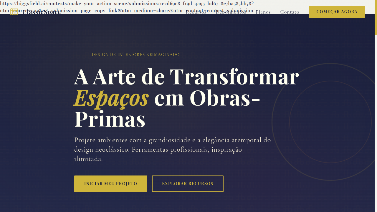
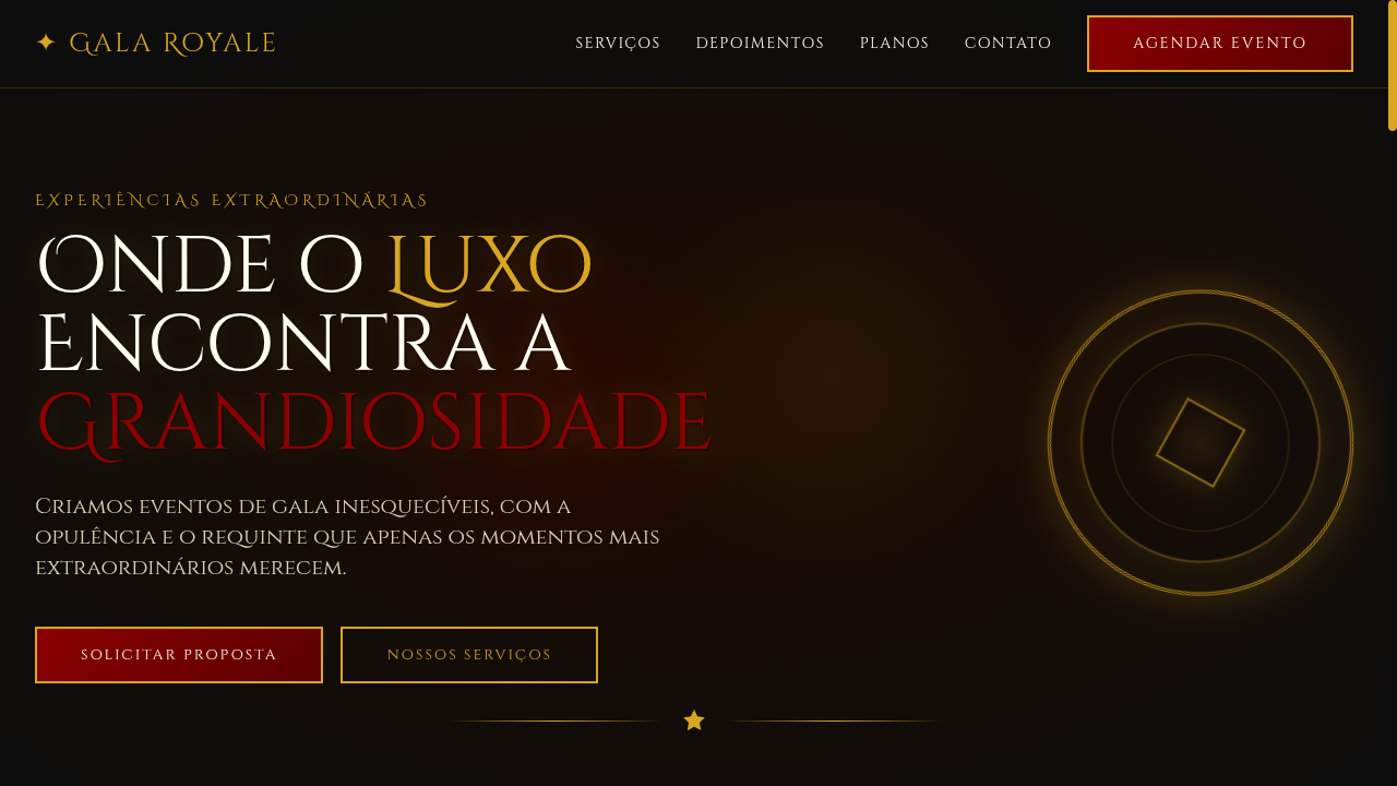
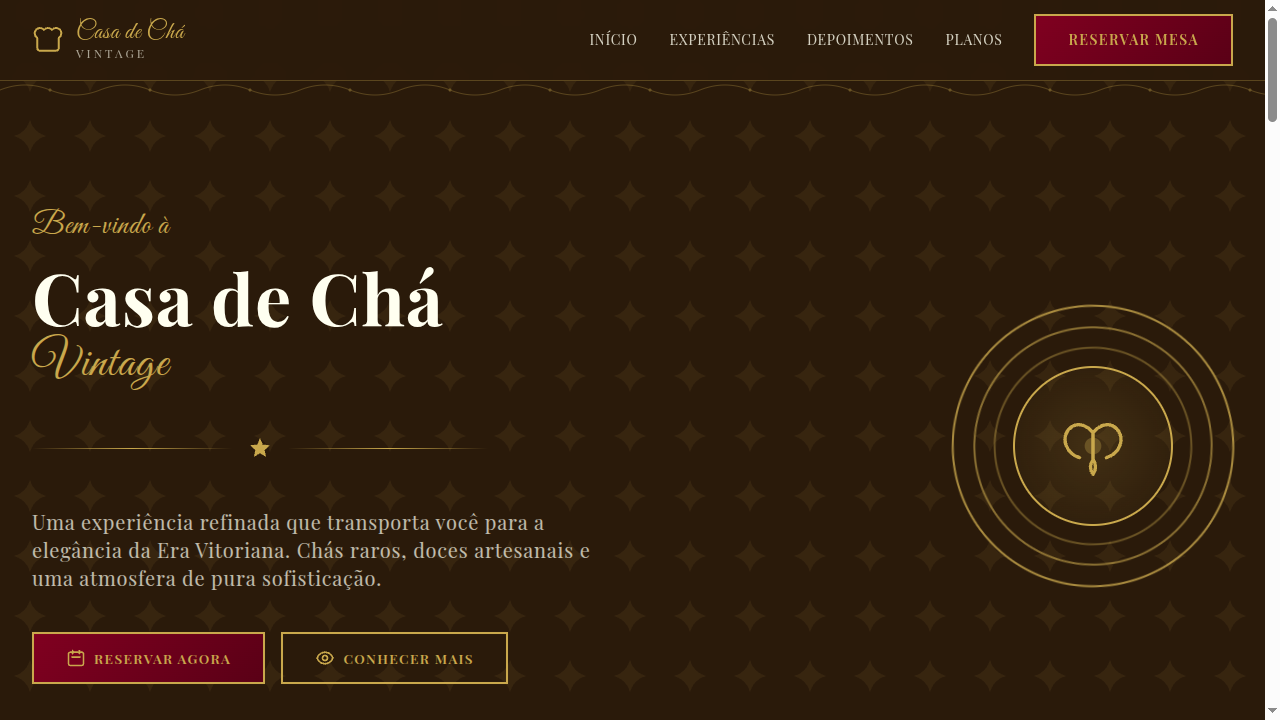
Neoclassical art emerged in the mid-18th century as a direct rebellion against the excess of Rococo. Architects, painters, and sculptors looked back to ancient Greece and Rome—not out of nostalgia, but out of intellectual conviction. The excavations at Pompeii and Herculaneum gave artists primary sources they'd never had before. Winckelmann wrote that Greek art achieved "noble simplicity and quiet grandeur," and an entire generation took that as gospel. David, Canova, Ingres—they weren't decorating. They were making moral arguments in marble and oil. What makes Neoclassical relevant to design today isn't the columns or the togas. It's the underlying philosophy: that restraint communicates authority, that symmetry creates trust, that referencing shared cultural memory gives your work weight it couldn't earn on its own. Every courthouse with a pediment, every university seal with a laurel wreath—that's Neoclassical thinking still doing its job two centuries later. The style carries an implicit promise: we are serious, we are permanent, we will outlast trends. That's not a small thing to communicate visually.
When to Use
Reach for Neoclassical when your client needs to project institutional permanence. Law firms, government bodies, museums, and universities all benefit from this visual language because their authority depends on perceived stability. It works when you need gravitas without stuffiness—when the brief says "trustworthy" and "established" but the audience still expects contemporary craft. Avoid it for startups chasing disruption narratives or brands targeting youth culture. This aesthetic earns its power precisely because it refuses to be trendy.
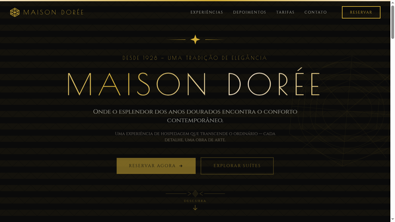
Design Principles
- Symmetry as authority — Center-axis compositions and mirrored layouts signal institutional confidence. Break symmetry only with intention.
- Restrained palette, maximum contrast — Think warm stone against deep navy or black. Let negative space do the heavy lifting instead of color variety.
- Classical proportion over arbitrary spacing — Use golden ratio or column-based grids. The math should feel inevitable, not decorative.
- Typography carries the weight — Serif faces with high contrast strokes and generous tracking. The letterforms themselves should echo chiseled inscriptions.
- Ornament must be earned — Every decorative element needs structural justification. A border, a rule, a flourish—each one should reinforce hierarchy, never compete with content.
Technical Specs
Colors
Primary
Secondary
Effects
Subtle gold borders, classical column dividers, serif typography with elegant spacing, marble texture backgrounds, soft vignette overlays, smooth fade-in transitions (400ms)
Light/Dark
✓ Full / ◐ Partial
Related
Last synced: 4/1/2026