Neobrutalismo Ousado
Bold and provocative neobrutalist landing page for a disruptive design agency. Ideal for landing pages, modern websites. AI-ready template.
Use case: Landing pages, Modern websites
Historical Context
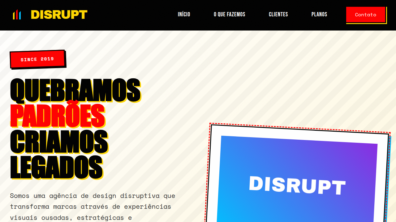
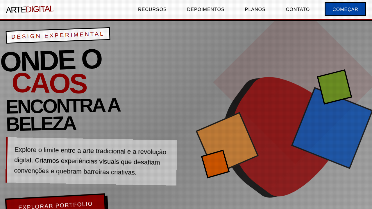
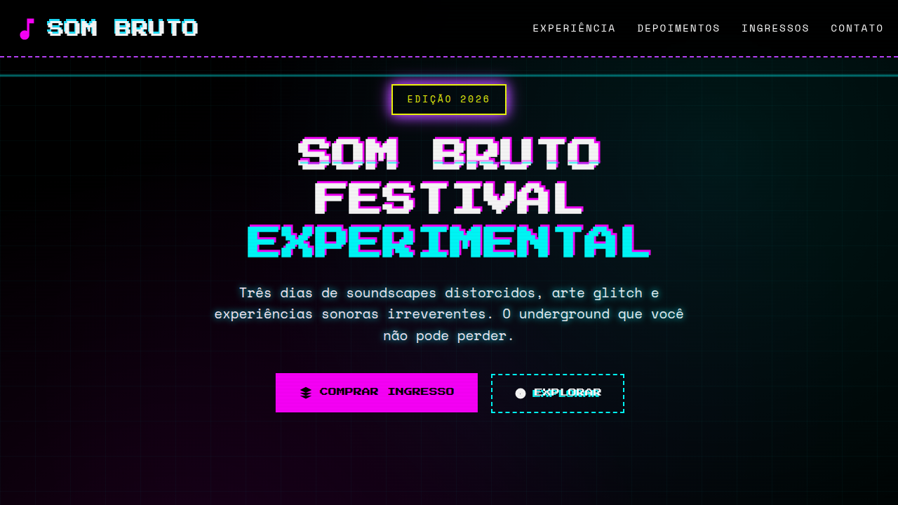
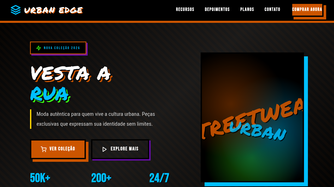
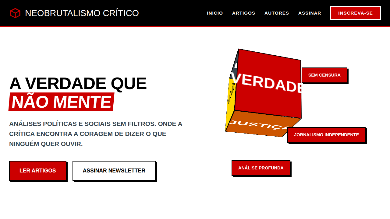
When Sahil Lavingia redesigned Gumroad in 2020, he didn't just strip away the polish — he detonated it. Black borders. Saturated primaries. Drop shadows that looked like they were rendered in MS Paint. The internet lost its mind. Designers called it ugly. Then they copied it. What followed wasn't a trend. It was a permission slip. Suddenly every creative agency landing page, every Web3 project, every portfolio site that wanted to scream "we're not like them" had a formula: 4px borders, one loud color, flat illustrations with intentional roughness. The aesthetic said anti-corporate while being deployed by corporations. That tension is the point. Bold neobrutalism works because it's legible as rebellion without actually being difficult. It borrows concrete architecture's honesty — exposed structure, no decorative lies — but wraps it in candy colors. It's brutalism for people who still want to convert visitors. The thick-border-primary-color formula became a shorthand for disruption, and unlike most shorthand, it still hits when executed with conviction rather than copied from a Figma community file.
When to Use
When your brand needs to punch through the sea of rounded-corner sameness. Perfect for creative agencies that practice what they preach, startups positioning against bloated incumbents, portfolio sites where the design IS the credential, and Web3 projects that need visual credibility without corporate cosplay. Skip it if your audience expects reassurance over provocation — this style filters people out by design, which is exactly the point.
Design Principles
- Borders are structural, not decorative — use them at consistent heavy weights (3-4px) to define every element's territory on the page
- One primary color does all the heavy lifting; everything else is black, white, or a neutral — restraint in palette creates maximum impact
- Shadows are offset and solid, never blurred — they reference print and physical layering, not depth simulation
- Typography is oversized and unapologetic — headlines should feel like they're shouting across the room, body text stays readable but dense
- Whitespace is generous between sections but tight within components — this contrast creates rhythm and prevents the boldness from becoming noise
Technical Specs
Colors
Primary
Secondary
Effects
Cores contrastantes e jarring, tipografia oversized e ousada, elementos sobrepostos, bordas grossas, sombras duras, layouts assimétricos, micro-interações de clique agressivas, efeitos de glitch sutil.
Light/Dark
✓ Full / ✗ No (com elementos de alto contraste)
Related
Last synced: 4/1/2026