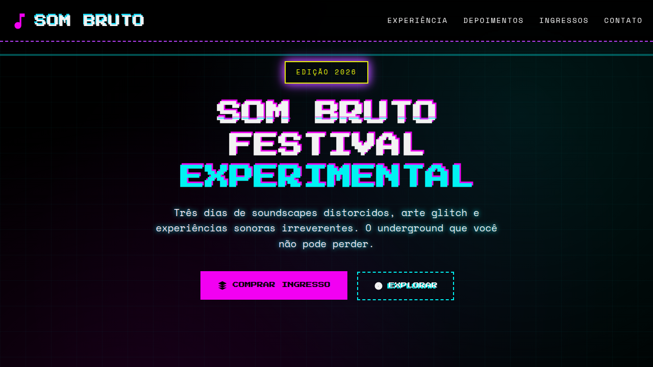
Neobrutalismo Crítico
Direct and bold neobrutalist landing page for a social and political critique blog. Ideal for landing pages, modern websites. AI-ready template.
Use case: Landing pages, Modern websites
Historical Context
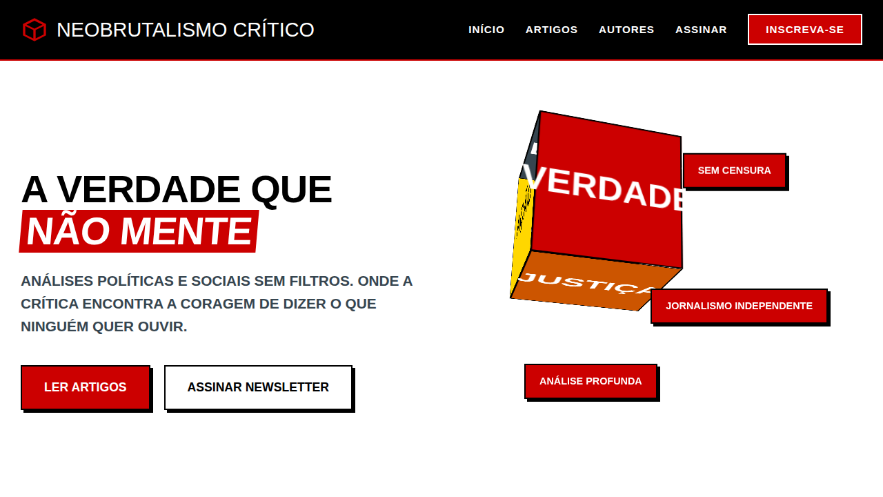
Brutalism in architecture was never about beauty. It was about honesty — concrete left bare, structure exposed, no decorative lies. The buildings said: we refuse to perform for you. That same defiance migrated to the screen. Early web brutalism rejected the polished veneer of corporate design, but it often stopped at aesthetics. It was punk cosplay without the politics. Critical Neobrustalism picks up where that posturing left off. It treats rawness not as style but as stance. The unfinished edge, the visible grid, the refusal to round corners — these aren't choices made for novelty. They're choices made because smoothness is complicity. When every SaaS product looks like it was extruded from the same Figma template, choosing to look uncomfortable is itself a political act. This isn't anti-design. It's anti-consensus. The roughness communicates that the content matters more than the container — that you're here to read, to think, to act. Not to be soothed into scrolling past.
When to Use
Deploy this when the message is more important than the brand. Political commentary that needs to feel urgent, not curated. Activist campaigns where polish would undermine credibility. Independent journalism that wants distance from the outlets it critiques. Zines, manifestos, grassroots organizing. If your client asks 'can we make it friendlier?' — this isn't for them. It works when discomfort is the point, when you want readers slightly on edge, paying attention.
Design Principles
- Expose the structure — visible grids, raw borders, no decorative abstraction between content and reader
- Friction is intentional — reject smooth scrolling, soft transitions, and anything that lulls attention
- Typography carries the argument — oversized headlines, tight leading, monospace for data, serif for opinion. Let type do the shouting
- Color as signal, not decoration — high-contrast black/white as default, color only when it means something (red for urgency, yellow for caution)
- No comfort patterns — avoid rounded corners, drop shadows, gradient warmth. If it feels safe, strip it back
Technical Specs
Colors
Primary
Secondary
Effects
Tipografia grande e em negrito, blocos de texto com bordas fortes, imagens em preto e branco com detalhes em cor, layouts de coluna rígidos, micro-interações de destaque de texto, animações de transição de página abruptas.
Light/Dark
✓ Full / ✗ No
Related
Last synced: 4/1/2026