Neo-Grid Bold
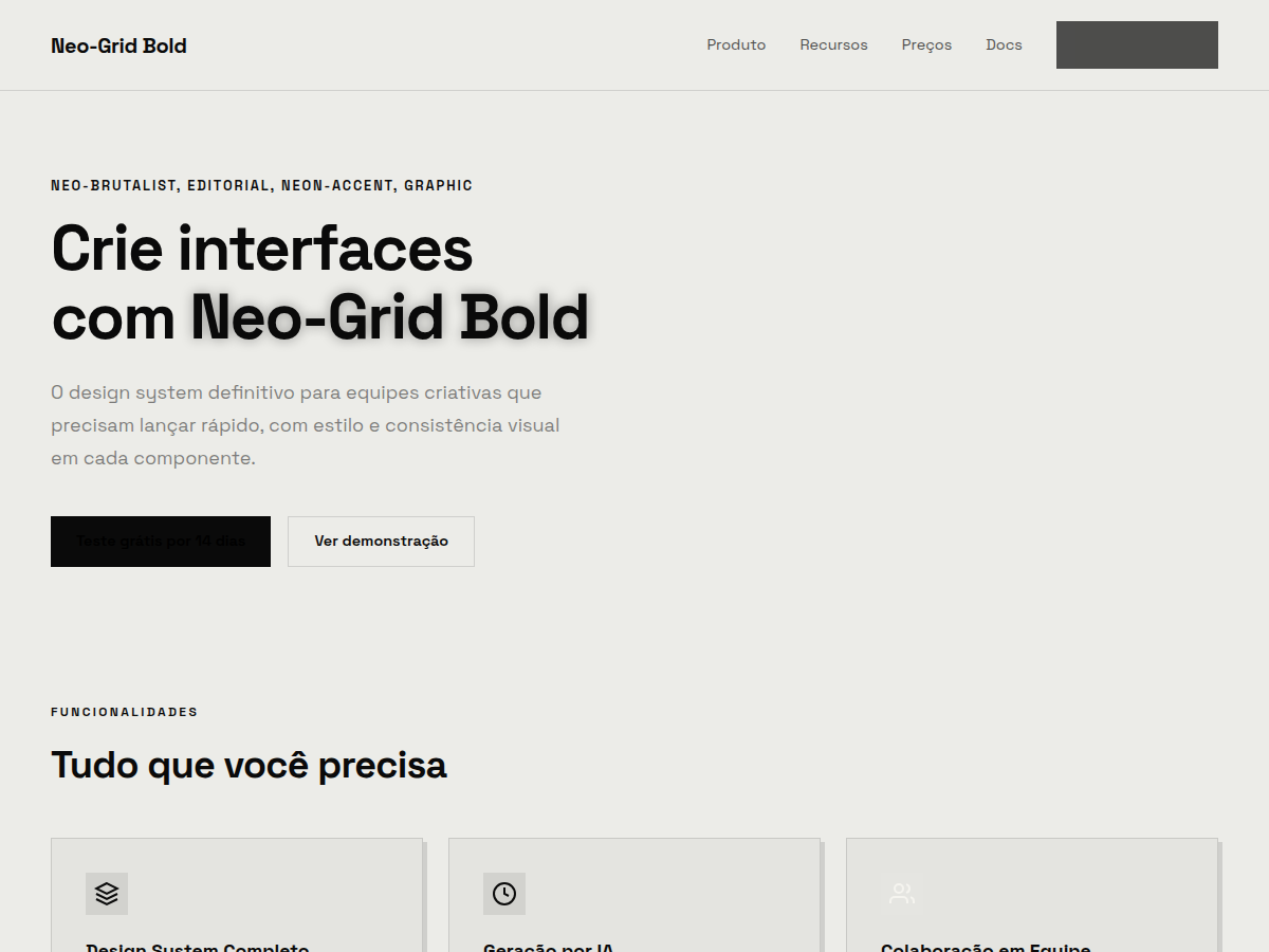
Neo-Grid Bold — Editorial neo-brutalism with a single neon yellow accent on off-white paper. Space Grotesk typography. off-white paper background, ink black, signature neon yellow accent used sparing. Best for product launch, design review, founder pitch. AI-ready design system.
Use case: product launch, design review, founder pitch, brand deck, consulting findings, conference talk
Historical Context
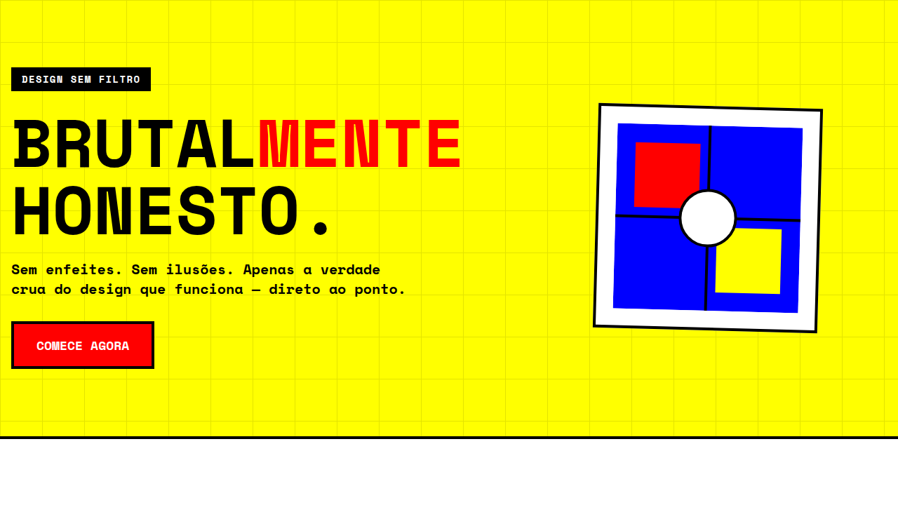
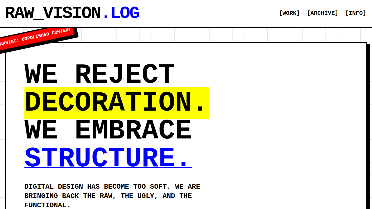
Neo-brutalism didn't emerge from nowhere — it's the rebellious grandchild of Swiss modernism filtered through 90s rave flyers and early-web geocities chaos. When designers got tired of the same rounded-corner, soft-shadow SaaS aesthetic dominating every landing page from 2016 onward, they reached back to Brutalist architecture's raw concrete honesty and slammed it into digital interfaces. The movement gained real traction around 2019-2021 when studios like Locomotive and agencies tired of "clean" started shipping work with hard edges, visible grids, and colors that hurt. Neo-Grid Bold takes this lineage and pushes the structural obsession further. Where early neo-brutalism was often chaotic — overlapping elements, broken layouts — this approach imposes a rigid, thick-bordered grid system that contains the energy without killing it. Bebas Neue isn't decorative here; it's architectural. Each letterform becomes a structural column. The neon yellow isn't accent — it's load-bearing. You're looking at punk rock that learned drafting.
When to Use
When your client's brand needs to scream in a room full of whispers. Neo-Grid Bold works for creative studios launching portfolios, experimental product brands that want zero confusion about their positioning, and any startup whose founders said "we are NOT doing another gradient mesh hero." It falls apart for healthcare, finance, or anything requiring trust signals over personality. This is a system for brands that already have conviction — it won't manufacture it for you.
Design Principles
- Structure is the rebellion — the thick grid isn't decoration, it's the entire point. Every element earns its cell or it doesn't exist.
- Neon yellow is structural, never decorative — use it to define boundaries, highlight active states, and create visual load-bearing walls. Never as a "fun accent."
- Typography at architectural scale — Bebas Neue set large enough to feel like signage, not headlines. If it could fit on a building facade, you're in the right range.
- No comfort radius — zero border-radius, no easing on transitions, no soft anything. Corners are sharp because decisions should be too.
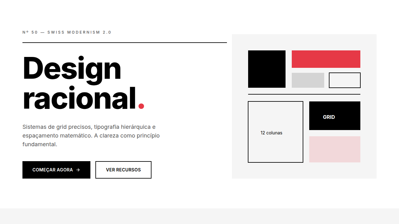
- Density over whitespace — neo-brutalism earns its impact through compression. Pack the grid tight, let elements breathe only through border thickness, not empty space.
Technical Specs
Colors
Primary
Secondary
Effects
display font Space Grotesk for hero headlines, smooth hover transitions (200-250ms), subtle lift shadows, neon-yellow single accent on off-white, thick border columns, high-contrast stats, dense grid, compact 1.2rem gaps
Light/Dark
✓ Full / ✗ None
Related
Last synced: 5/6/2026