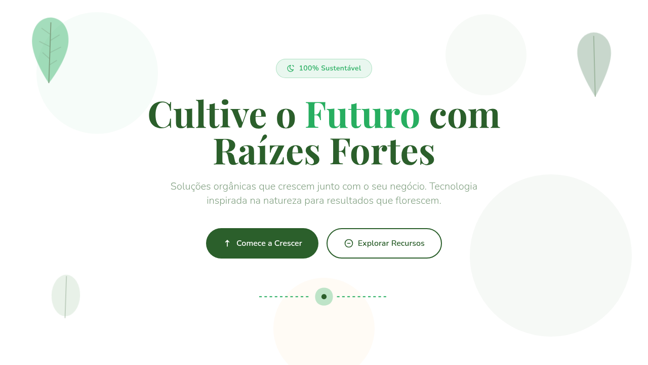
Natureza / Elementos Botânicos
Nature botanical infographic. Ideal for landing pages, modern websites. AI-ready template.
Use case: Landing pages, Modern websites
Historical Context
Long before the sustainability wave hit corporate reporting, botanical illustration had already proven itself as a bridge between science and emotion. Think of Ernst Haeckel's radiolaria drawings — data rendered through organic form, making the invisible tangible. That lineage matters. The modern resurgence is pragmatic, not decorative. ESG mandates forced companies to communicate environmental data to non-technical audiences. Pie charts felt cold. Bar graphs felt corporate. Designers reached for leaves, root systems, tree rings — visual metaphors people already understood intuitively. A carbon footprint shaped like mycelium networks reads faster than a stacked area chart ever could. What's interesting now is the tension. Botanical infographics walk a razor's edge between clarity and ornament. The best ones use organic shapes structurally — vein patterns as flow diagrams, petal arrangements as proportional comparisons — rather than just wrapping conventional charts in floral borders. That structural honesty is what separates data visualization from decoration.
When to Use
Reach for botanical elements when your data needs to feel alive rather than extracted. Environmental reports, obviously. Sustainability dashboards where stakeholders aren't analysts. Wellness brands communicating health metrics. Nature-adjacent nonprofits. They work beautifully when the audience resists traditional chart formats — when you need someone to linger rather than scan. Skip them for financial data, engineering specs, or anything where perceived precision matters more than emotional resonance.
Design Principles
- Structure first, ornament second — use organic shapes as data containers, not decorative afterthoughts
- Maintain readable data ratios; a leaf can encode proportion, but never sacrifice legibility for botanical accuracy
- Limit your palette to what nature actually produces — oversaturated greens and neon florals break the metaphor instantly
- Let whitespace breathe like negative space in a garden; density kills the organic feeling you're trying to achieve
- Pair hand-drawn botanical textures with precise typographic data labels — the contrast creates credibility
Technical Specs
Colors
Primary
Secondary
Effects
Warm natural lighting, soft diffuse, leaf sway animations, floral border reveals, organic shape morphing, nature-inspired transitions
Light/Dark
✓ Full / ✓ Full
Related


Last synced: 4/1/2026