MiniMax Colorful Cards
MiniMax-inspired landing page with white canvas and colorful product cards. Ideal for plataformas de ia multi-modelo, galerias de ai, produtos consumer ai, showcases de tecnologia. AI-ready template.
Use case: Plataformas de IA multi-modelo, Galerias de AI, Produtos consumer AI, Showcases de tecnologia
Historical Context
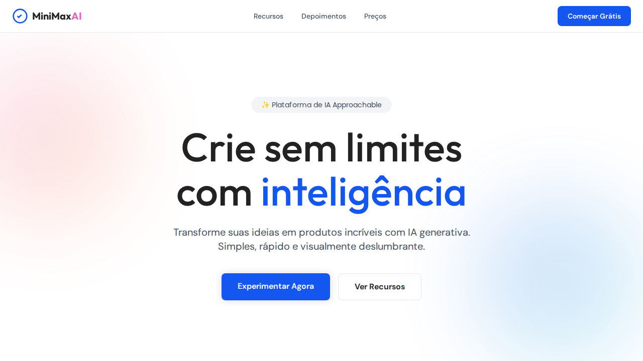
The colorful card on a white canvas isn't new — it's a direct descendant of the Material Design card system Google introduced in 2014, but stripped of its shadows and depth cues. What MiniMax and similar AI-native products did was flatten that paradigm further: no elevation, no border, just pure hue sitting on white. The logic is simple. When your product does something complex (generative AI, multi-modal creation), your interface needs to feel approachable. Color becomes the wayfinding system. Each card is a door, and the color tells you what's behind it before you read a single word. This pattern gained serious traction around 2022-2023 as consumer AI products exploded. Notion AI, Character.ai, and dozens of creative tools adopted it simultaneously — not because they copied each other, but because the constraint was identical: make something powerful feel like a toy. The white canvas provides breathing room. The saturated, slightly muted palette signals playfulness without childishness. It's the design equivalent of speaking in a calm voice about something exciting. What makes MiniMax's execution notable is the commitment to flatness. No gradients pretending to be flat. No subtle inner shadows hedging the bet. Just color, radius, and whitespace doing all the work.
When to Use
Reach for this pattern when your product needs to feel inviting despite technical complexity. AI tools, creative platforms, consumer apps where the first impression matters more than information density. It works when you have distinct categories or entry points that benefit from color-coding. It fails when you need hierarchy within the cards themselves — this pattern is deliberately flat in both senses. Don't use it for data-heavy dashboards or enterprise tools where playfulness reads as unserious.
Design Principles
- White canvas is non-negotiable — the background does nothing so the cards can do everything. No off-whites, no subtle patterns, no gradients. Pure white creates the tension that makes color pop.
- Color is structural, not decorative. Each hue maps to a function or category. If you can't explain why a card is that specific color, you're decorating, not designing.
- Flatness means flatness. No box-shadows, no subtle elevations on hover, no gradients masquerading as solid fills. The moment you add depth, you've broken the contract with the user's eye.
- Border radius should be generous but consistent — typically 16-24px. This is what separates 'playful' from 'clinical.' But pick one value and commit. Mixed radii in this pattern looks like a bug.
- Whitespace between cards is as important as the cards themselves. Tight grids kill the breathability that makes this pattern work. Let the white canvas actually be a canvas, not just a gutter.
Technical Specs
Colors
Primary
Secondary
Effects
Canvas branco dominante com cards de produto coloridos como âncoras visuais. Cards com gradientes vibrantes (rosa, roxo, laranja, azul) como galeria de IA. Sombras purple-tinted (rgba(44,30,116,0.16)) criando glow de marca. Pill nav (9999px) para navegação e toggles. Cards generosamente arredondados (20-24px). Multi-font: DM Sans (UI), Outfit (display), Poppins (mid-tier). Hero 80px weight 500 line-height 1.10. Line-height universal 1.50.
Light/Dark
✓ Full / ✗ Not Recommended
Related
Last synced: 4/1/2026