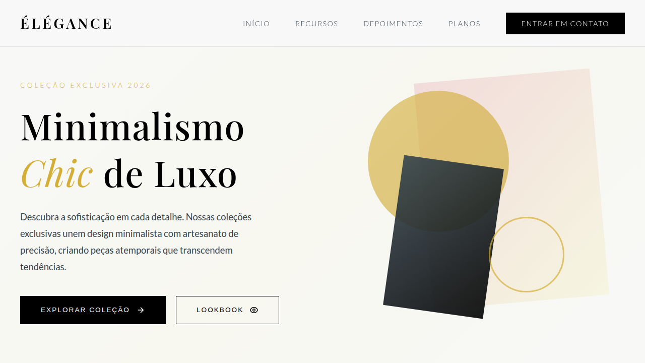
Minimalismo Chic de Luxo
Design an elegant and minimalist luxury fashion e-commerce landing page. Ideal for landing pages, modern websites. AI-ready template.
Use case: Landing pages, Modern websites
Historical Context
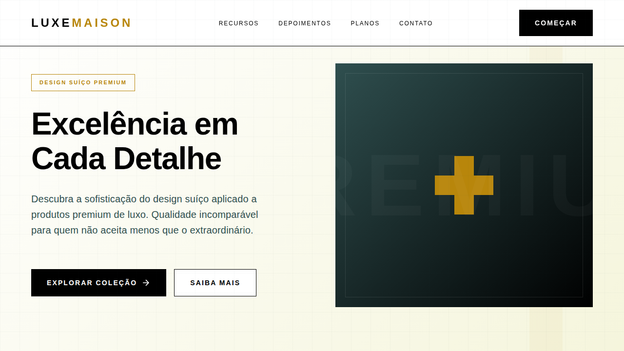
Phoebe Philo's Céline didn't invent minimalism, but it weaponized it. The website was almost hostile in its spareness — enormous white space, a single product per viewport, typography so restrained it dared you to look away. The Row followed suit: no logos, no navigation clutter, just cloth and negative space doing the talking. Bottega Veneta went further, deleting its social media entirely in 2021, proving that in luxury, absence is the loudest statement. This lineage traces back to Swiss modernism, but the luxury mutation is distinct. Where Swiss design democratized information, luxury minimalism gatekeeps it. The grid is there, but it breathes differently — slower, more deliberate, with margins that feel like they cost money. Every pixel of whitespace is a flex. The restraint isn't about clarity; it's about exclusivity. You either understand the codes or you don't. The product doesn't explain itself to you. Today's high-end e-commerce inherits this posture. Quiet interfaces that refuse to sell. No urgency banners, no countdown timers. The design whispers because it doesn't need to shout.
When to Use
When the brand earns its silence. This system works for fashion houses, jewelry, premium skincare — anything where the product's material quality justifies the restraint. It falls apart instantly if the product can't carry the weight of all that empty space. Don't use it for mid-market brands trying to look expensive; customers will feel the disconnect. Reserve it for contexts where conversion pressure is low and brand perception is everything.
Design Principles
- Negative space as status symbol — margins should feel deliberately extravagant, not merely empty
- One focal point per viewport — if everything whispers, nothing competes; let a single image or product command attention
- Typography as architecture — use weight and scale contrasts within a single restrained typeface rather than decorative variety
- Interaction through absence — remove hover states, reduce affordances, let the user discover rather than be guided
- Slow choreography — transitions at 600ms+, easing curves that decelerate; the interface moves like fabric, not software
Technical Specs
Colors
Primary
Secondary
Effects
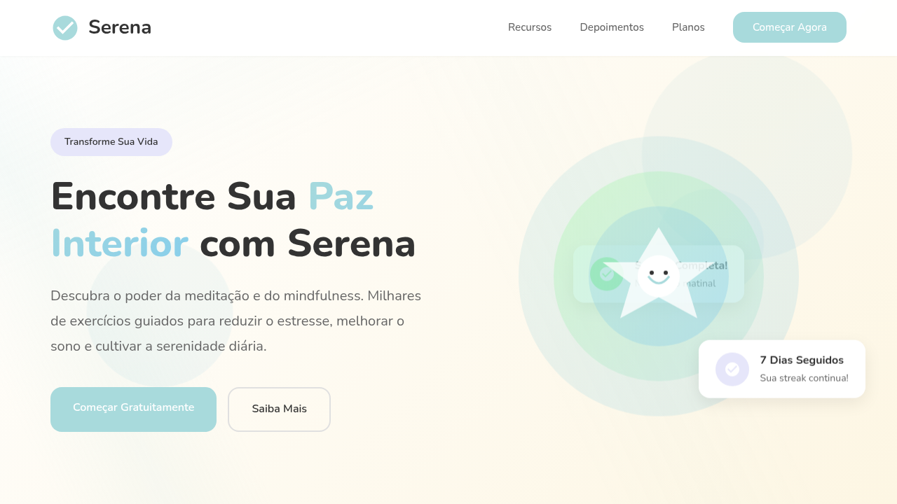
Layouts limpos com muito espaço em branco, tipografia serifada e sans-serif de alta qualidade, imagens de produto em grande escala, navegação sutil, micro-interações de hover em produtos, transições suaves e elegantes.
Light/Dark
✓ Full / ✗ No
Related
Last synced: 4/1/2026