Mid-Century Modern
Mid-century modern landing page with clean lines, organic curves and muted vibrant colors from the 1950s. Ideal for branding de móveis, layouts de pôsteres retro, decoração de interiores, produtos lifestyle. AI-ready template.
Use case: Branding de móveis, Layouts de pôsteres retro, Decoração de interiores, Produtos lifestyle
Historical Context
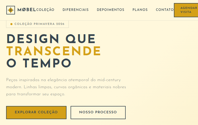
Mid-Century Modern emerged between the mid-1940s and late 1960s as a direct rejection of prewar ornamentation. Designers like Charles and Ray Eames, Eero Saarinen, and Arne Jacobsen weren't decorating — they were solving problems. New materials (molded plywood, fiberglass, aluminum) enabled forms that previous generations couldn't manufacture. The movement democratized good design; the Eames lounge chair was aspirational, but their molded plywood chairs were meant for everyone. What makes MCM endure isn't nostalgia — it's the logic. Every curve exists because the material wanted to go there. Every leg is tapered because it's structurally honest. The style spread from furniture to architecture to graphic design because its principles are universal: respect materials, eliminate the unnecessary, let function generate form. The postwar optimism baked into MCM gives it warmth that pure modernism lacks. It's modernism that actually wants you to sit down and stay awhile.
When to Use
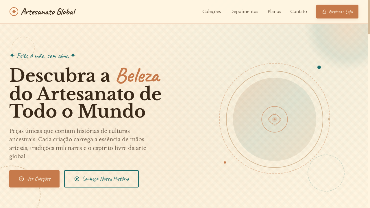
Reach for Mid-Century Modern when a project needs to feel sophisticated without being cold. It's the sweet spot between minimal and inviting — perfect for brands that want credibility and approachability simultaneously. Works beautifully for furniture companies, architecture firms, hospitality brands, and any retro-modern identity that needs to signal taste without shouting. Avoid it when you need raw edge or maximalist energy — MCM is confident, not loud.
Design Principles
- Organic geometry over rigid angles — tapered legs, gentle curves, and boomerang shapes that feel human-scaled
- Material honesty: expose wood grain, celebrate the warmth of walnut and teak, let surfaces speak
- Restrained color palettes anchored in mustard, olive, burnt orange, and teal against warm neutrals
- Negative space as a compositional tool — MCM breathes, it never crowds
- Functional elegance: every element earns its place through utility first, beauty as consequence
Technical Specs
Colors
Primary
Secondary
Effects
Atomic-era starburst SVG decorations, organic boomerang/kidney shapes via clip-path, clean thin lines as dividers, muted color blocks, subtle retro texture overlays, smooth slide-in animations (400ms), tapered leg-inspired border details
Light/Dark
✓ Full / ✓ Full
Related
Last synced: 4/1/2026