Memphis
Memphis-style landing page with vibrant bold colors, geometric shapes (triangles, circles, squiggles), postmodern 80s aesthetic. Ideal for branding retro, peças editoriais, embalagens funky, campanhas jovens. AI-ready template.
Use case: Branding retro, Peças editoriais, Embalagens funky, Campanhas jovens
Historical Context
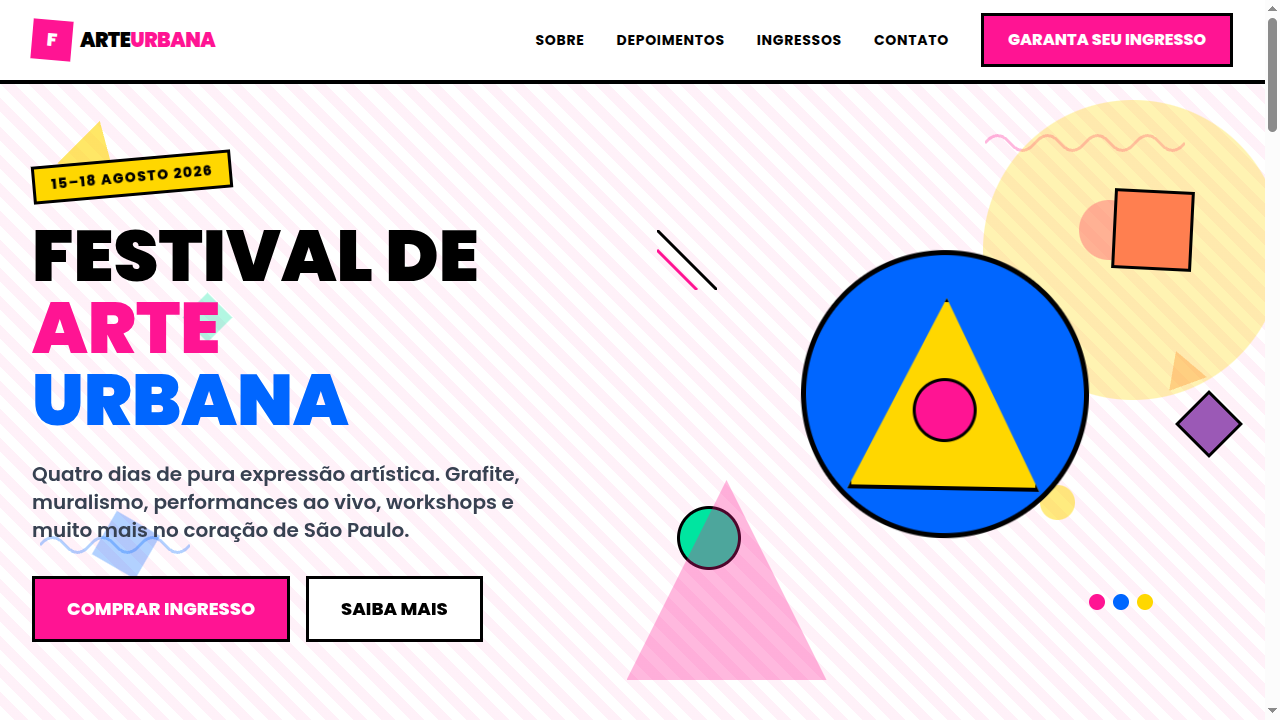
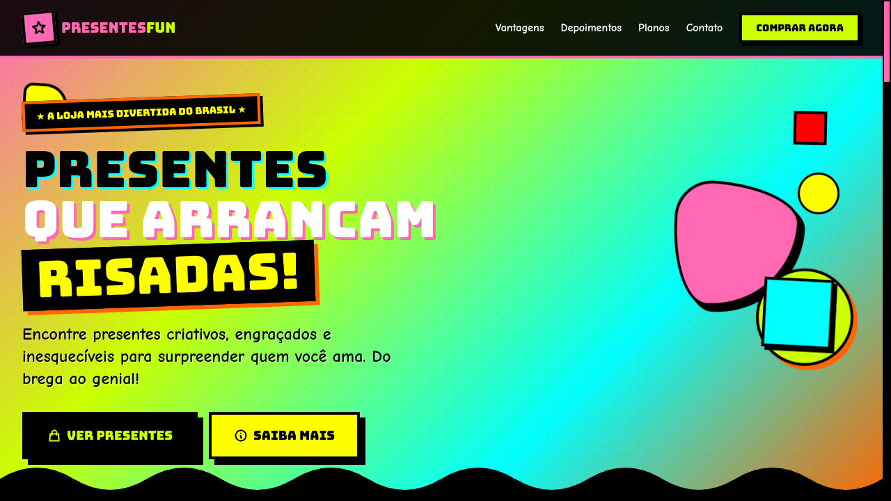
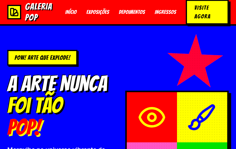
Memphis exploded out of Milan in 1981 when Ettore Sottsass gathered a crew of designers who were collectively sick of the beige rationalism that dominated everything. They named the group after a Bob Dylan track playing during their first meeting — "Stuck Inside of Mobile with the Memphis Blues Again" — and proceeded to violate every rule modernism held sacred. Clashing colors, plastic laminates, terrazzo patterns, and shapes that served no functional purpose whatsoever. The establishment hated it. That was the point. What Memphis understood, and what most design movements miss entirely, is that taste is political. By rejecting "good taste" as defined by the Bauhaus lineage, they exposed how much of modernist design was really about class signaling dressed up as universal truth. The squiggles and triangles weren't random — they were deliberate provocations against a design orthodoxy that had calcified into dogma. The movement burned hot and brief. By 1988 Sottsass dissolved the group, but the DNA persists everywhere — from 90s Nickelodeon to contemporary brand identities that refuse to take themselves seriously. Every time a designer reaches for a zigzag or an arbitrary geometric accent, they're channeling Memphis whether they know it or not.
When to Use
Memphis works when your brand needs to signal irreverence, energy, and creative confidence. It's the right call for youth-facing campaigns, music and event branding, fashion editorials, and any creative studio that wants to communicate "we don't do boring." It falls apart instantly when applied timidly — half-committed Memphis just looks like a mistake. You either go full maximalist or you pick a different system. Also: if your audience skews corporate or conservative, Memphis will read as unserious rather than bold. Know your context.
Design Principles
- Clash deliberately — combine colors that modernism says shouldn't coexist, but do it with conviction, not randomness
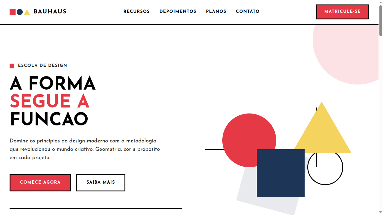
- Geometry as decoration, not structure — triangles, circles, and squiggles exist for visual energy, not to organize information
- Reject hierarchy when it serves you — Memphis flattens importance, letting pattern and shape compete equally with content
- Surface over depth — embrace flat, graphic, almost cartoonish treatments; drop shadows and gradients belong to other systems
- Asymmetry as default — centered, balanced compositions kill the Memphis energy; let elements collide off-grid
Technical Specs
Colors
Primary
Secondary
Effects
Bold geometric shapes as decorative elements (CSS triangles, circles), squiggly line borders via SVG, confetti-like scattered patterns, playful rotation on hover (5-15deg), pop-in animations, dotted and zigzag patterns as backgrounds
Light/Dark
✓ Full / ◐ Partial
Related
Last synced: 4/1/2026