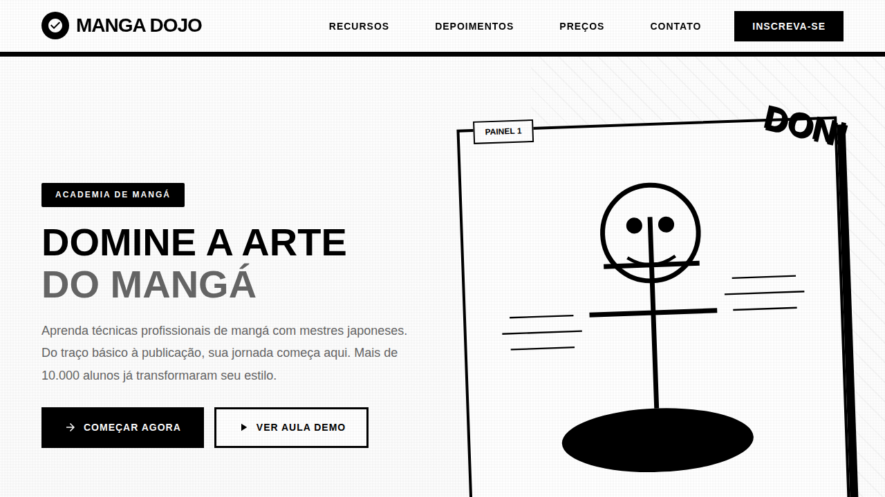
Manga Instructional Comic
Manga style landing page, black and white comic, speed lines, dynamic panels, ink aesthetic, instructional comic design. Ideal for landing pages, modern websites. AI-ready template.
Use case: Landing pages, Modern websites
Historical Context
Manga as instructional medium didn't emerge from some corporate brainstorm. It grew organically in post-war Japan, where publishers realized sequential art could teach everything from cooking to electronics repair. The format exploded in the 1960s and 70s — government manuals, workplace safety guides, even tax filing instructions rendered in panels with expressive characters and dramatic pacing. What made it stick wasn't novelty. It was comprehension. Studies consistently showed readers retained more from manga-format instructions than from plain text equivalents. The retro-pop aesthetic we associate with instructional manga — bold screentones, exaggerated reactions, speed lines on mundane tasks — crystallized in the 1980s. Publishers like Gakken and Shogakukan perfected the formula: a relatable protagonist encounters a problem, a mentor figure appears, knowledge transfers through dialogue and visual demonstration. The format respected readers enough to entertain them while teaching. Western design finally caught on decades later. Now everyone wants "manga-style onboarding" without understanding the grammar. The panel transitions, the emotional beats between information dumps, the careful balance of white space and density — these aren't decorative choices. They're pedagogical architecture refined over sixty years.
When to Use
Reach for this when your content is procedural and your audience's attention is earned, not guaranteed. Tutorials that would otherwise be walls of numbered steps. Onboarding flows where users need motivation alongside instruction. Educational products targeting younger demographics or Japanese-market audiences who read this grammar natively. It works brilliantly for complex multi-step processes — assembly guides, software workflows, cooking sequences — where showing emotional context (frustration, then breakthrough) keeps people moving forward instead of abandoning at step four.
Design Principles
- Panel rhythm dictates comprehension speed — alternate dense informational panels with breathing-room reaction shots. Never stack three heavy panels consecutively.
- Characters exist to externalize the learner's internal state. Their confusion is permission for the reader to not already know. Their excitement signals that mastery is coming.
- Screentones and speed lines aren't decoration — they're hierarchy tools. Use them to direct the eye toward the critical action within a panel, not to fill empty space.
- Respect the gutter. Panel transitions carry meaning: moment-to-moment for precision tasks, action-to-action for workflows, scene-to-scene for context shifts. Wrong transition type breaks the teaching rhythm.
- Retro-pop color palettes (limited, high-contrast, halftone-friendly) enforce visual consistency across long sequences. Restraint in color means each accent actually signals something.
Technical Specs
Colors
Primary
Secondary
Effects
Dynamic comic paneling, speed lines (beta flash), impact bursts, expressive character acting, traditional ink aesthetics, halftone screentones.
Light/Dark
✓ Full / ✗ No
Related
Last synced: 4/1/2026