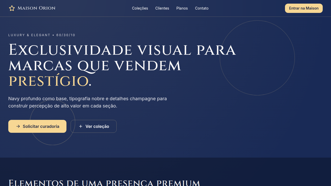
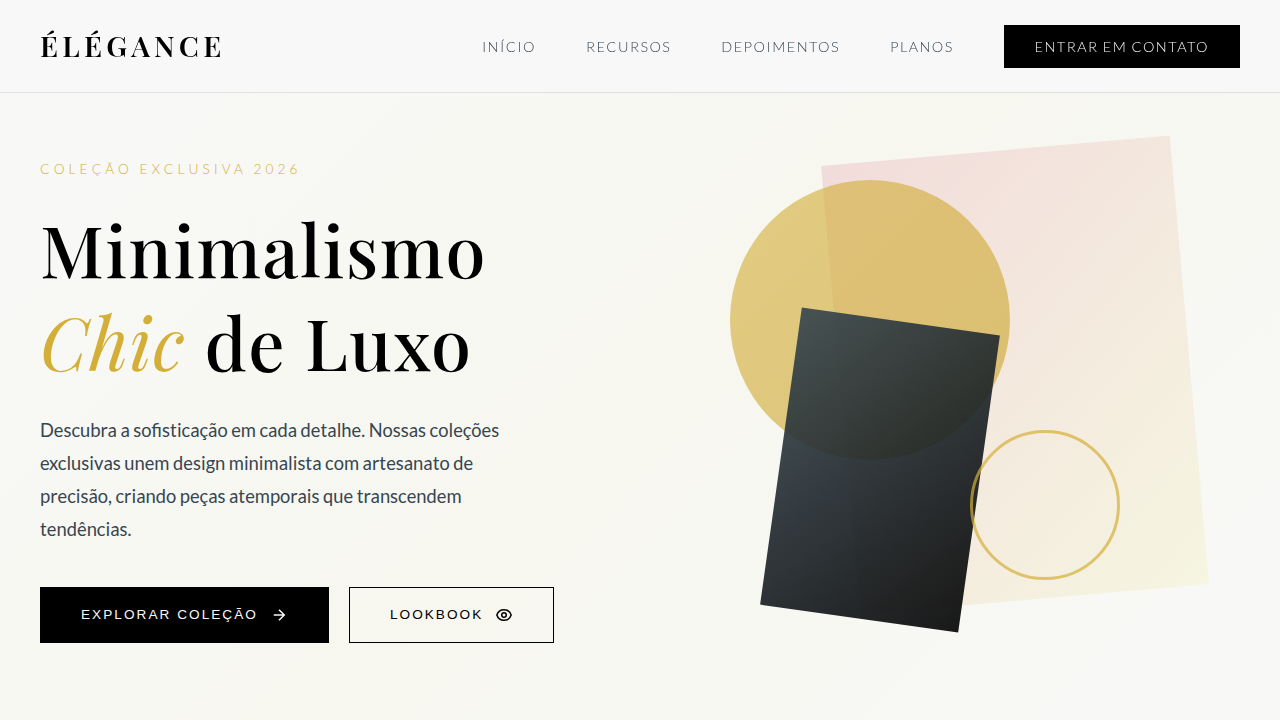
Luxury & Elegant
Luxury and elegant interface with strict 60/30/10 color hierarchy. Ideal for branding de luxo, hotéis e hospitalidade premium, moda high-end, joalheria, serviços financeiros exclusivos. AI-ready template.
Use case: Branding de luxo, Hotéis e hospitalidade premium, Moda high-end, Joalheria, Serviços financeiros exclusivos
Historical Context
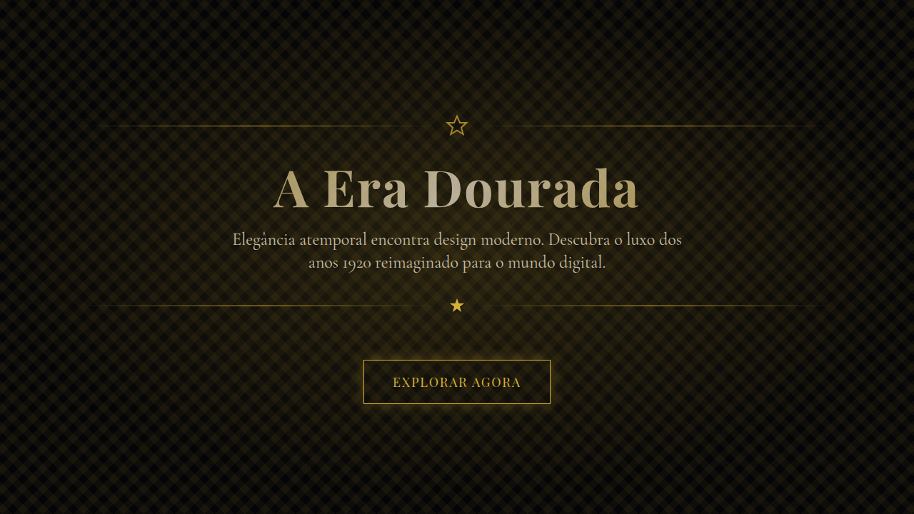
Luxury design didn't emerge from aesthetics alone — it came from scarcity. The earliest luxury visual languages were born in Parisian couture houses and Swiss watchmaking, where every typographic choice signaled exclusivity. Didone serifs, generous whitespace, and restrained color palettes weren't decorative decisions; they were gatekeeping mechanisms. If your materials looked accessible, you weren't luxury. The digital era nearly destroyed this. Early web design democratized everything, and luxury brands struggled to translate physical restraint into pixels. It took until the late 2010s for digital luxury to find its footing — brands like Bottega Veneta deleting social media entirely, Celine dropping its accent, entire websites reduced to a single typeface and negative space. The lesson was clear: luxury online means refusing to compete for attention. Today's luxury design systems inherit this lineage but face new tensions. Dark modes, motion design, and immersive experiences push against the traditional stillness of luxury. The best work resolves this by treating motion as choreography rather than animation — deliberate, unhurried, almost reluctant to reveal itself.
When to Use
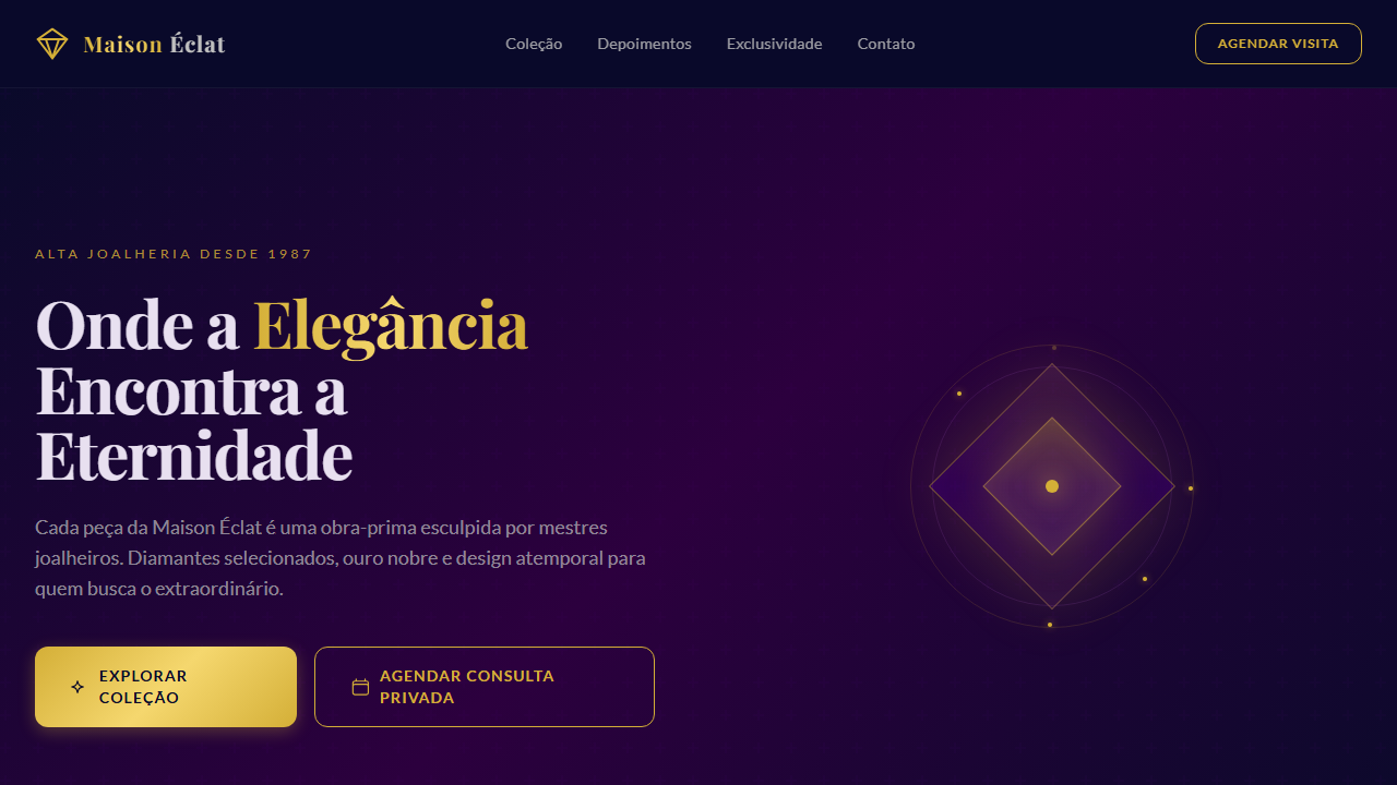
Deploy this system when the brand's entire value proposition rests on perceived quality and exclusivity. Luxury brands, five-star hospitality, private banking, haute couture, fine jewelry, premium real estate — anywhere the audience expects to feel selected rather than sold to. If your conversion funnel involves urgency tactics or discount badges, this isn't your system. Luxury design earns trust through restraint. It works when silence communicates more than noise, and when every pixel of whitespace is doing deliberate, expensive work.
Design Principles
- Radical restraint — remove until it breaks, then add back one element. Luxury is what you refuse to include.
- Typographic authority — one serif family, used with conviction. Size contrast replaces color contrast. Let letterforms do the heavy lifting.
- Choreographed motion — nothing animates without purpose. Transitions are slow, eased with intention, and never loop. Think curtain reveal, not bounce.
- Material honesty — textures, photography, and color must reference physical luxury. No gradients that don't exist in nature. No shadows without a light source.
- Asymmetric tension — reject centered-everything layouts. Luxury compositions use deliberate imbalance to create visual intrigue and guide the eye with confidence.
Technical Specs
Colors
Primary
Secondary
Effects
10%: Champagne #F7D794 em filetes, logomarca e botões premium; tipografia serifada para títulos, contraste refinado, brilho discreto e transições suaves (240-320ms)
Light/Dark
✓ Full / ✓ Full
Related
Last synced: 4/1/2026